



YOOSOO
Branding, Photography,Detail Page Design, Packaging
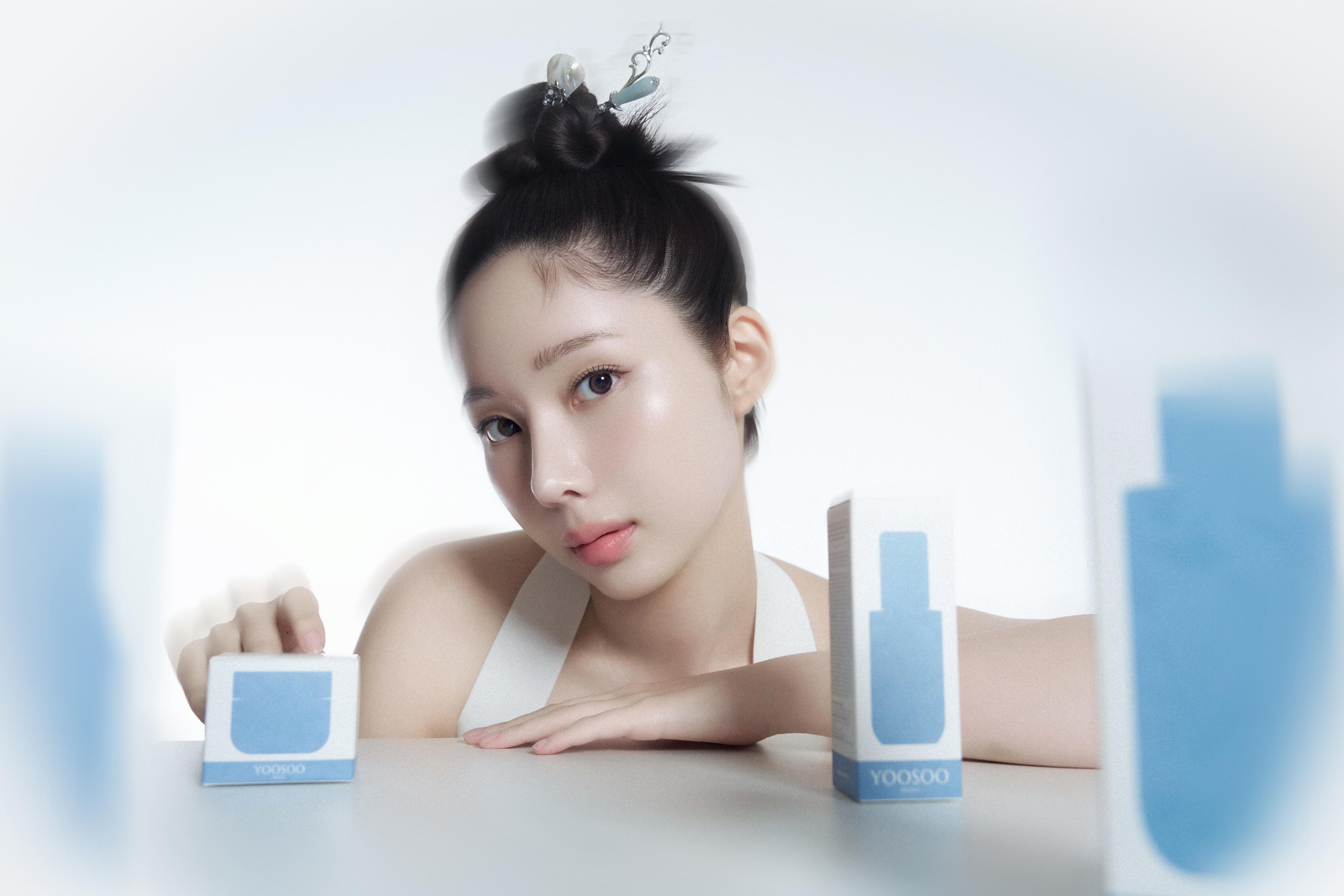
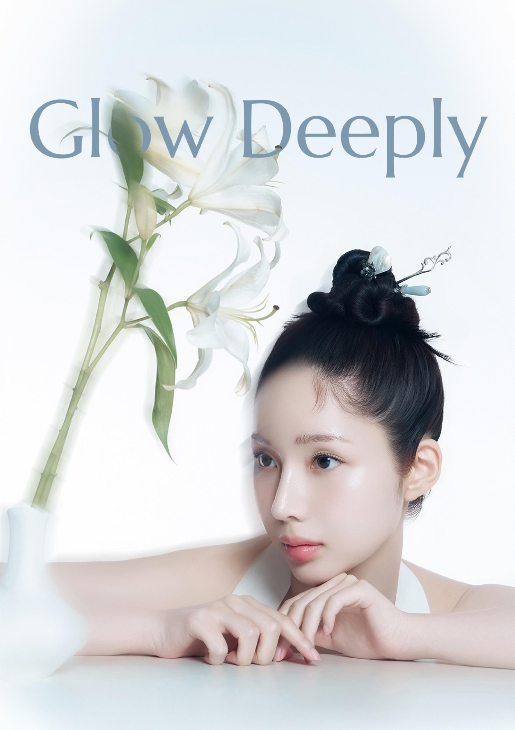
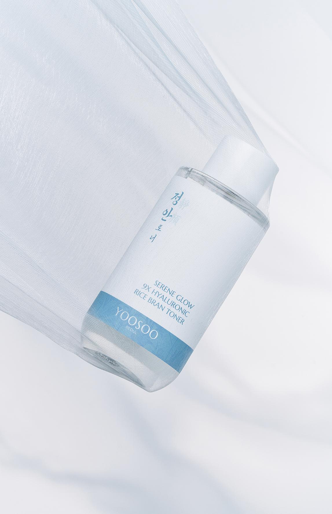
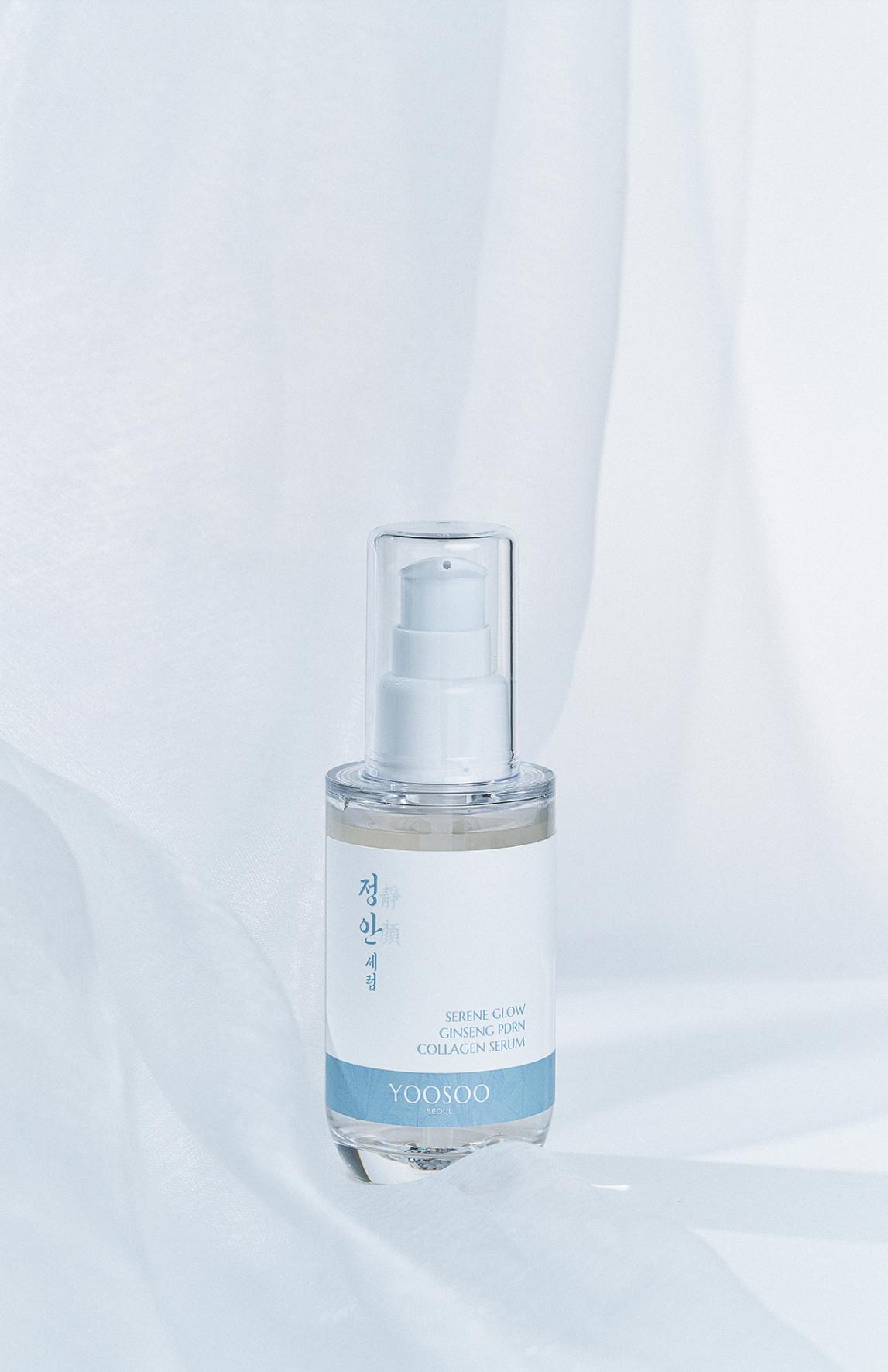
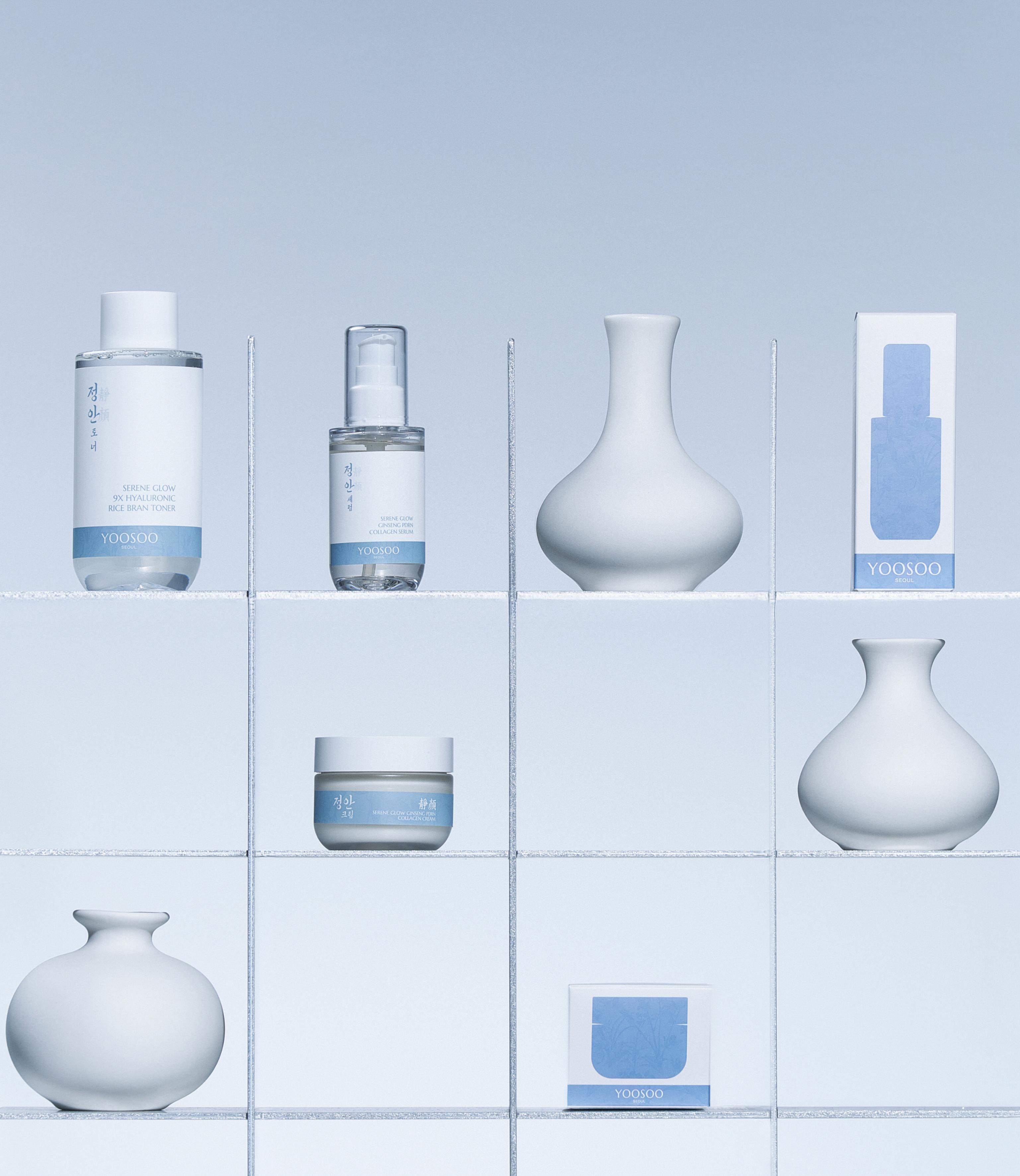
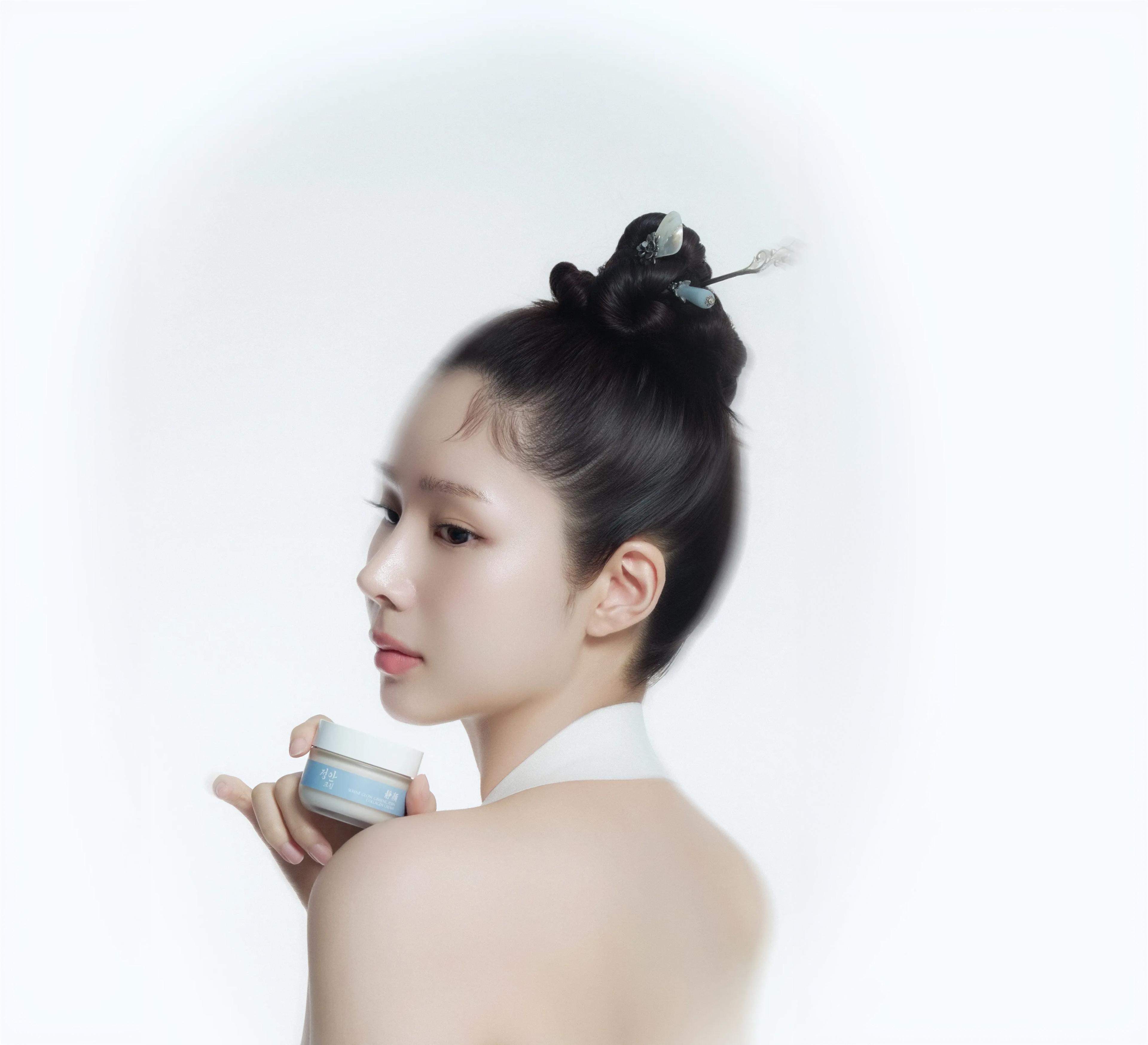
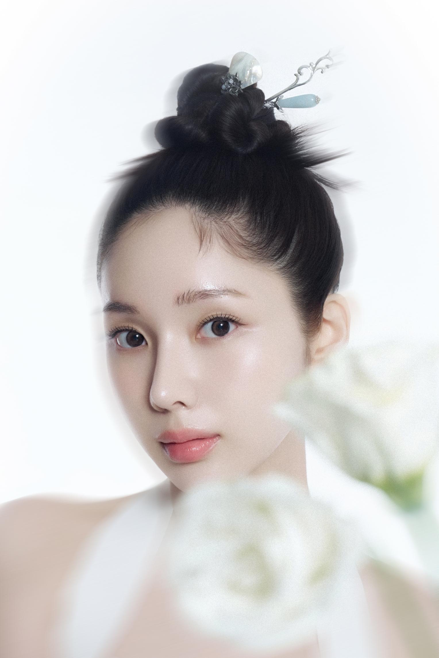
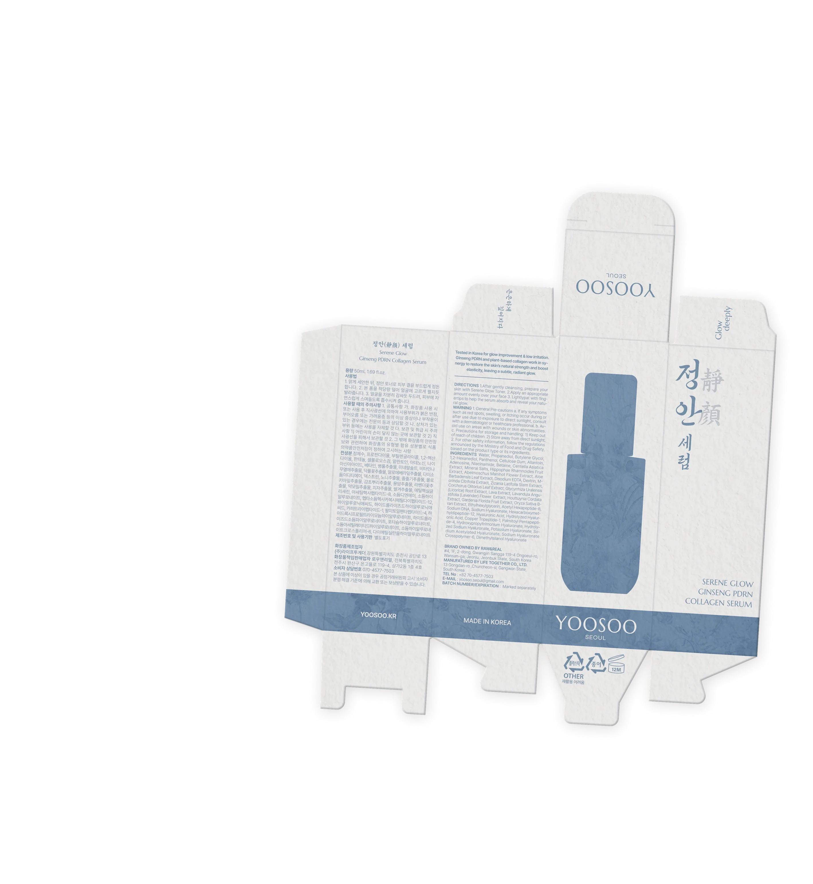
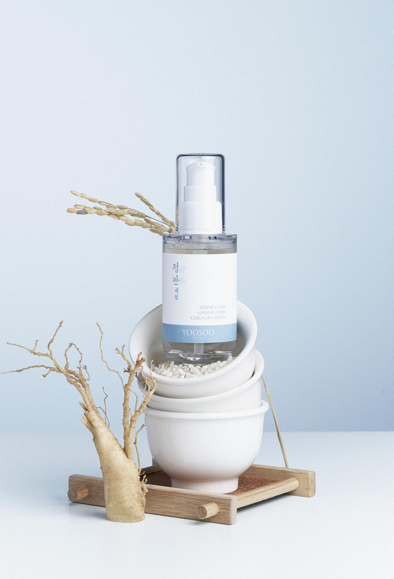
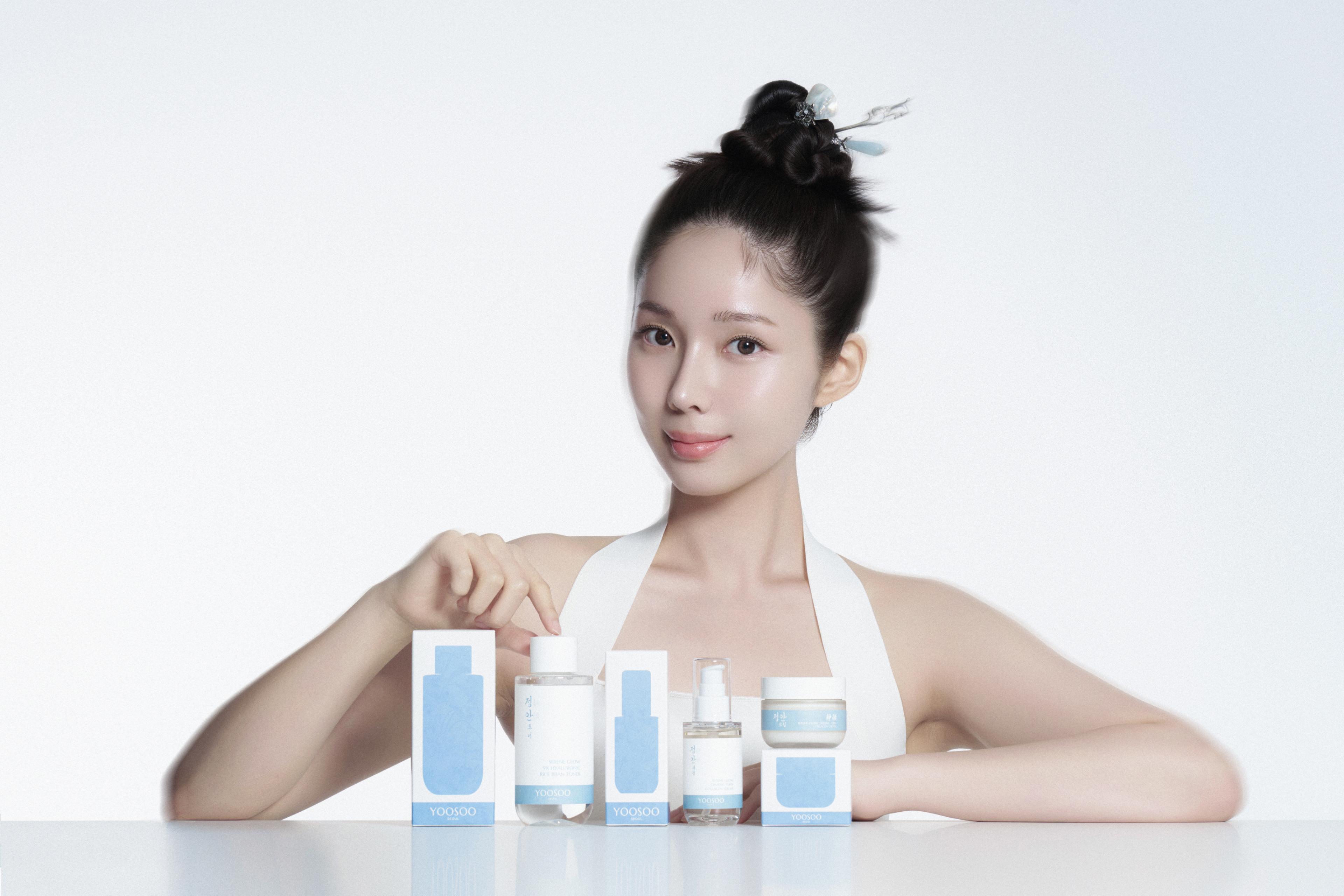
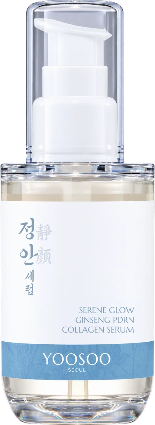
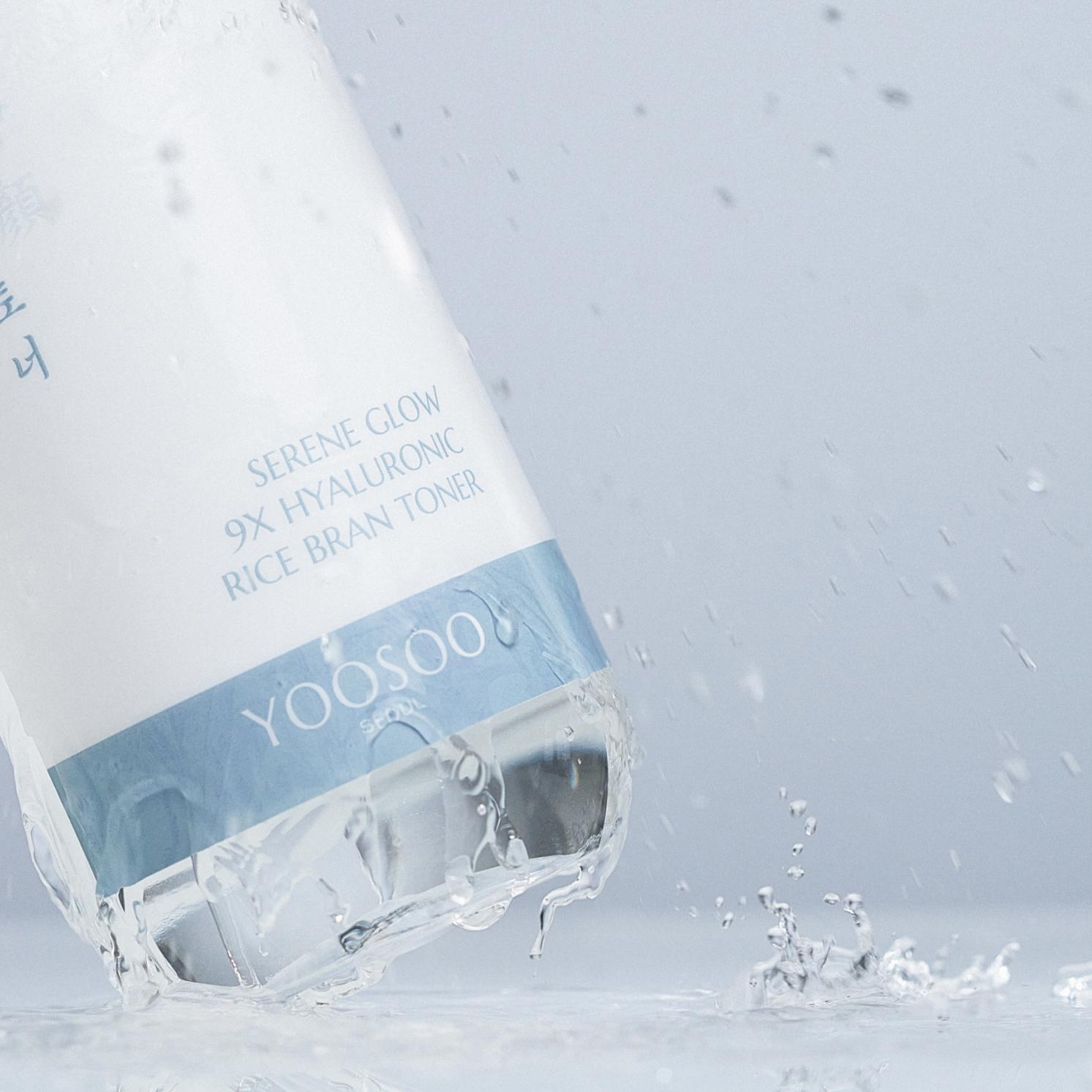
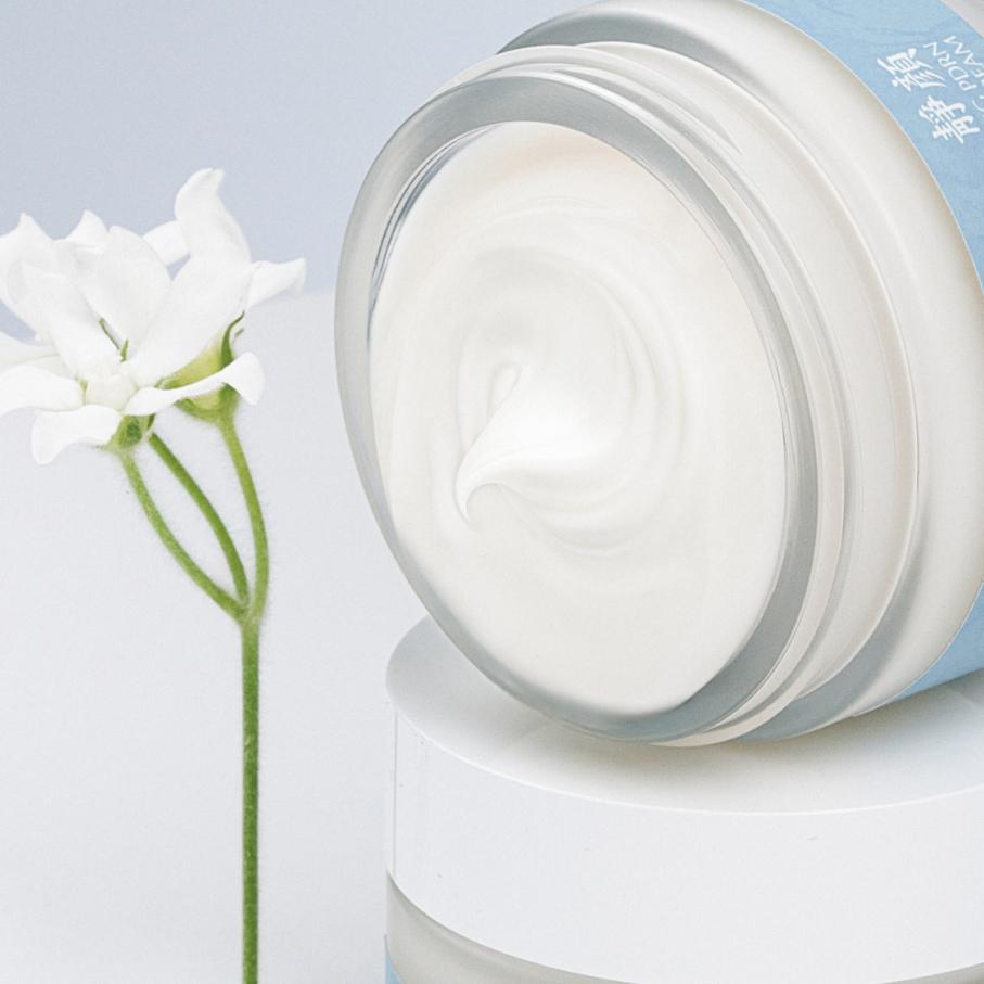
YOOSOO is a skincare brand inspired by the clear waters of Korea. Its name, meaning ‘flowing water,’ carries the idea of a flow that restores the skin's natural balance and vitality. The Jeongan (靜顔, ‘calm face’) line aims for a calm, comfortable complexion even amid external stressors, offering a routine of toner, serum and cream. We defined the identity of the newly launched brand around the clarity of water and ingredients found in Korean nature. The calm that Jeongan stands for is expressed through serene blue and generous white space, while Chinese characters and botanical patterns add a distinctly Korean impression. This visual direction was carried consistently across packaging, photography and detail pages.
Brand Value Core
Inspired by ‘the flow of clear water,’ YOOSOO defines the purity, flexibility and vitality of water as its core brand values. We connected a brand identity rooted in Korean nature with modern ingredient design, establishing the direction of a skincare brand that restores the skin's natural balance and vitality. Every touchpoint — brand story, products, benefits and user experience — was tied together under the single theme of ‘flow’ to build a consistent brand message and experience.
Clarity
A brand identity that begins with Korea's clean water
Serenity
The comfort and balance held in the name Jeongan
Vitality
Skin vitality through natural ingredients and product-specific care
Brand Core Message
We interpreted YOOSOO's ‘flow,’ inspired by Korea's clear water, as a care process that fills the skin with moisture and keeps it hydrated. Built on this flow, the Jeongan line keeps skin moist and comfortable and helps maintain its natural balance. By linking the clear, supple image of water with the functional values of hydration and moisture, we set key messages that bring the brand philosophy into everyday care.
Package Graphics
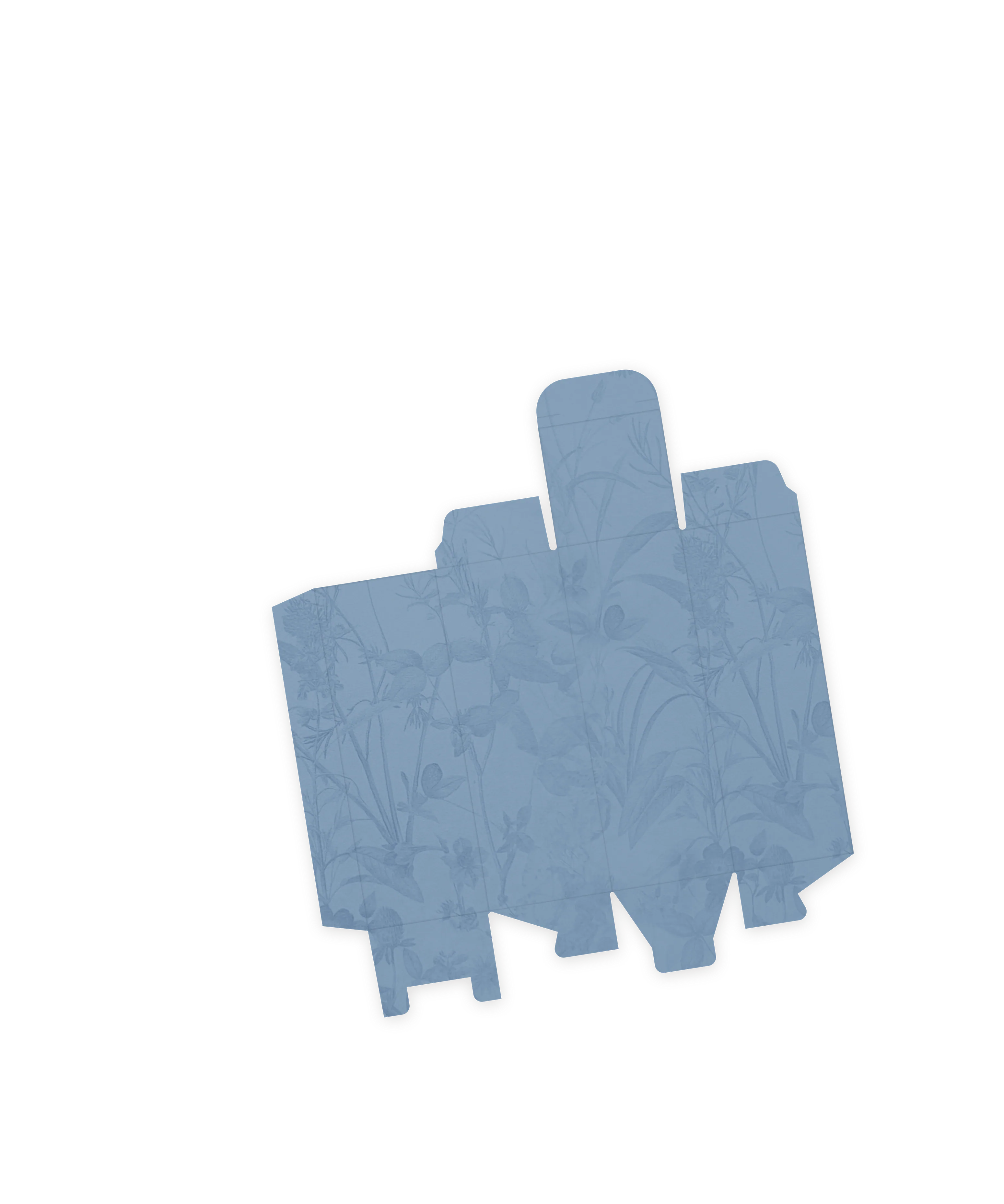
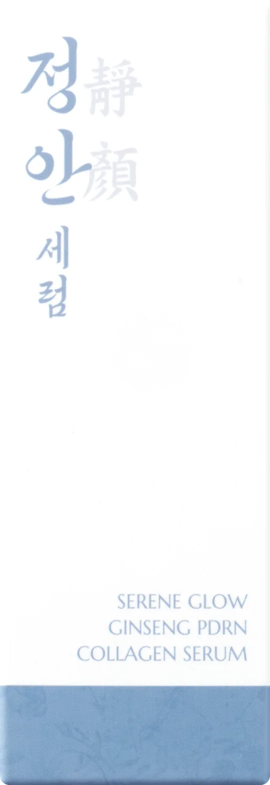
We expanded YOOSOO's story, which begins with Korea's clear water, into the vitality of nature that water nurtures. Delicate botanical imagery paired with a calm blue conveys both the nature-inspired character of the brand and the fresh impression of hydrating care. Lowering the contrast between background and plants lets the pattern appear subtly, and applying it across the whole Jeongan line gives the products visual consistency.
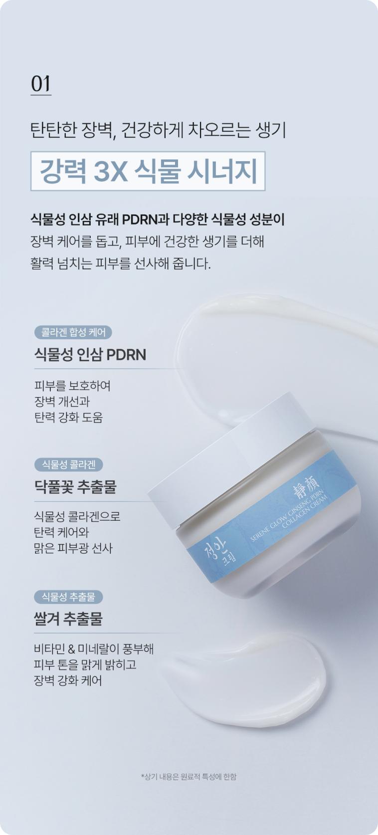
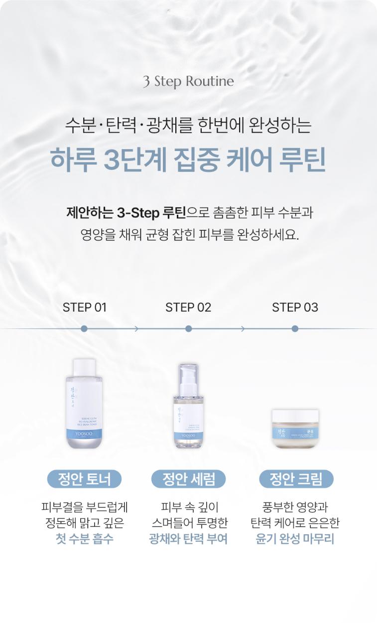
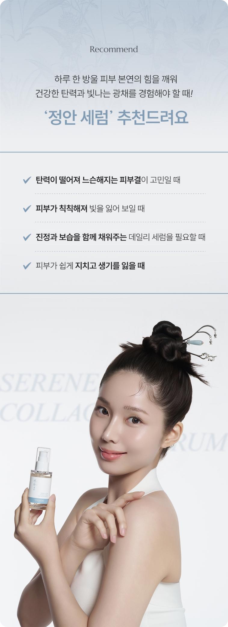
Detail Page
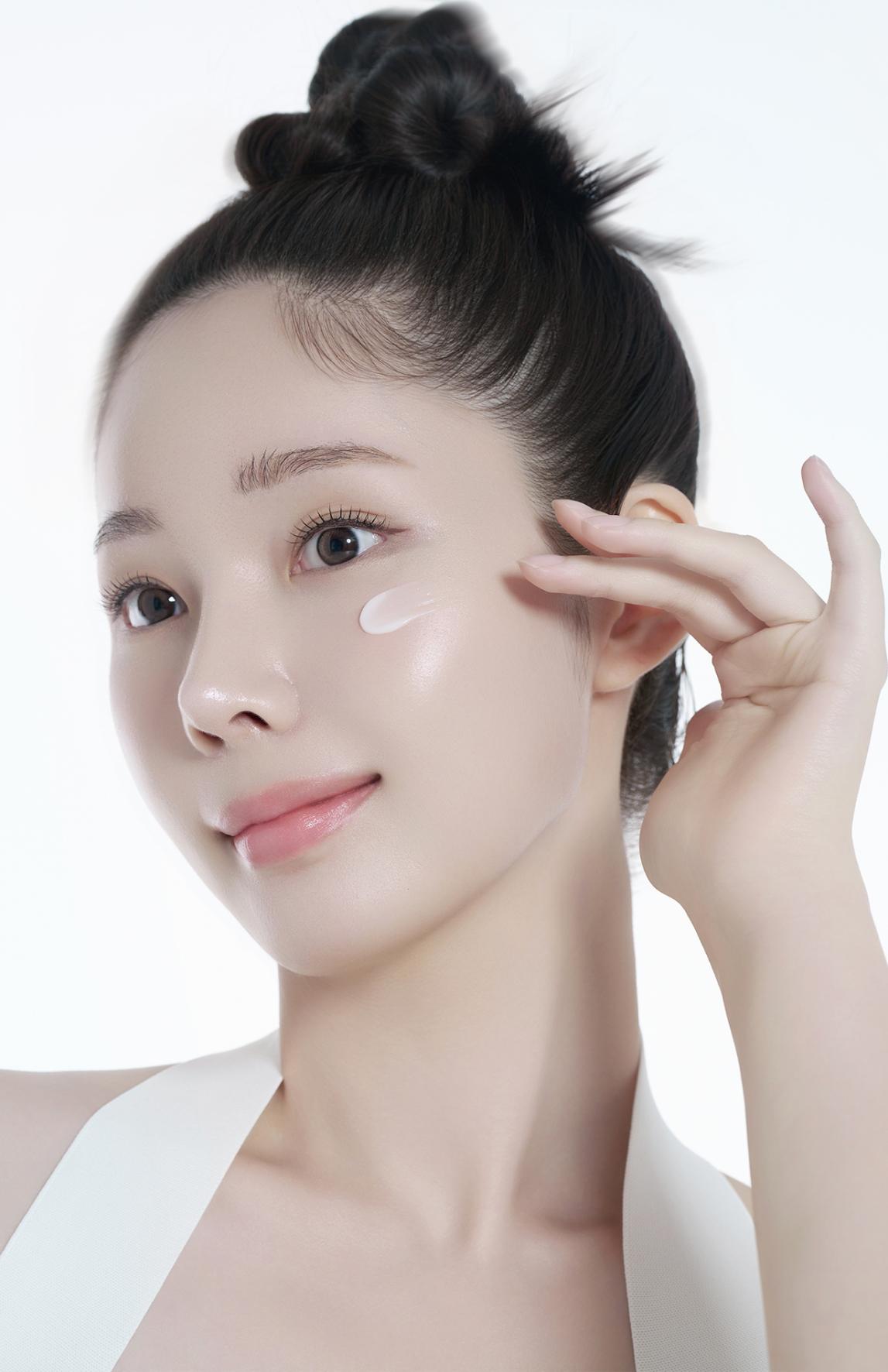
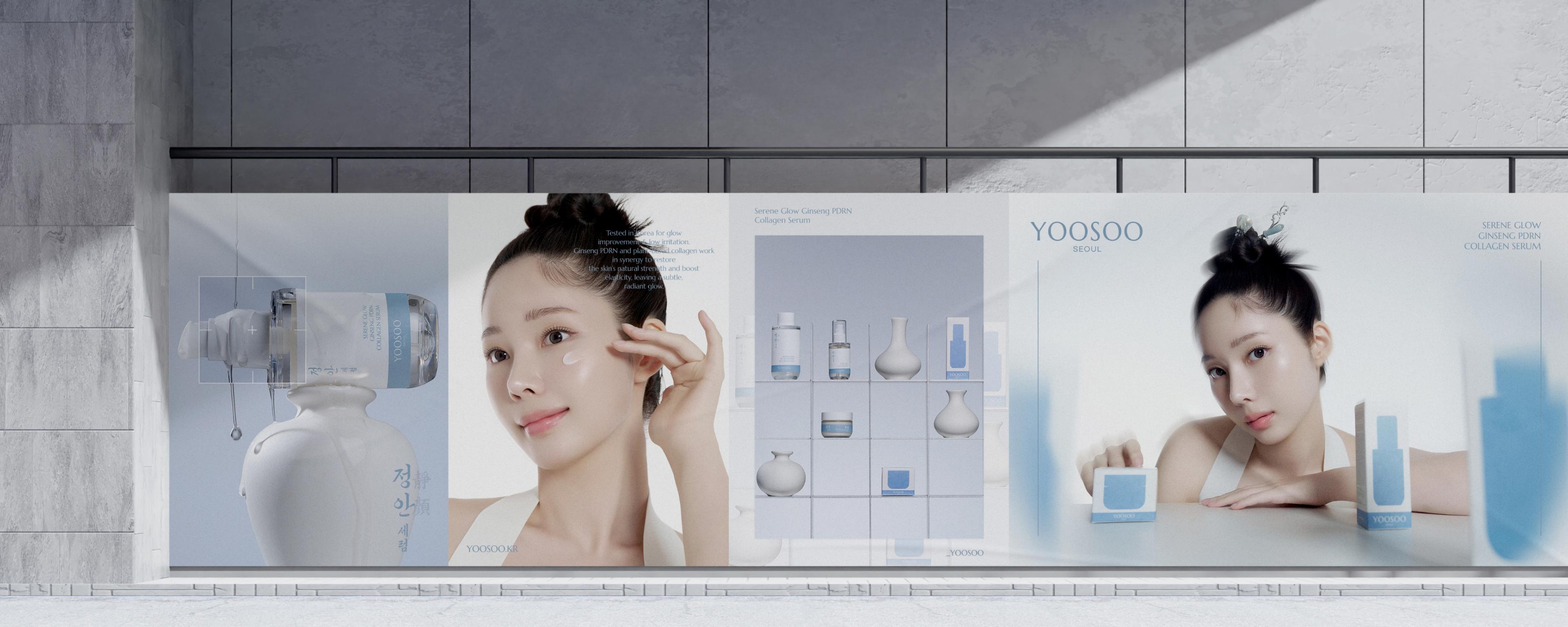
The detail pages for the YOOSOO Jeongan line were designed to clearly communicate the key ingredients and functions of the toner, serum and cream while building one consistent brand experience across all three. A shared information structure differentiates each product's character, and functional information connects naturally with the brand's visual identity. The line's calm blue tone runs throughout the pages, and photography and illustration work together to extend the brand's clear, refreshing image. Carefully balanced image and text density and spacing between sections keep a natural visual flow through the long scroll, conveying both the product's functionality and the brand's sensibility.