
OCURA
Photography, Film, Web site,Detail Page Design, 3D Motion
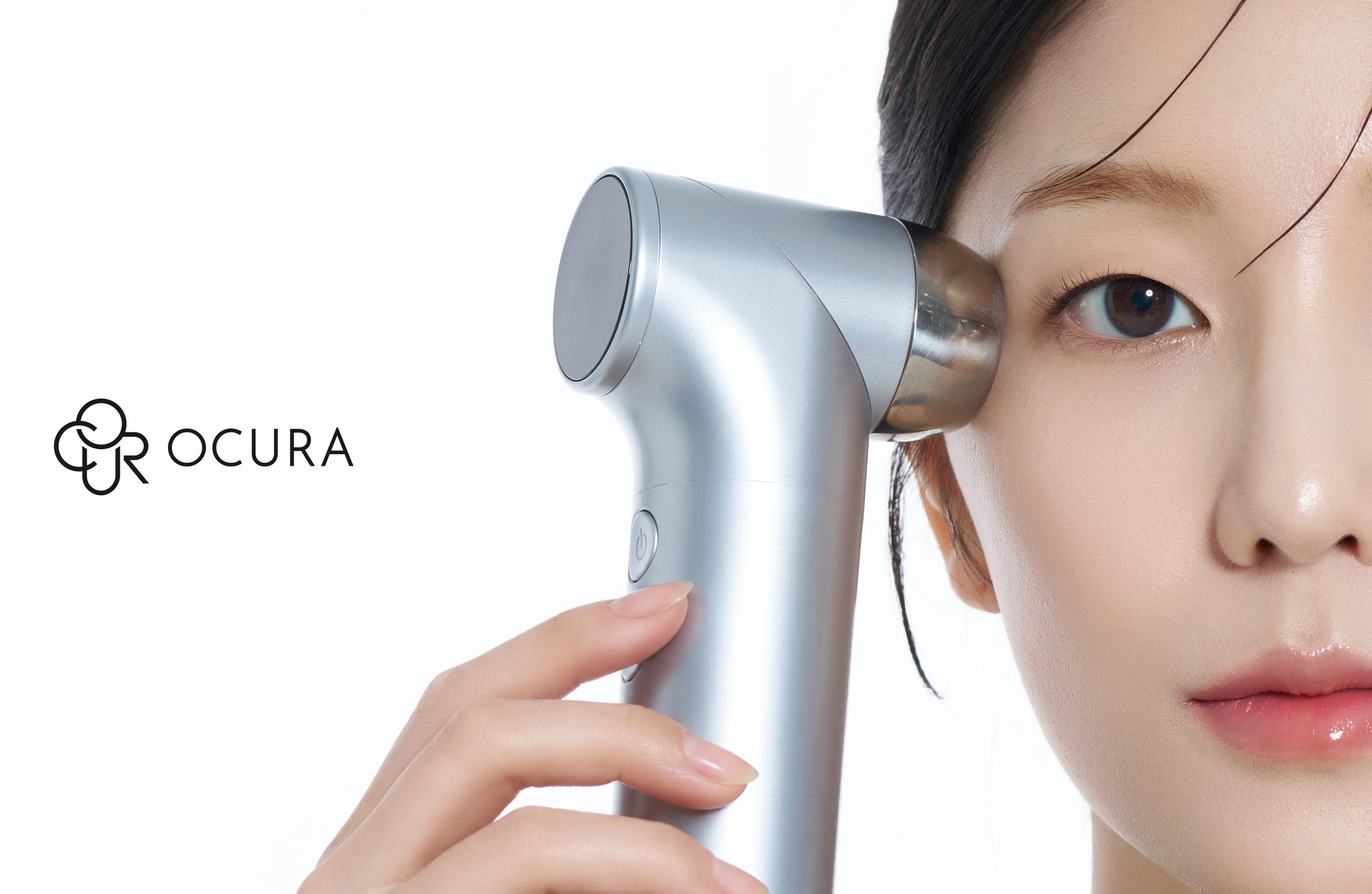
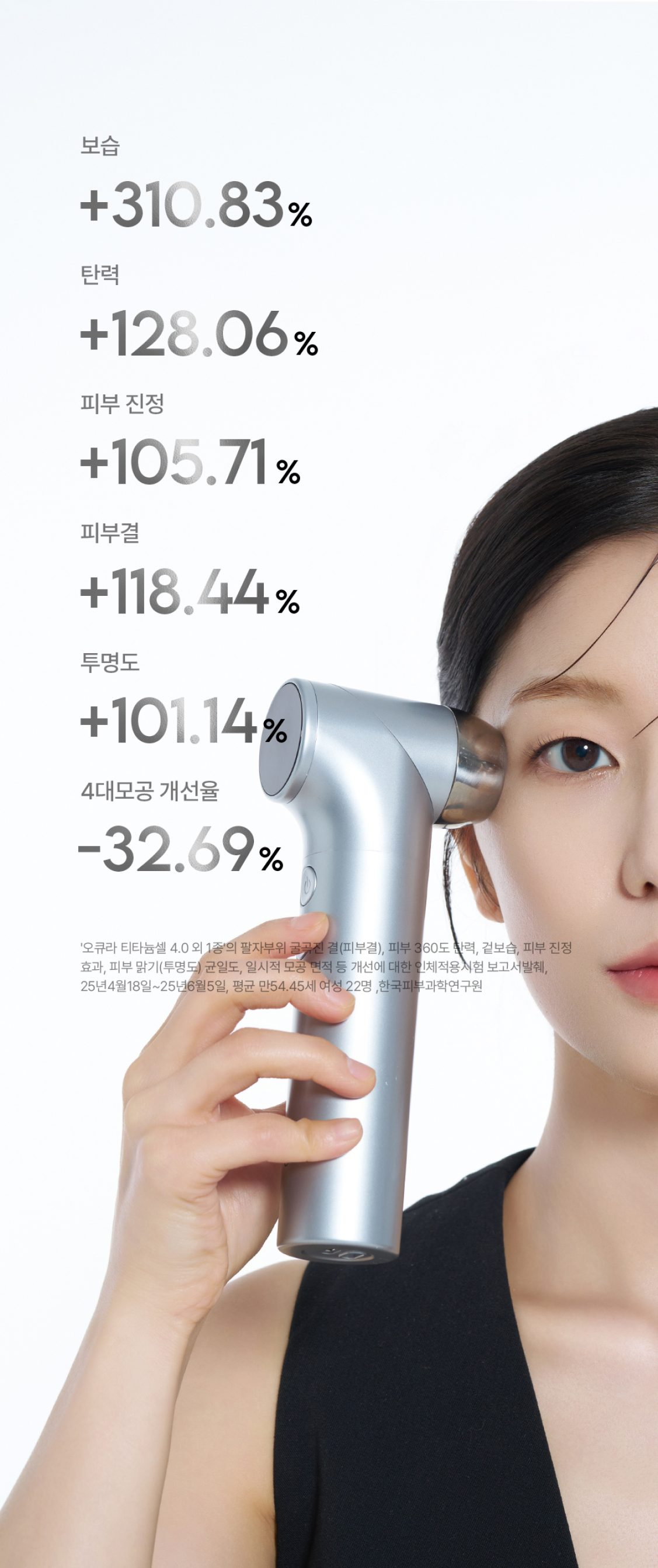
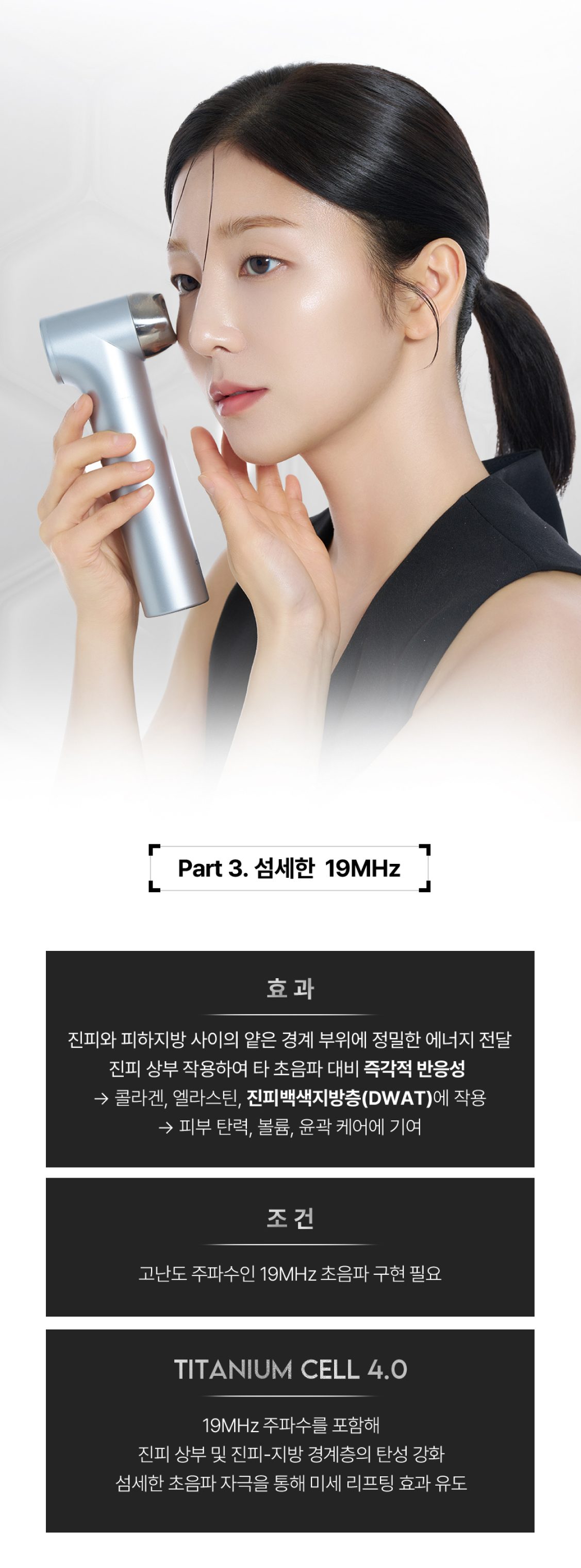
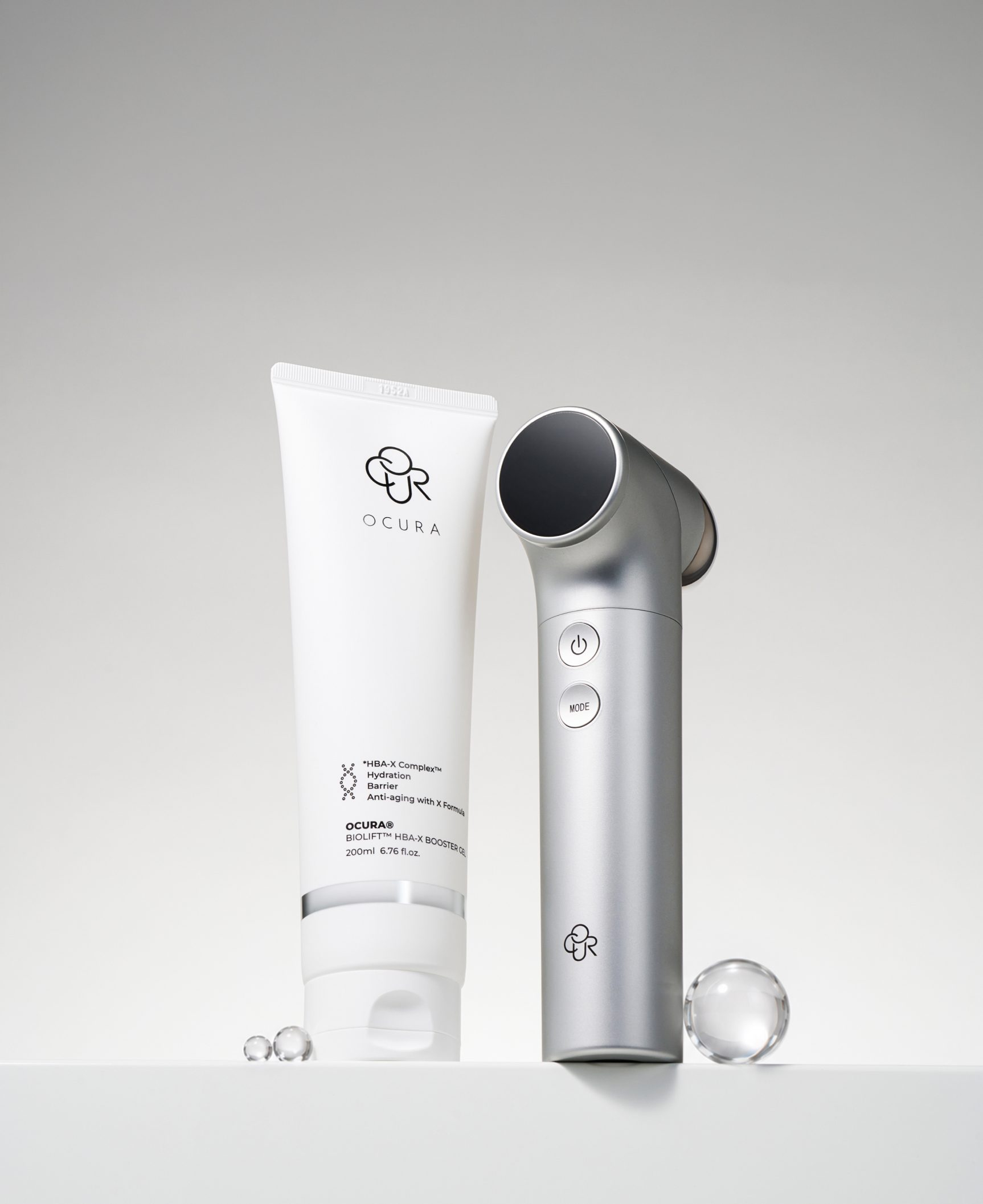
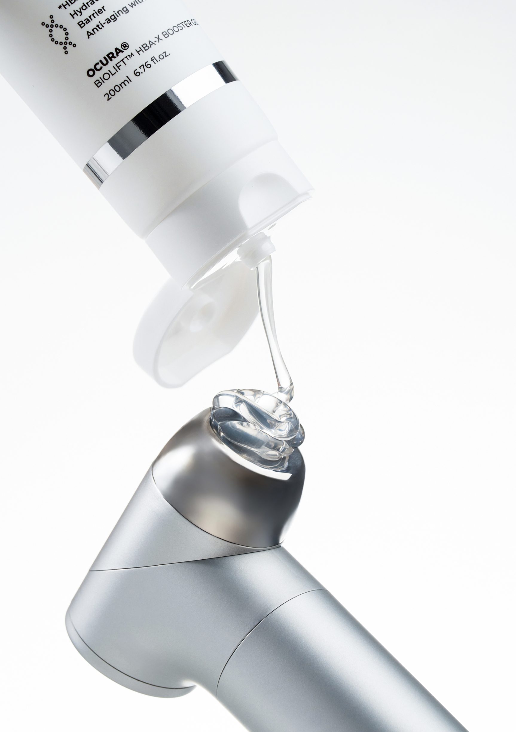
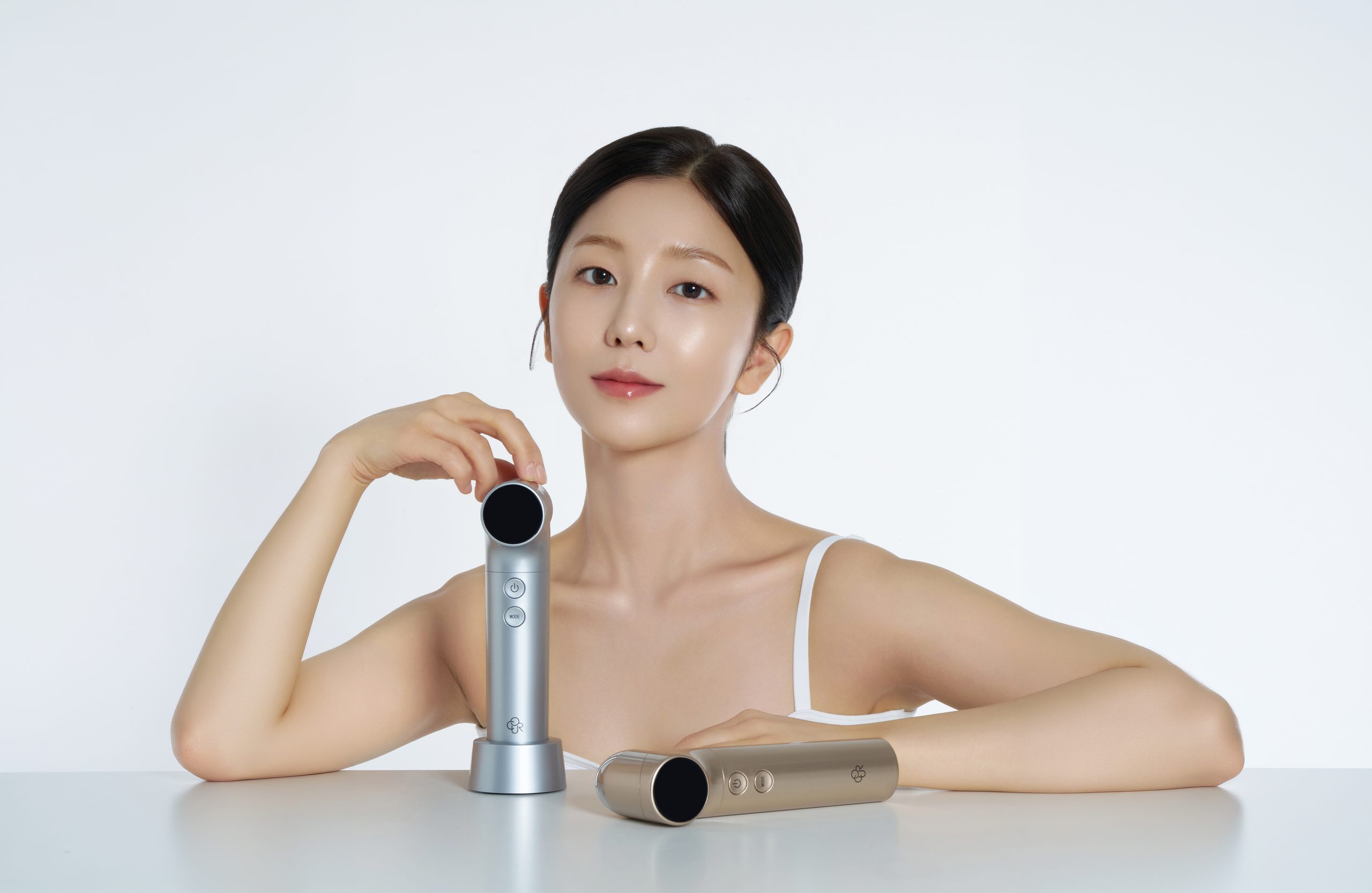
OCURA is a home beauty-tech brand that brings skin-care technology used by professional clinics into everyday life. Its products are developed on scientific research and clinical data, and the brand prefers to communicate performance through objective figures and evidence rather than abstract claims. To help consumers grasp OCURA's technical expertise and credibility more intuitively, we built every key brand touchpoint as one system: photography, film, 3D visuals, detail pages and the official website. The work conveys the product's technical features clearly while strengthening its image as a premium beauty device, and Titanium Cell 4.0 went on to complete a successful Wadiz crowdfunding campaign, confirming its competitiveness in the market.
Key Visual
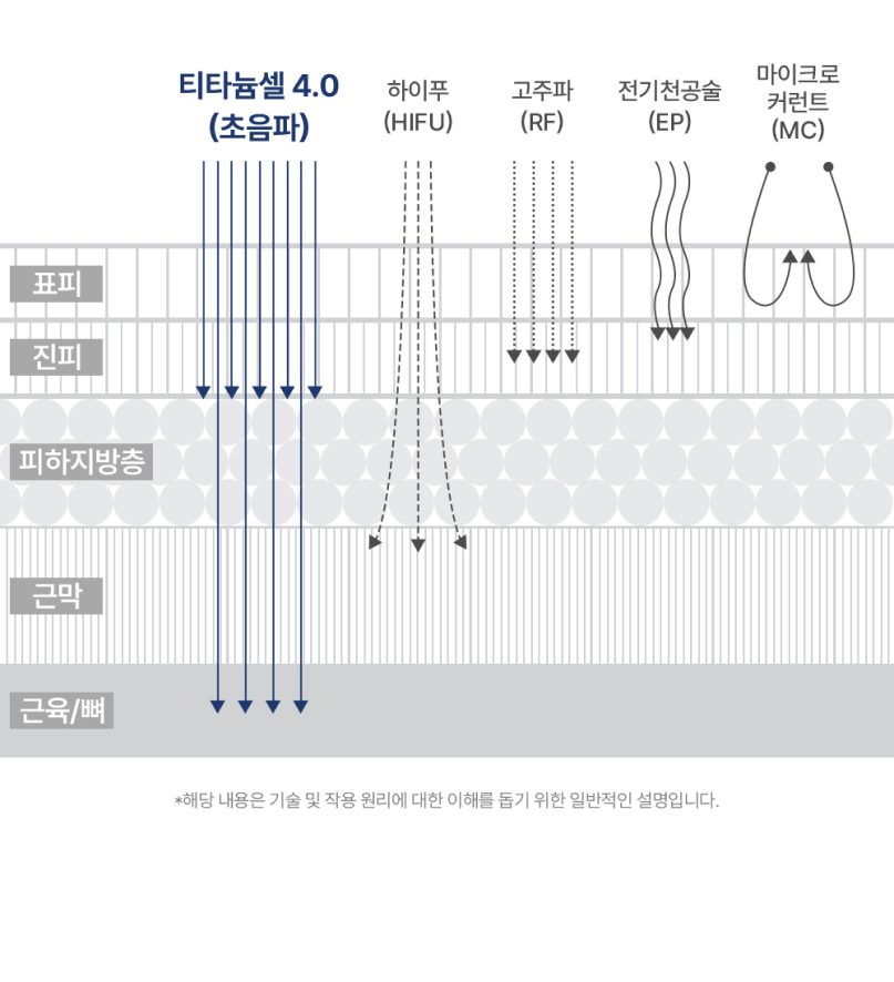
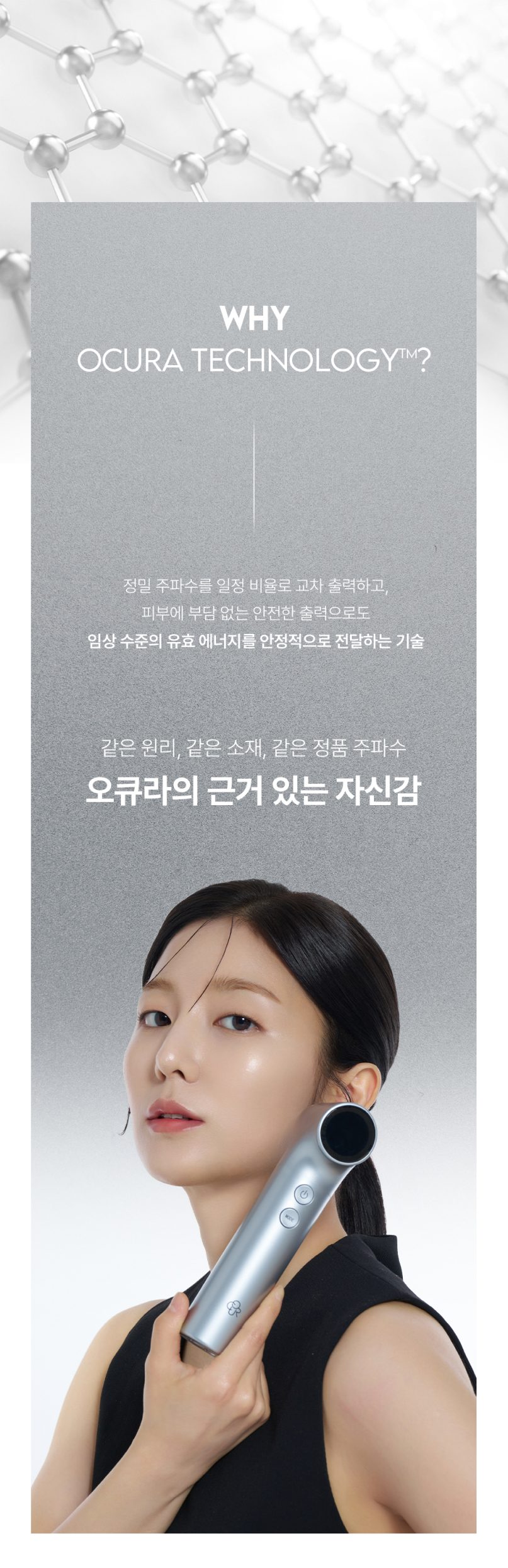
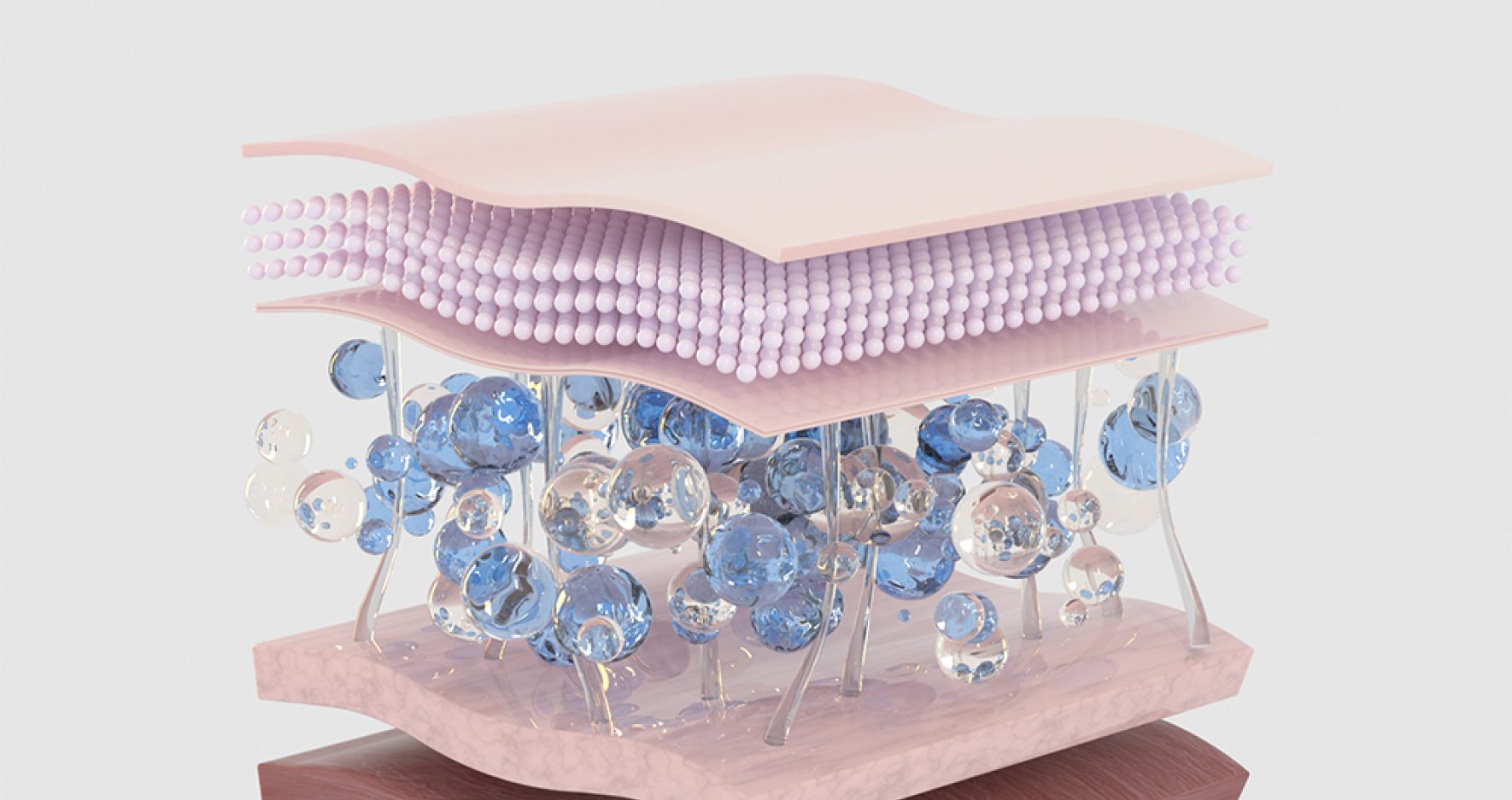
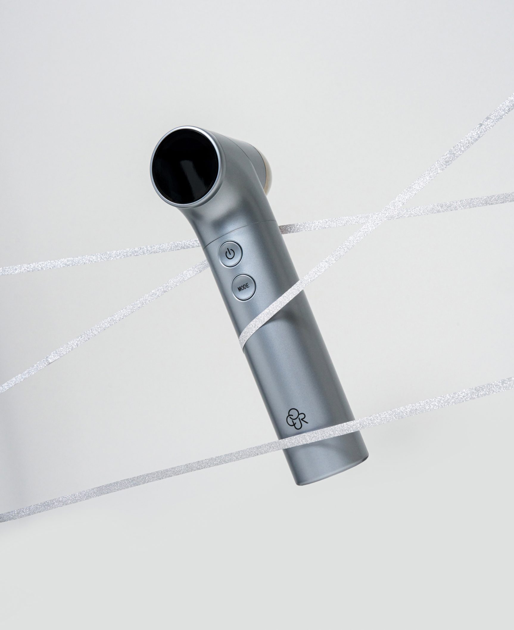
We connected the metallic character of titanium, scientific credibility and medical expertise into a single visual language. Grey-toned metallic graphics and restrained gloss create a precise, solid impression, while 3D graphics of skin cross-sections, tissue diagrams and ultrasound principles show the product's technical expertise at a glance. The aim was to communicate OCURA's technology and trustworthiness more clearly than an emotional beauty image could.
metallic and precise
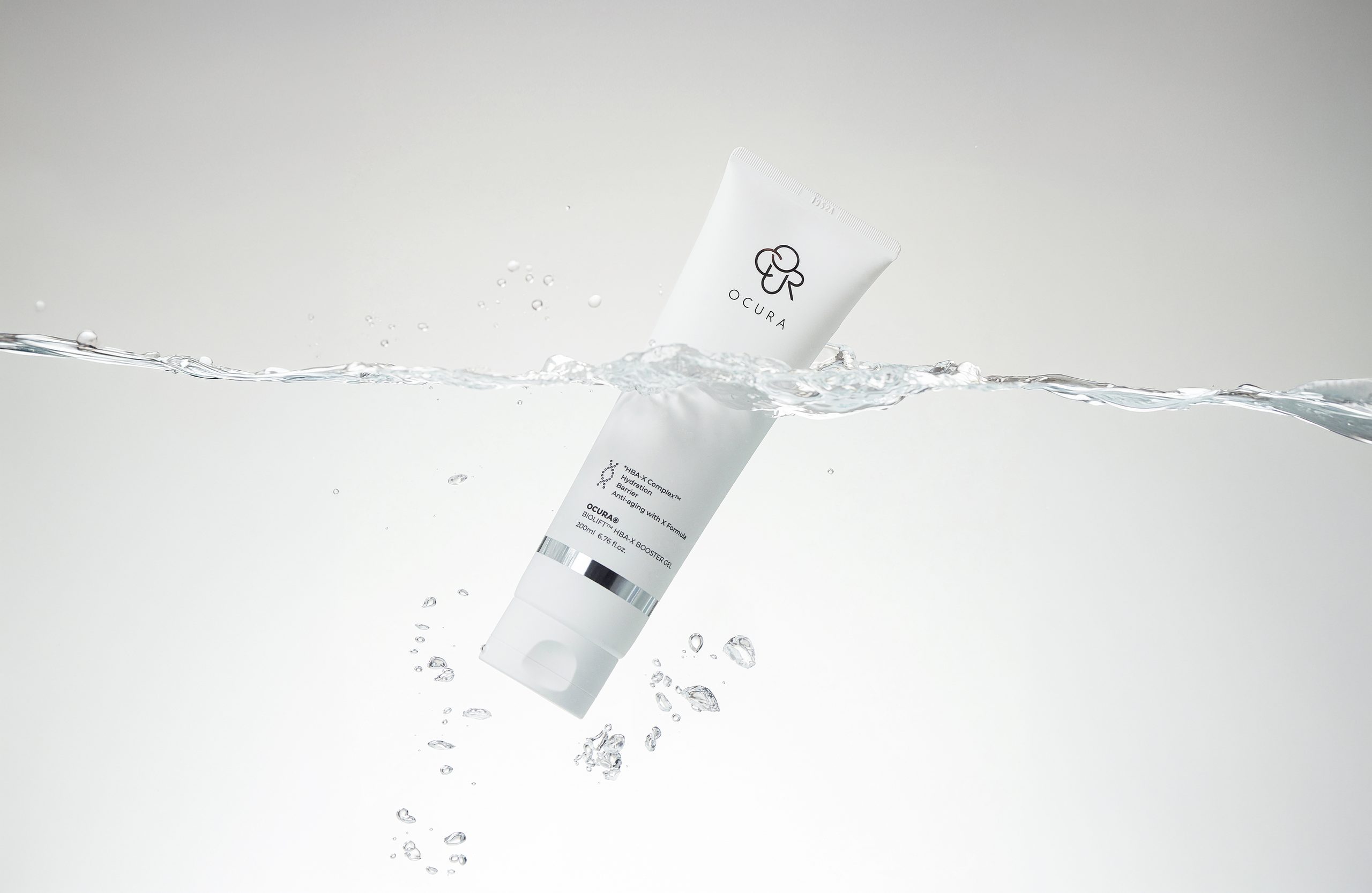
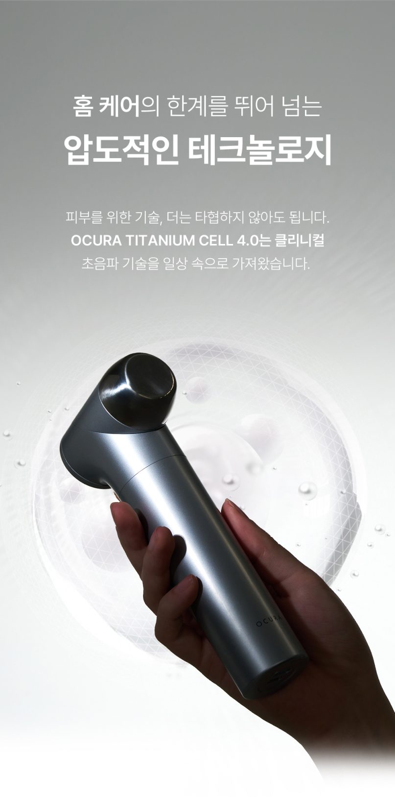
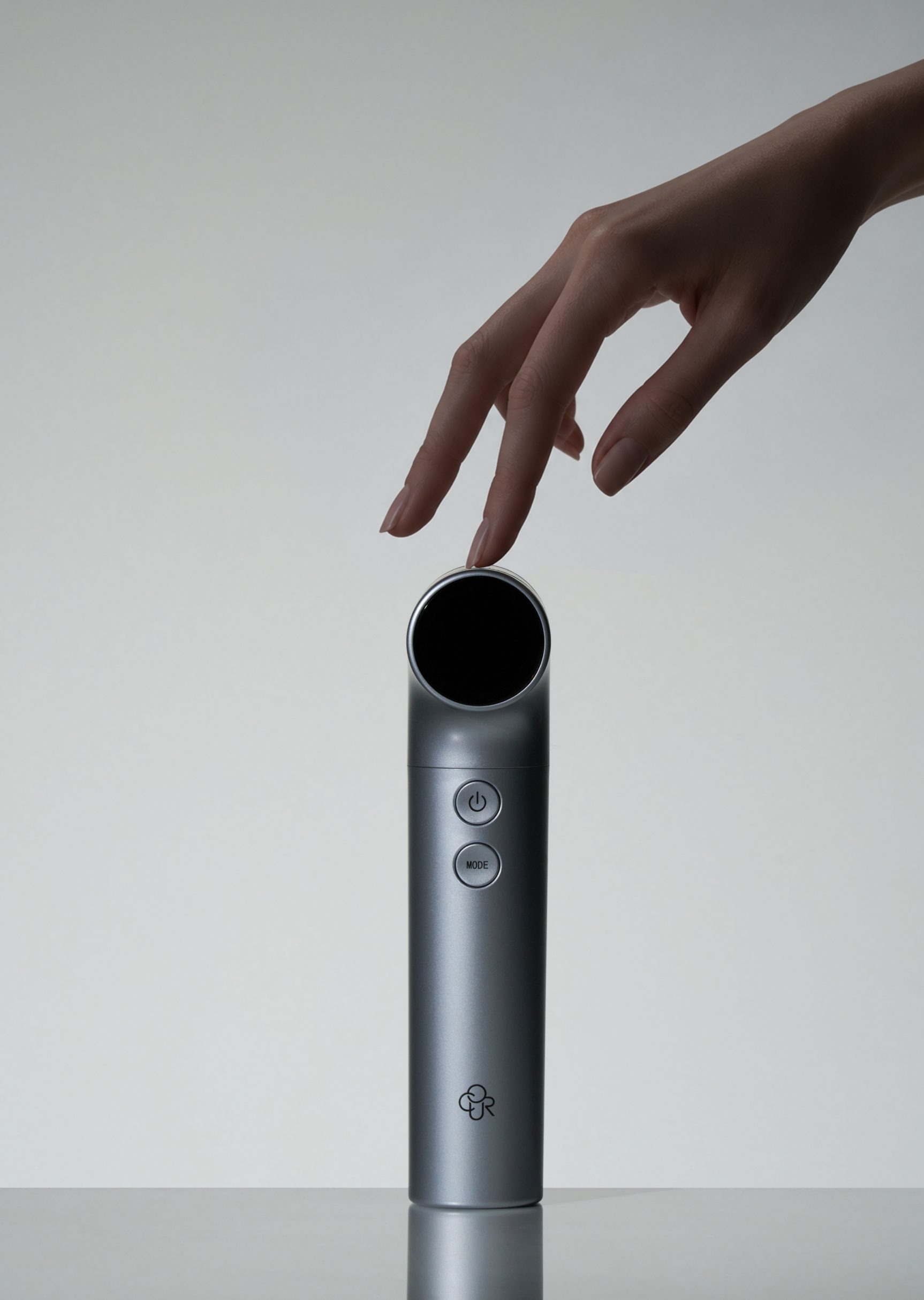
Building on the material qualities of the titanium head, we used grey metallic textures and subtle gradients. The cool, refined surfaces visually emphasize the device's precision engineering and professional character.
structured and clear
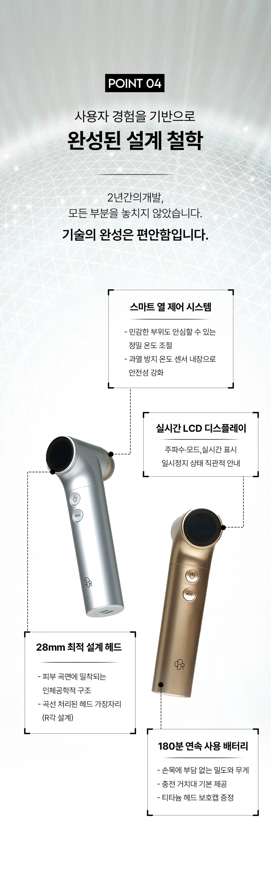
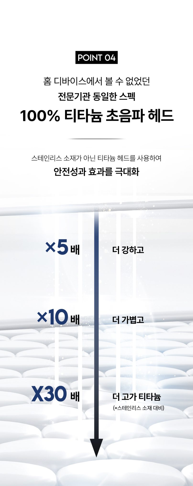
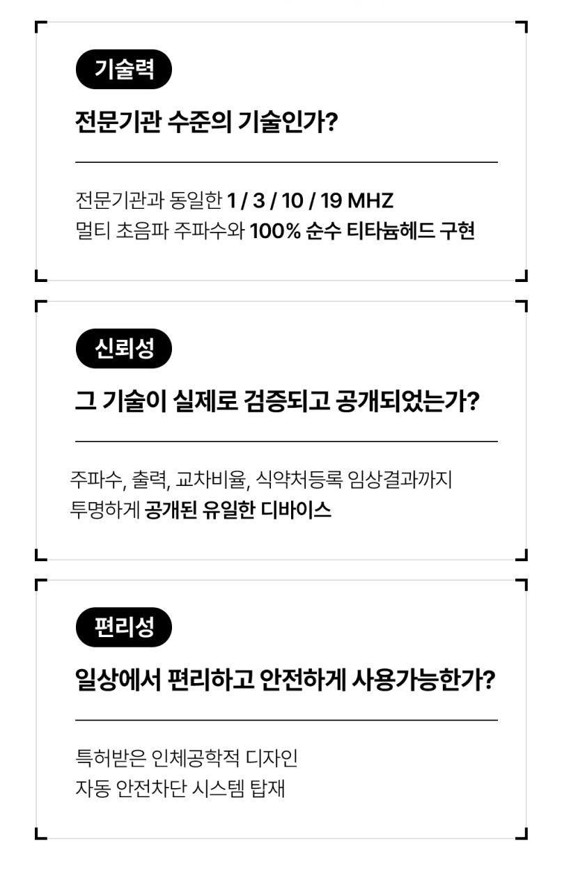
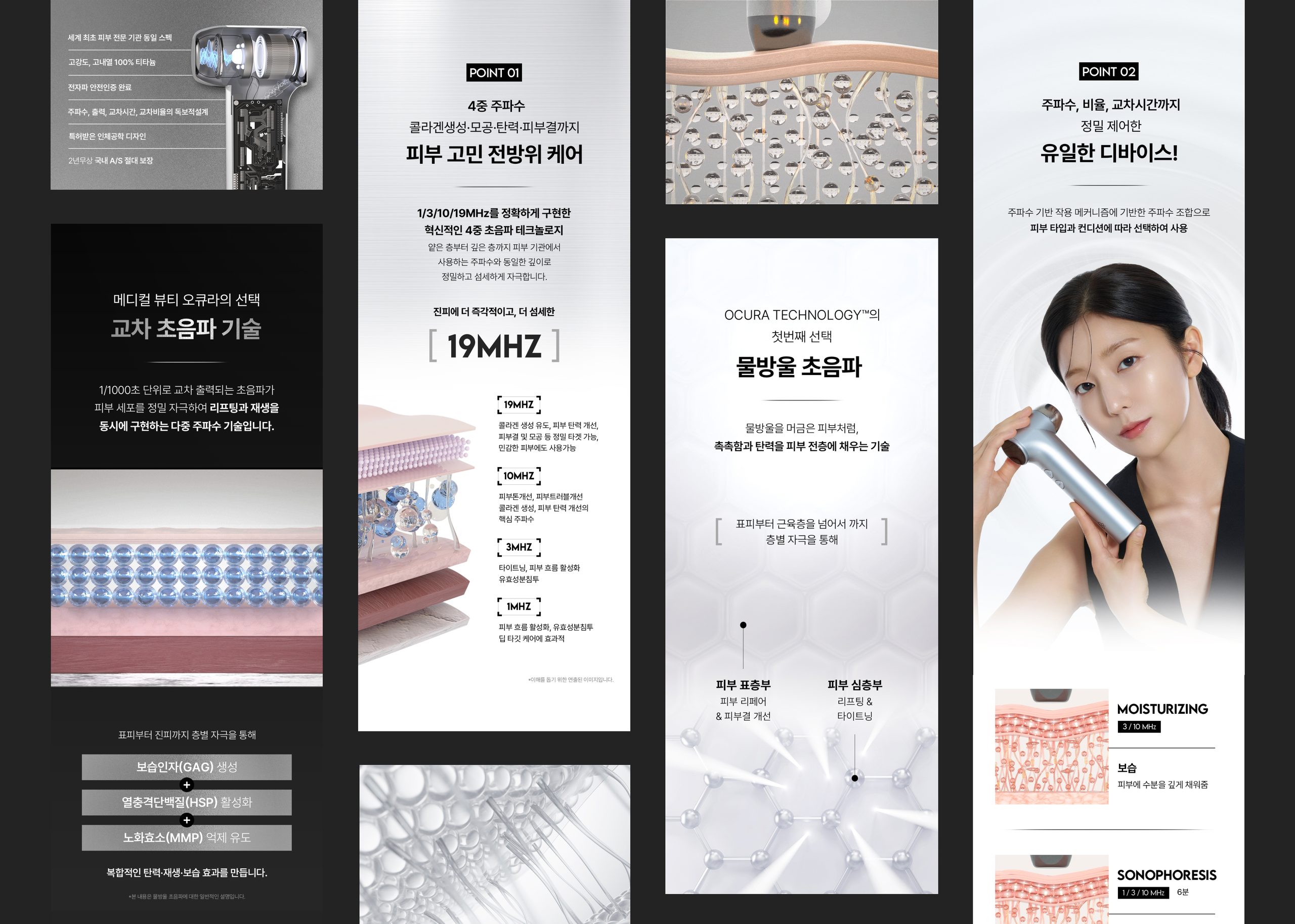
With so much information to handle — frequencies, clinical results, technical principles — a clear hierarchy and flow were essential. We separated headlines, key figures and explanations by priority so that even complex technical content can be understood quickly.
linear and focused
Linear graphic elements serve as visual devices for dividing and emphasizing information. They draw the eye naturally to key messages and figures, and give every screen a technical, orderly rhythm.
Visual Design Principle
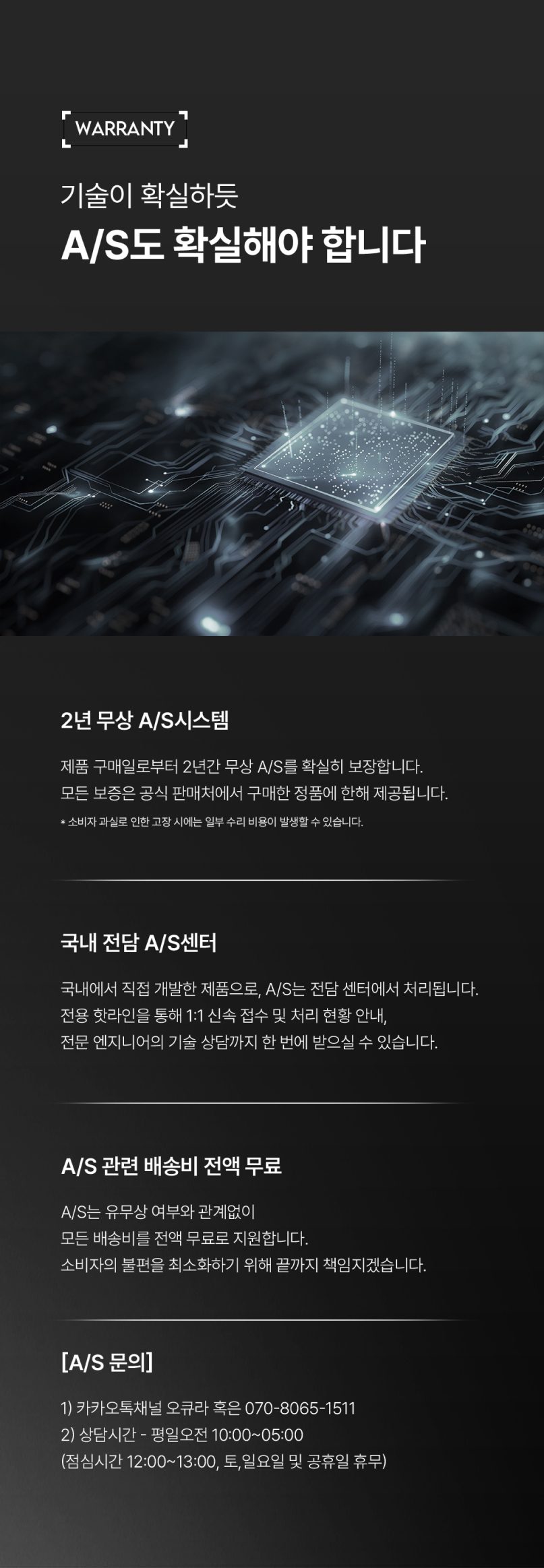
OCURA's visuals focus on clearly communicating the product's technical expertise and reliability. We applied the metallic textures, gradients and linear graphics associated with titanium consistently, and developed the visual system on a clear information hierarchy so that a wide range of technical information is delivered effectively.
3D Graphics
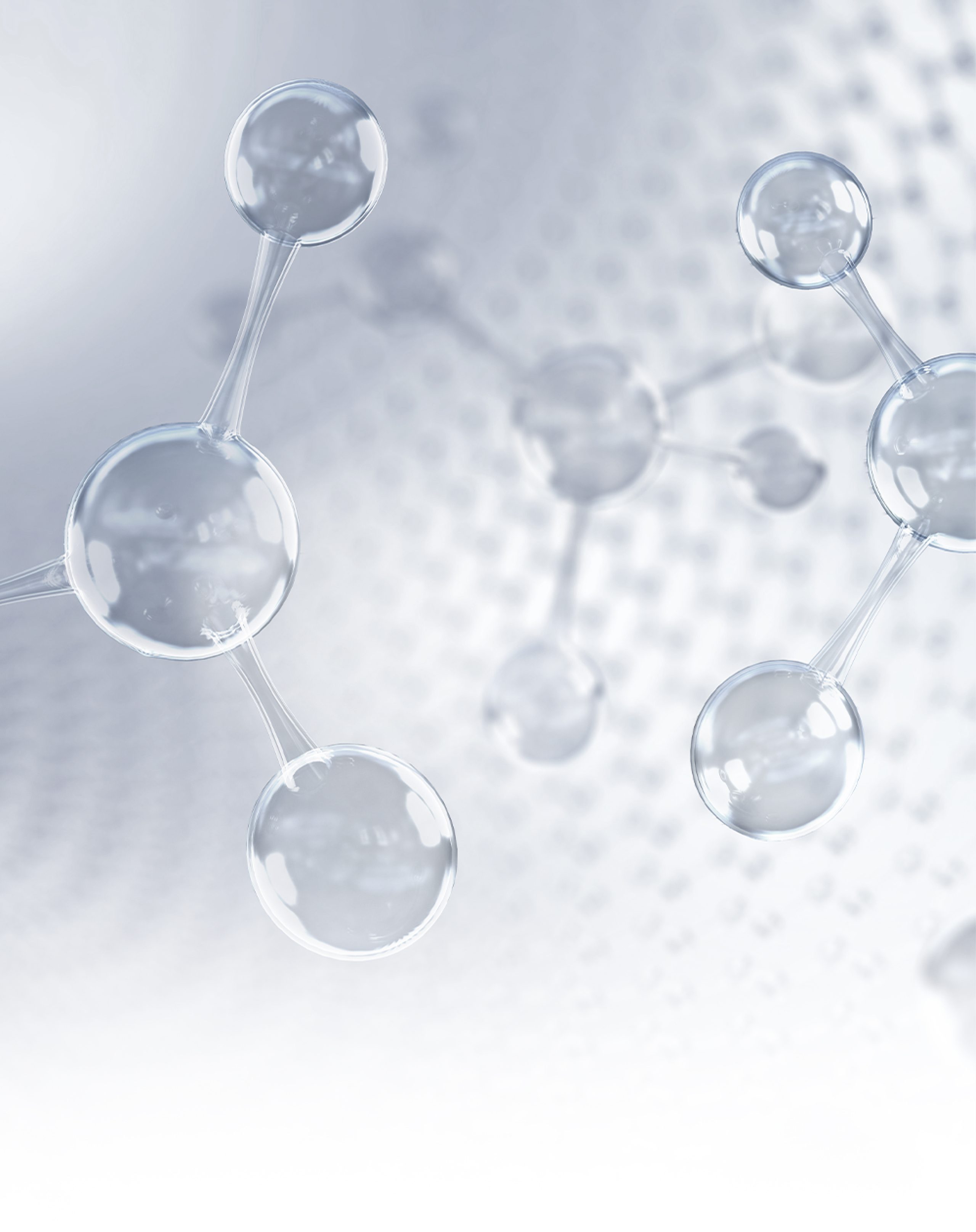
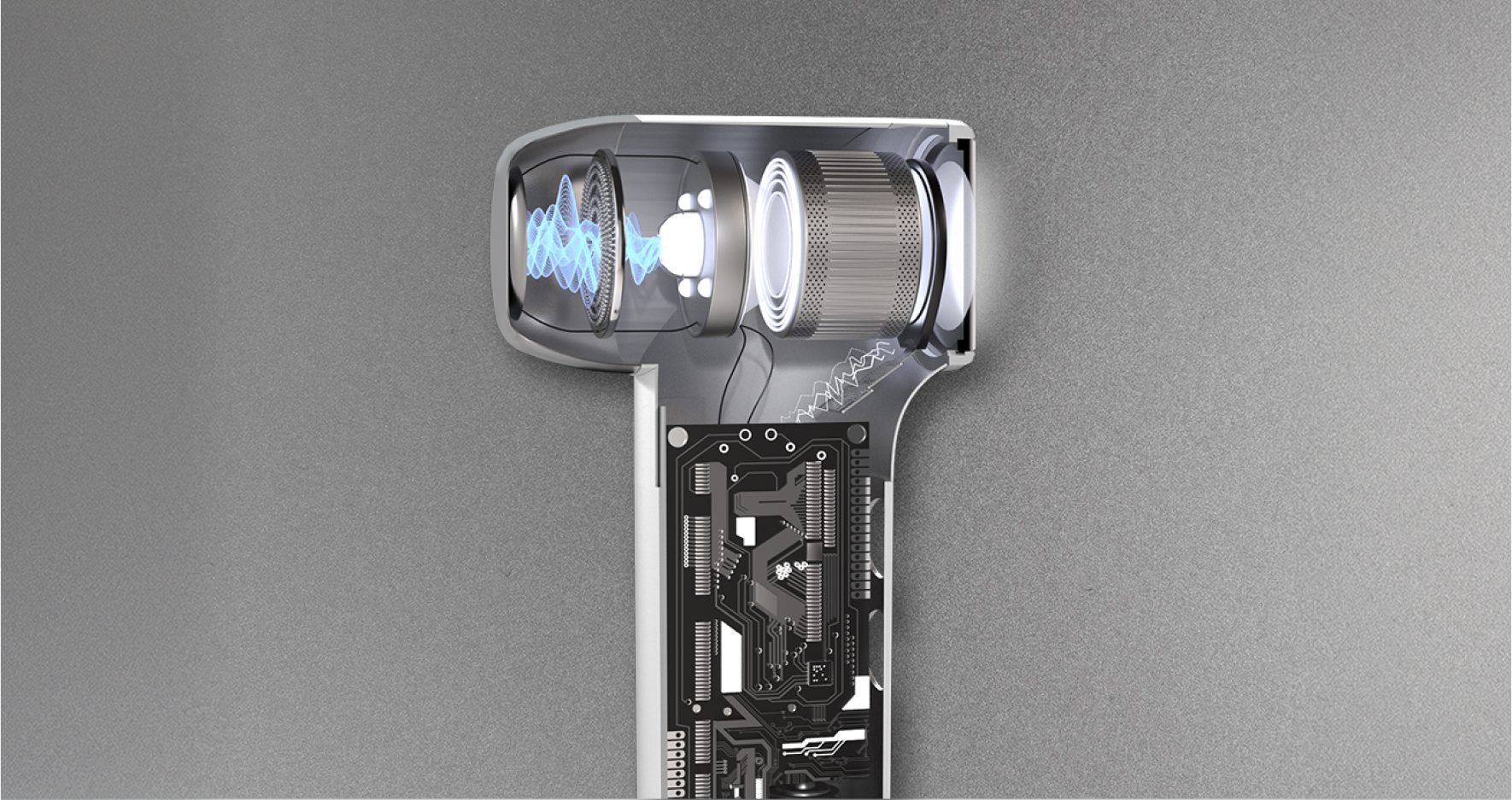
We produced 3D visuals to help consumers easily understand how the beauty device is built and how it works. From cross-sections of the device's internal structure to graphics visualizing changes in skin tissue during use, we made invisible technical principles and processes intuitive — turning complex technical information into accessible visual content and reinforcing the product's functional and technical credibility.