JELLSIS
Photography,
Detail page Design, Web Design
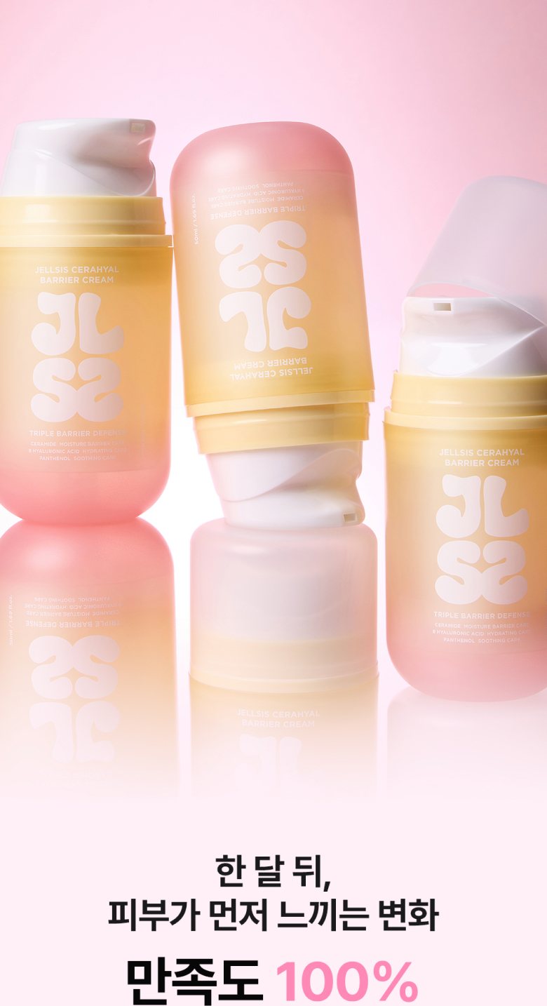
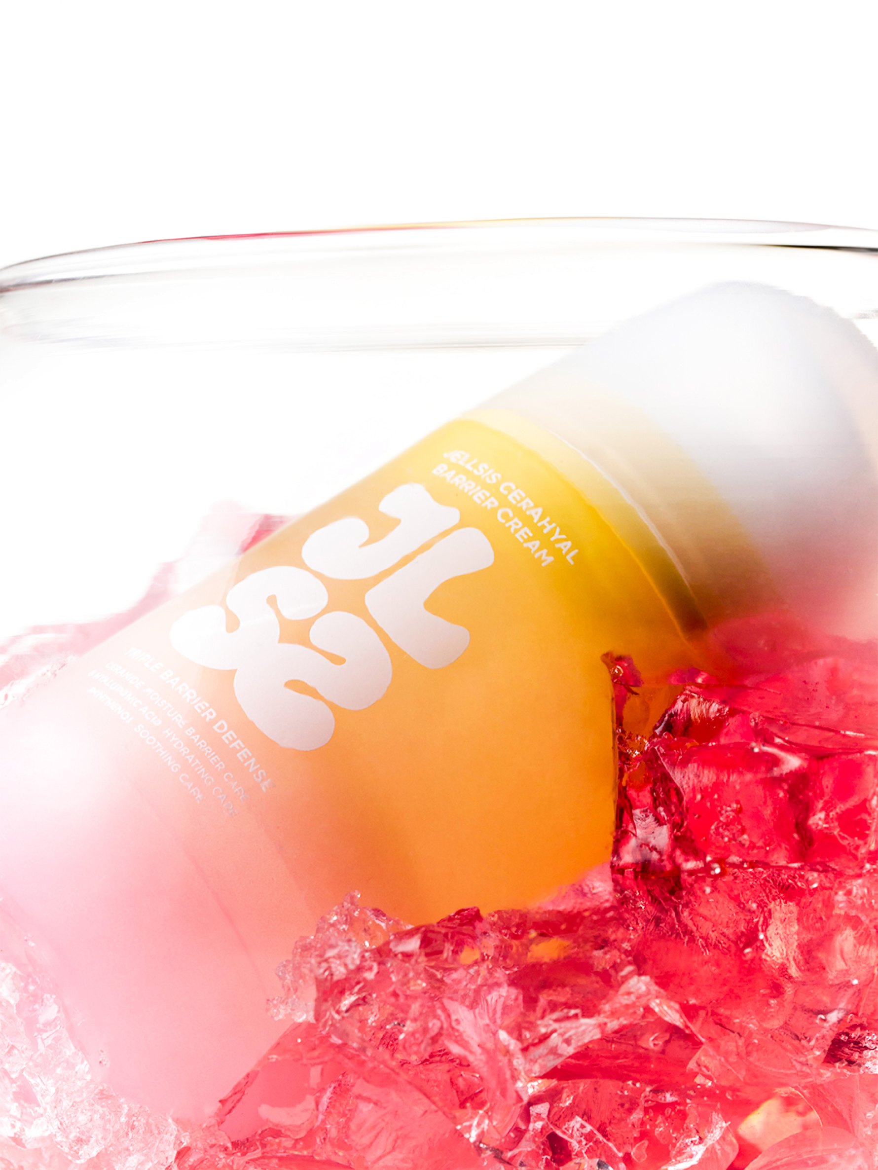
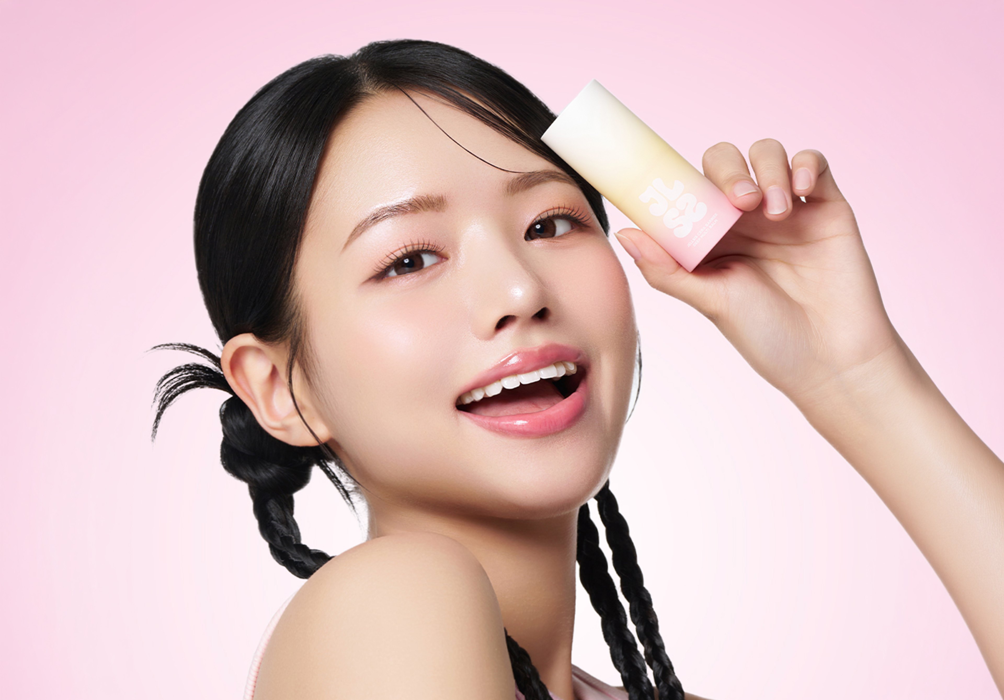
JELLSIS is a playful lifestyle brand that has offered new sensory experiences in everyday life through colorful textures and the joy of touch. The tactile experience JELLSIS built around slime has expanded into skincare, centered on the unique form and properties of ‘jelly.’ So that the identity carried over from its original category could be experienced naturally in beauty as well, we set the bouncy shape, translucent texture and supple movement of jelly as the main visual motifs. Going beyond simply communicating product function, we expanded the visual experience so that JELLSIS's distinctive sensibility connects into a full brand experience.
Visual Strategy
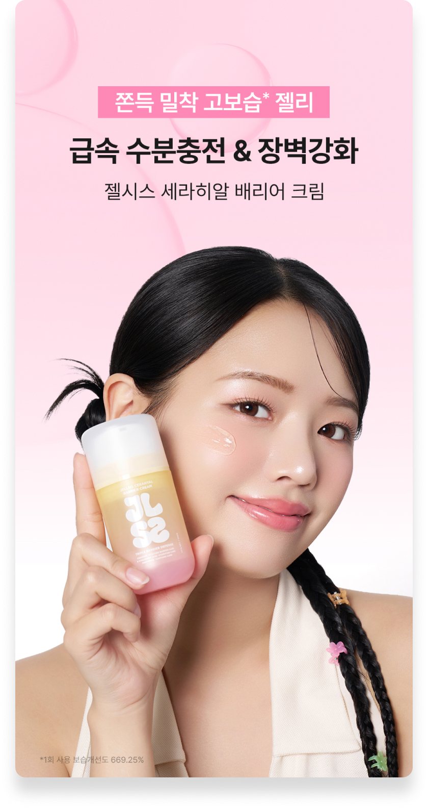
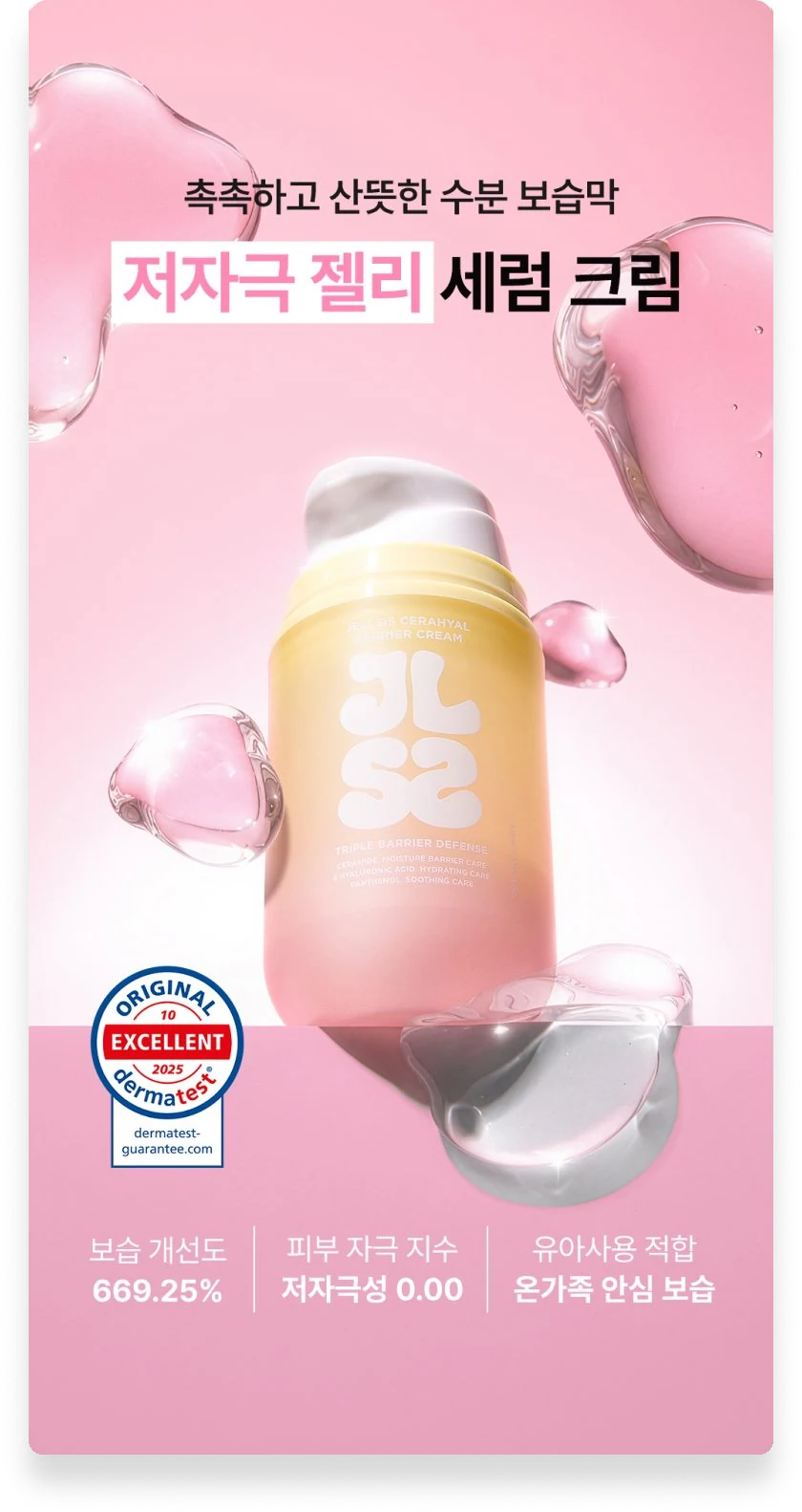
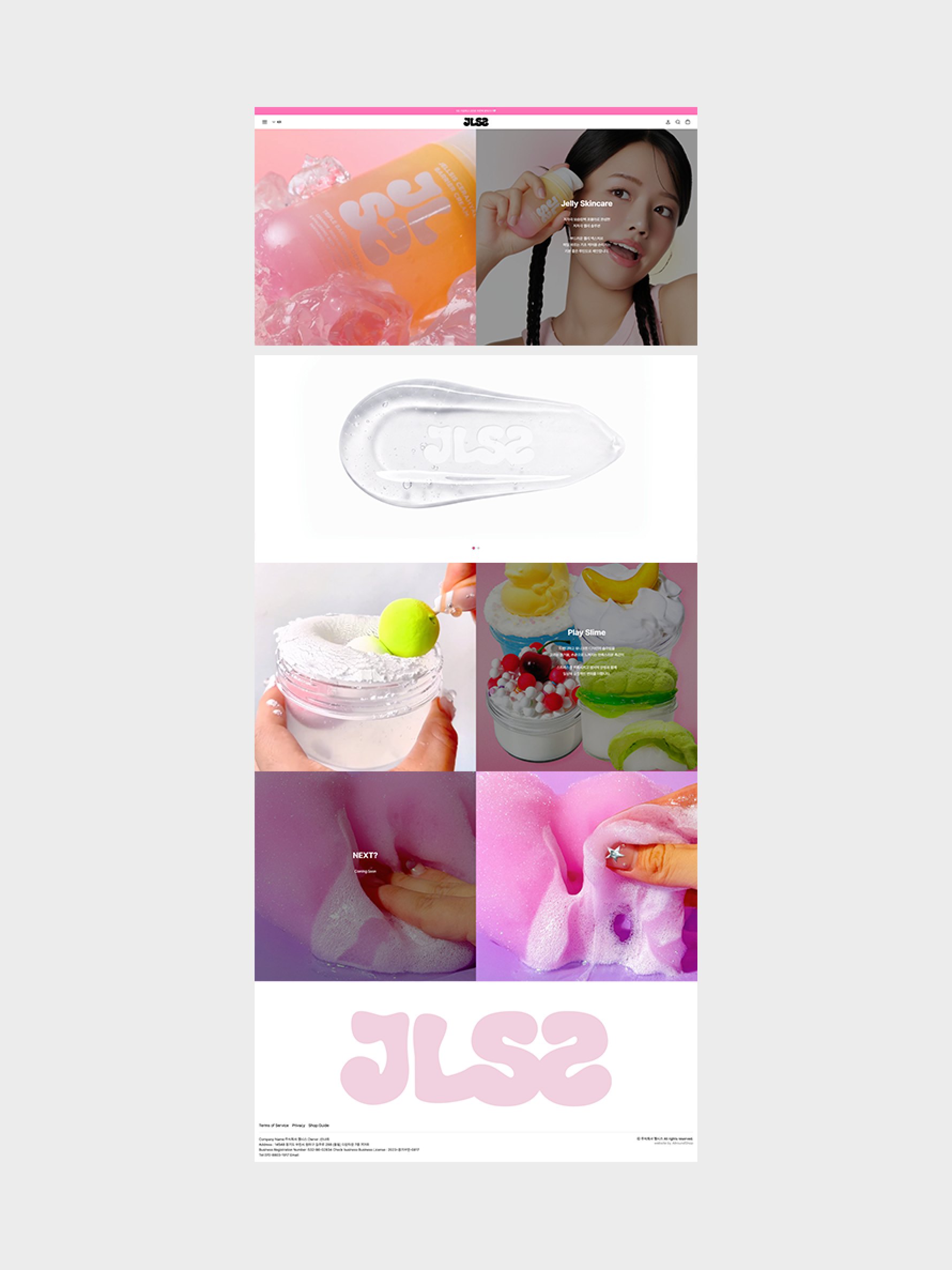
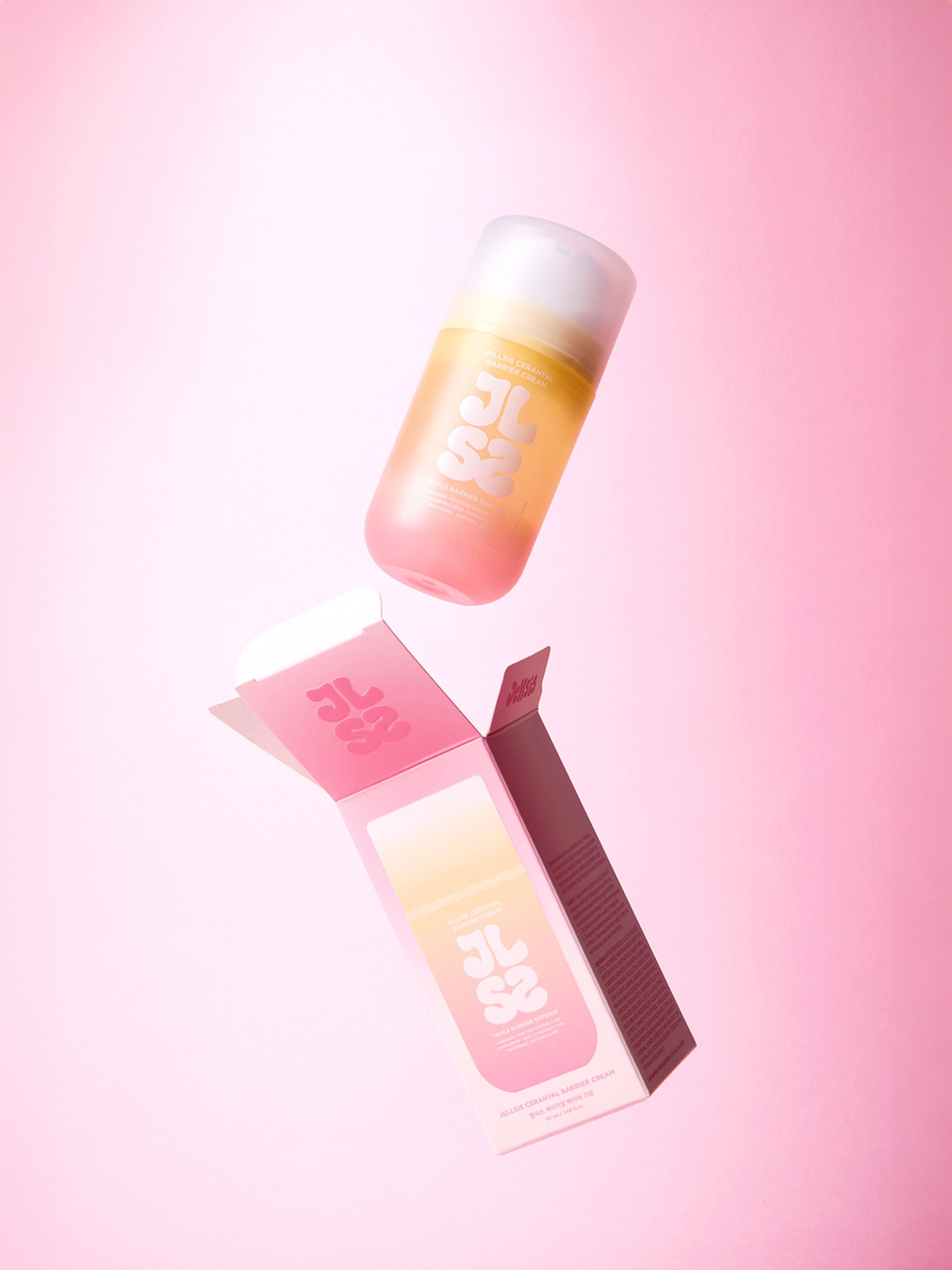
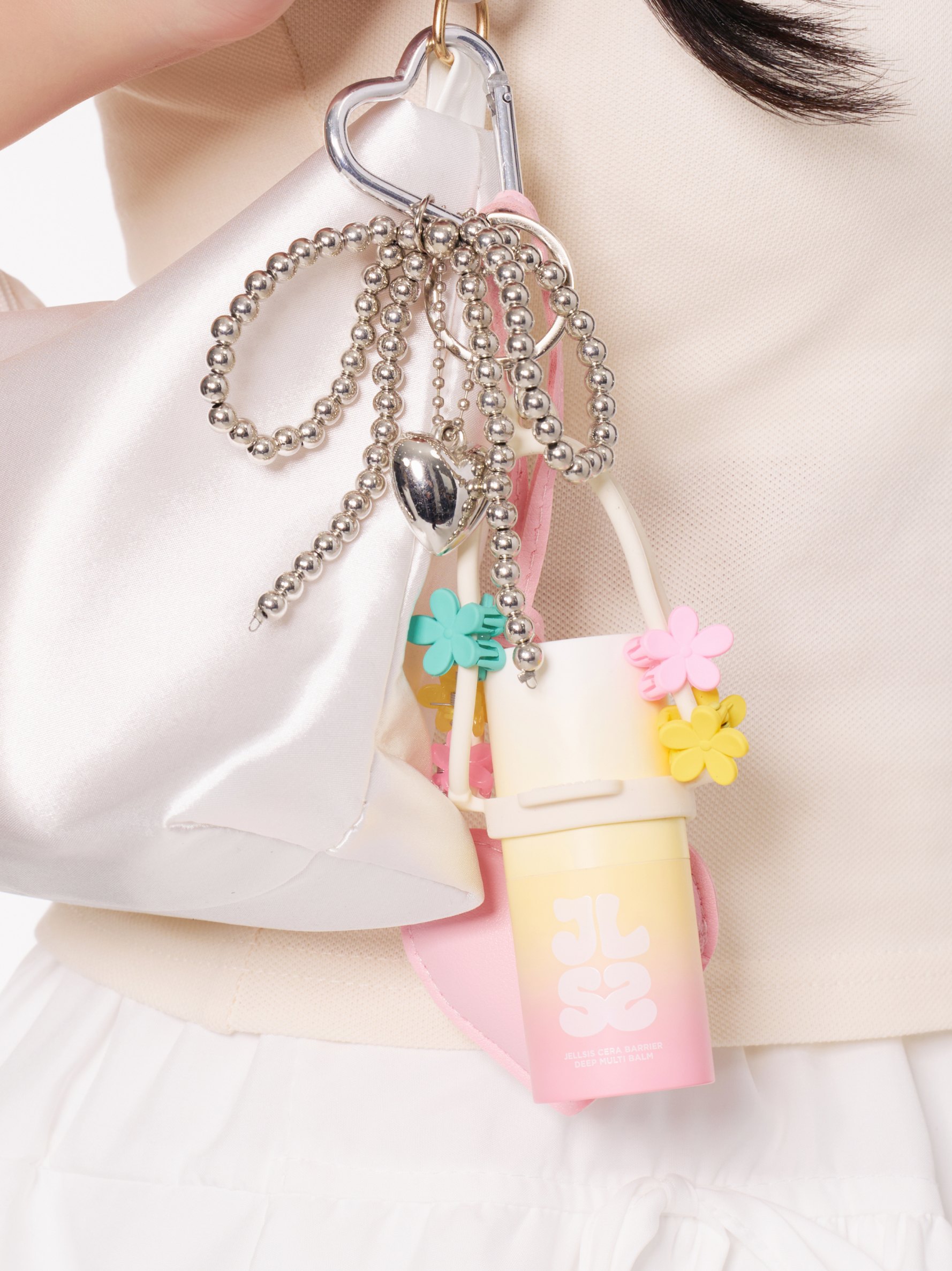
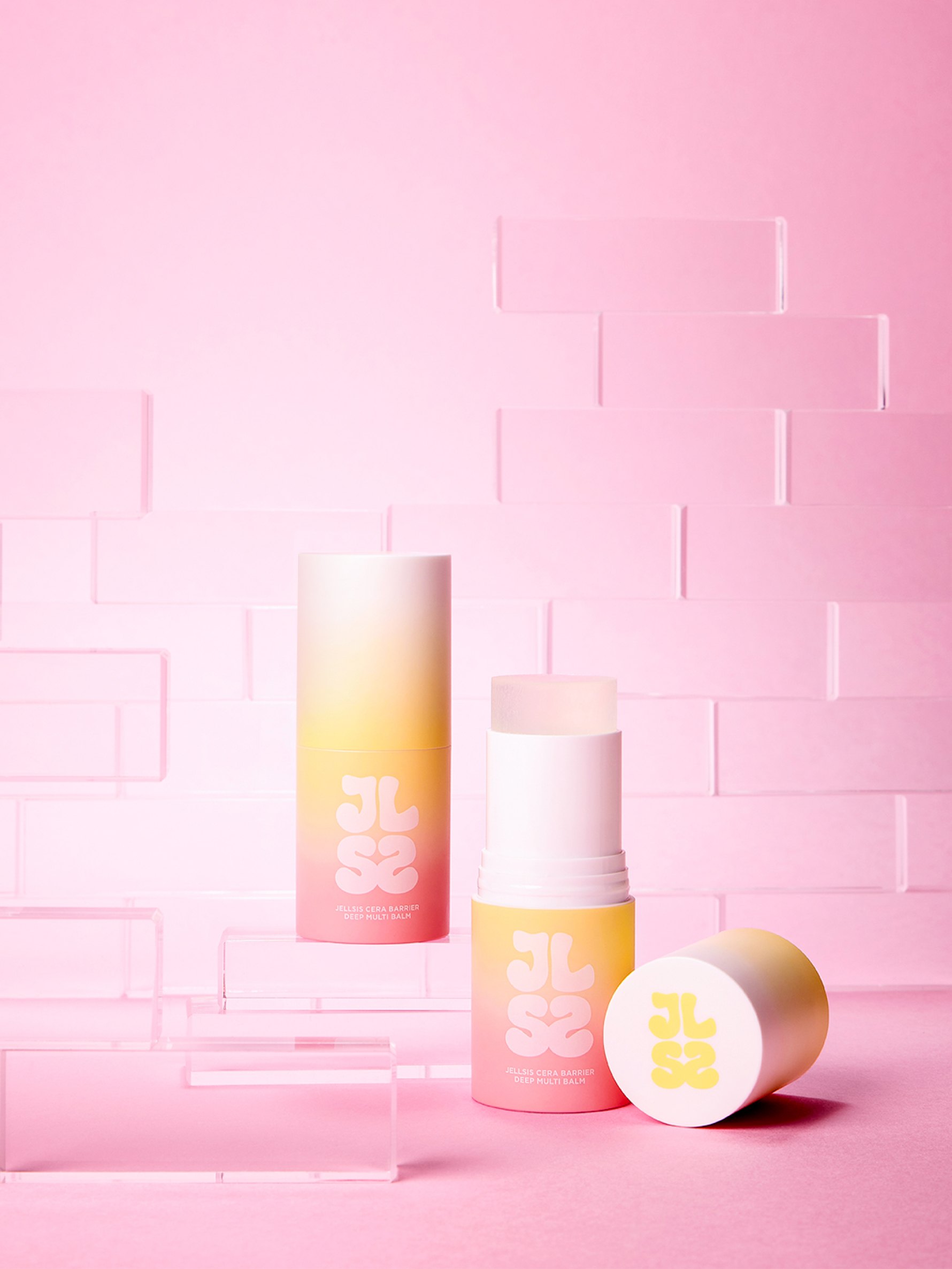
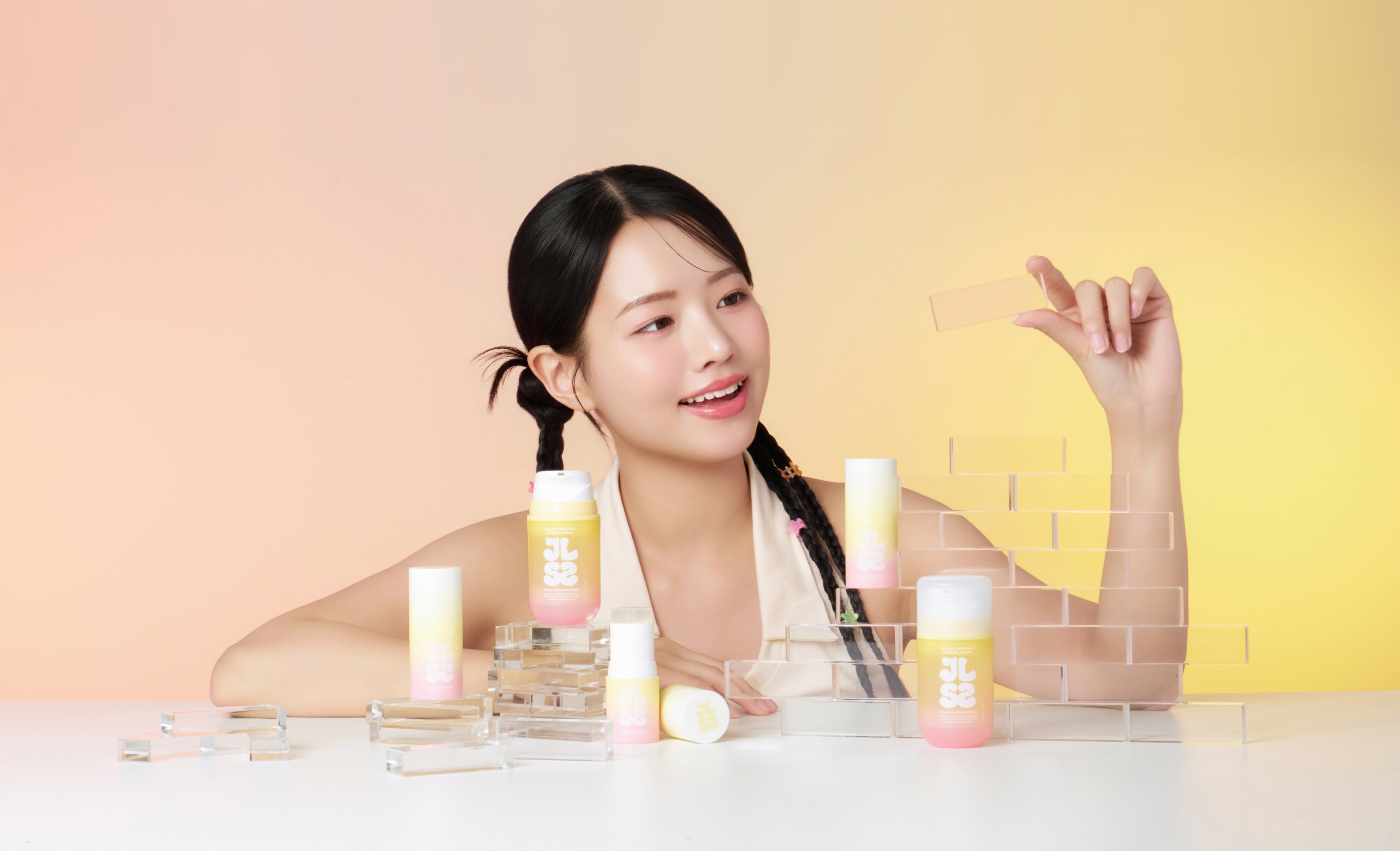
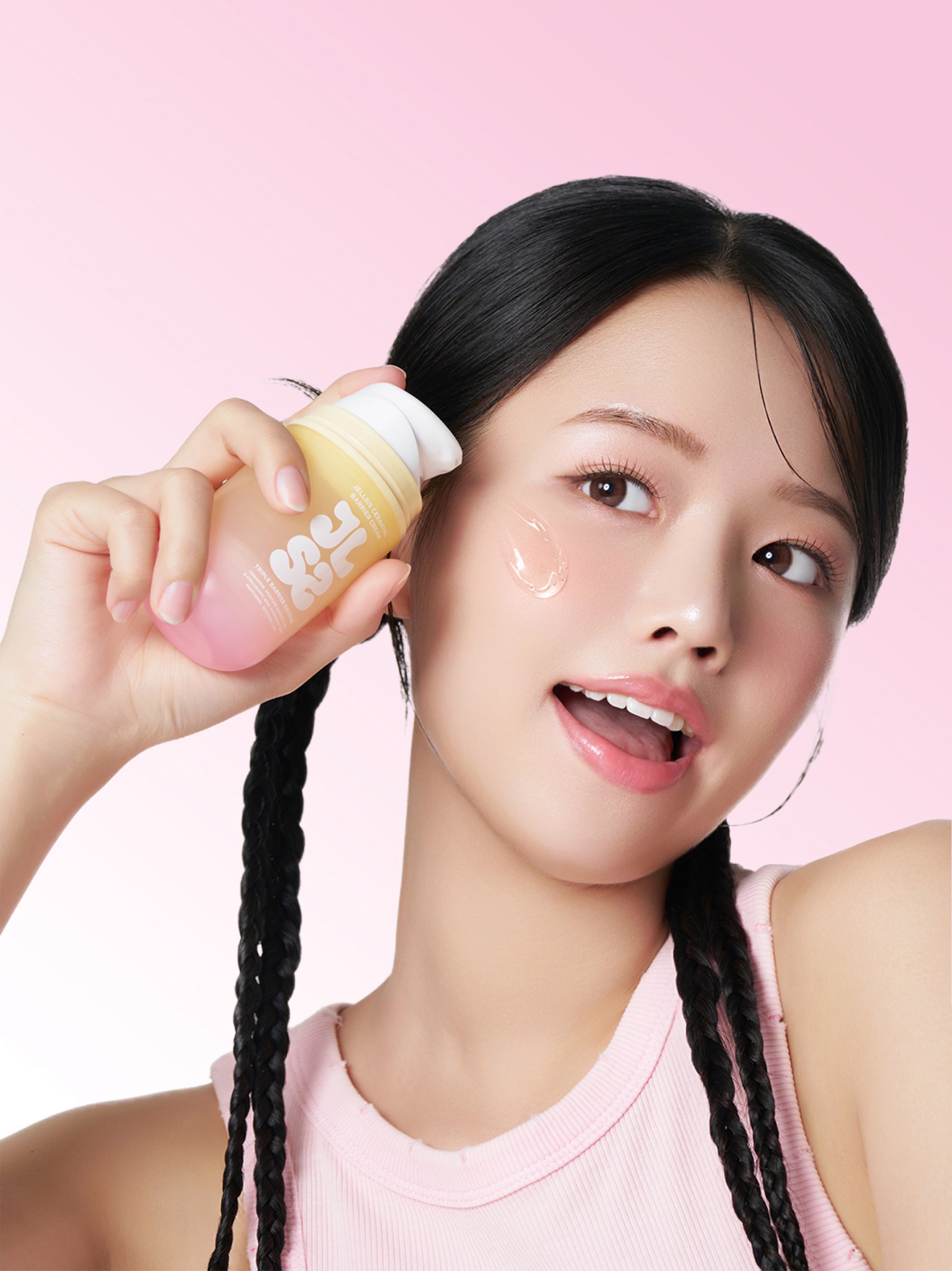
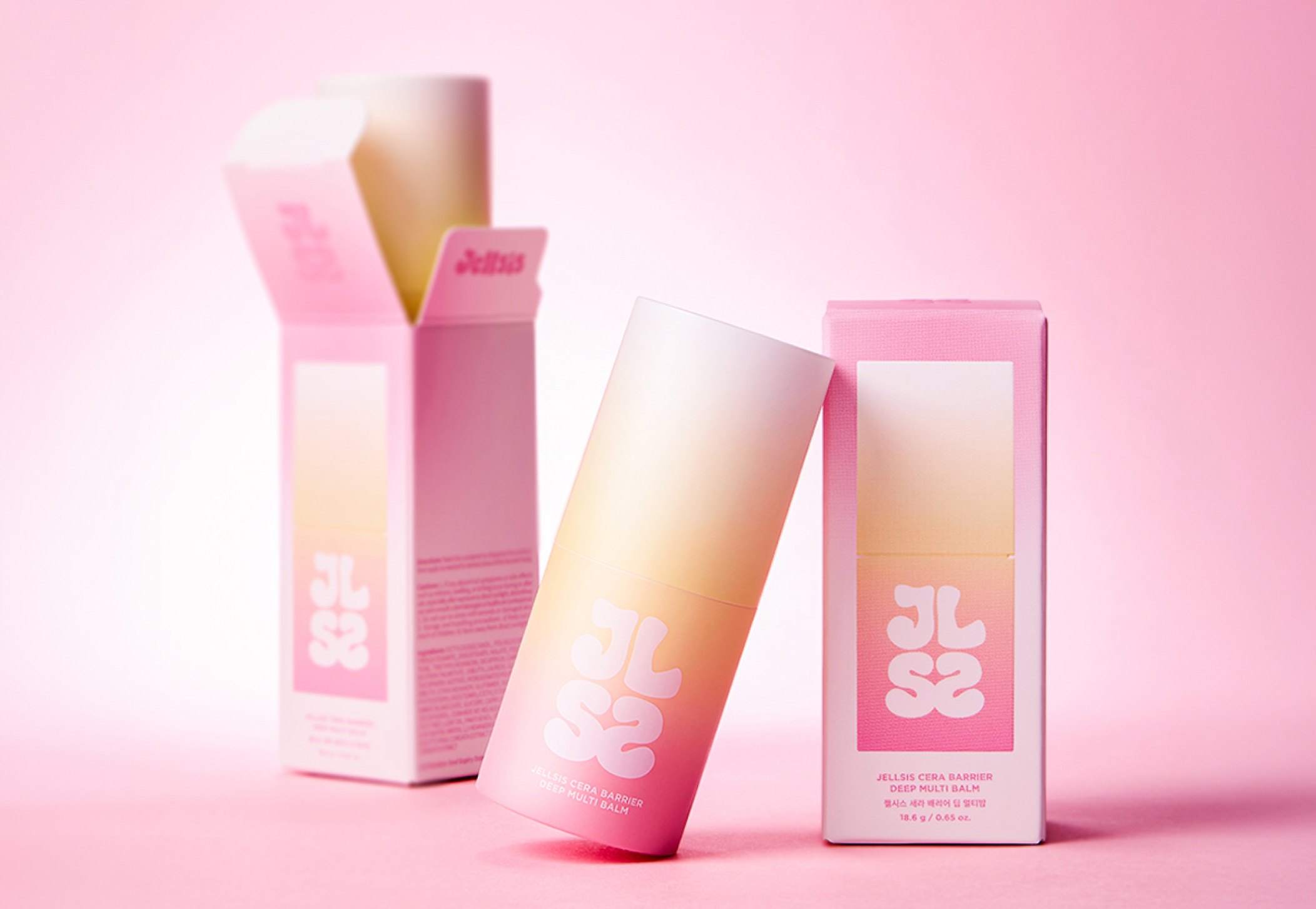
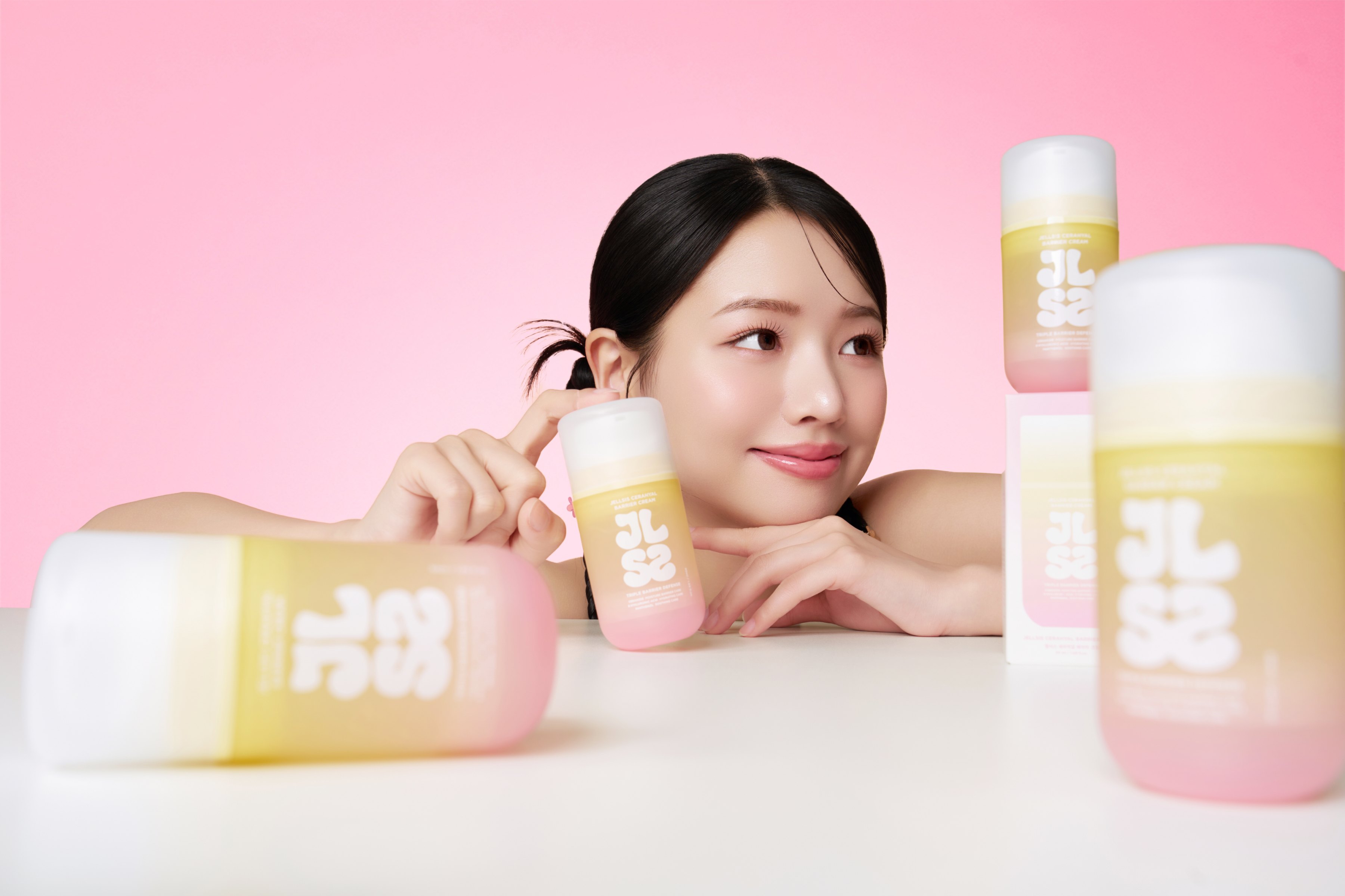
We designed a visual direction that keeps the girlish, sensory mood JELLSIS had already built, while clearly communicating the function and benefits of its products as a skincare brand. The bouncy shape, translucent texture and supple movement of jelly became the core visual elements tying the brand together, expressed so that each product's function and texture come through naturally. By keeping the same visual language across every touchpoint — photography, brand film, detail pages and the website — we strengthened JELLSIS's personality and developed a brand image that goes beyond merely fun visuals, leading to understanding of and trust in the products.
Detail page
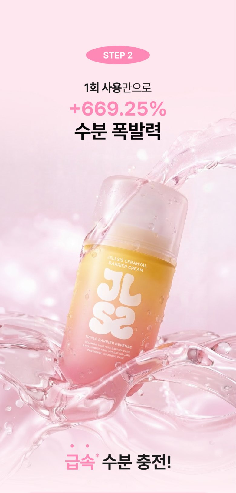
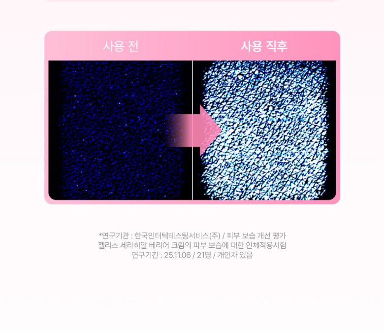
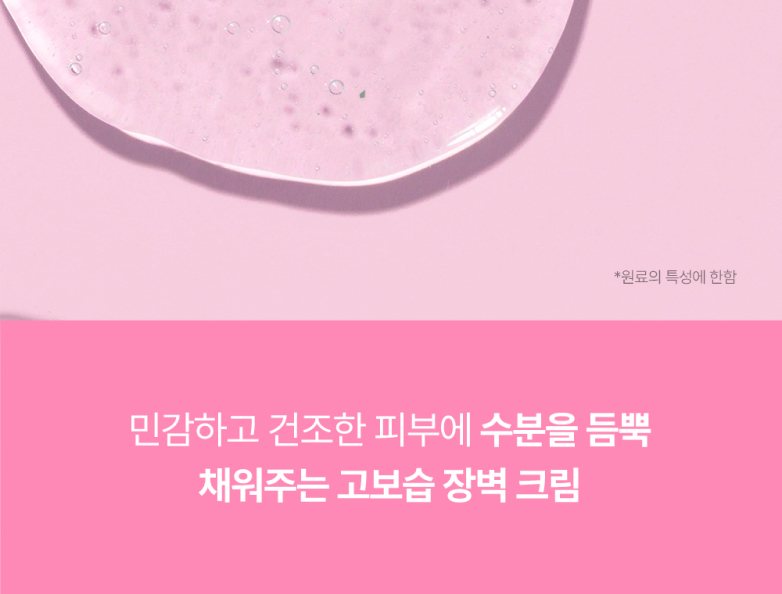
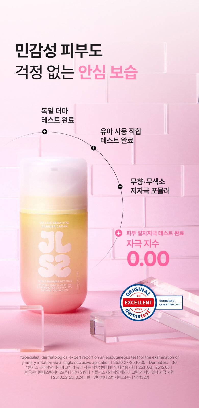
We extended the bouncy, lively feel of jelly into the visual experience of the entire detail page. Product textures convey the feel of each formula intuitively, and moving elements such as count-up motion and 3D GIFs are placed throughout to keep rhythm and immersion going along the long scroll. The brand color pink serves as the accent that ties product images, graphics and information areas into one tone, while benefits and product information are organized in a clear hierarchy — balancing JELLSIS's playful, bouncy mood with clear communication.