COREBIODERM, IOCELL’S PROPRIETARY SKIN PROBIOTIC INGREDIENT POWERED BY HY7714 AND HY’S RESEARCH EXPERTISE
HY iocell
Directing, Photography,Detail Page Design
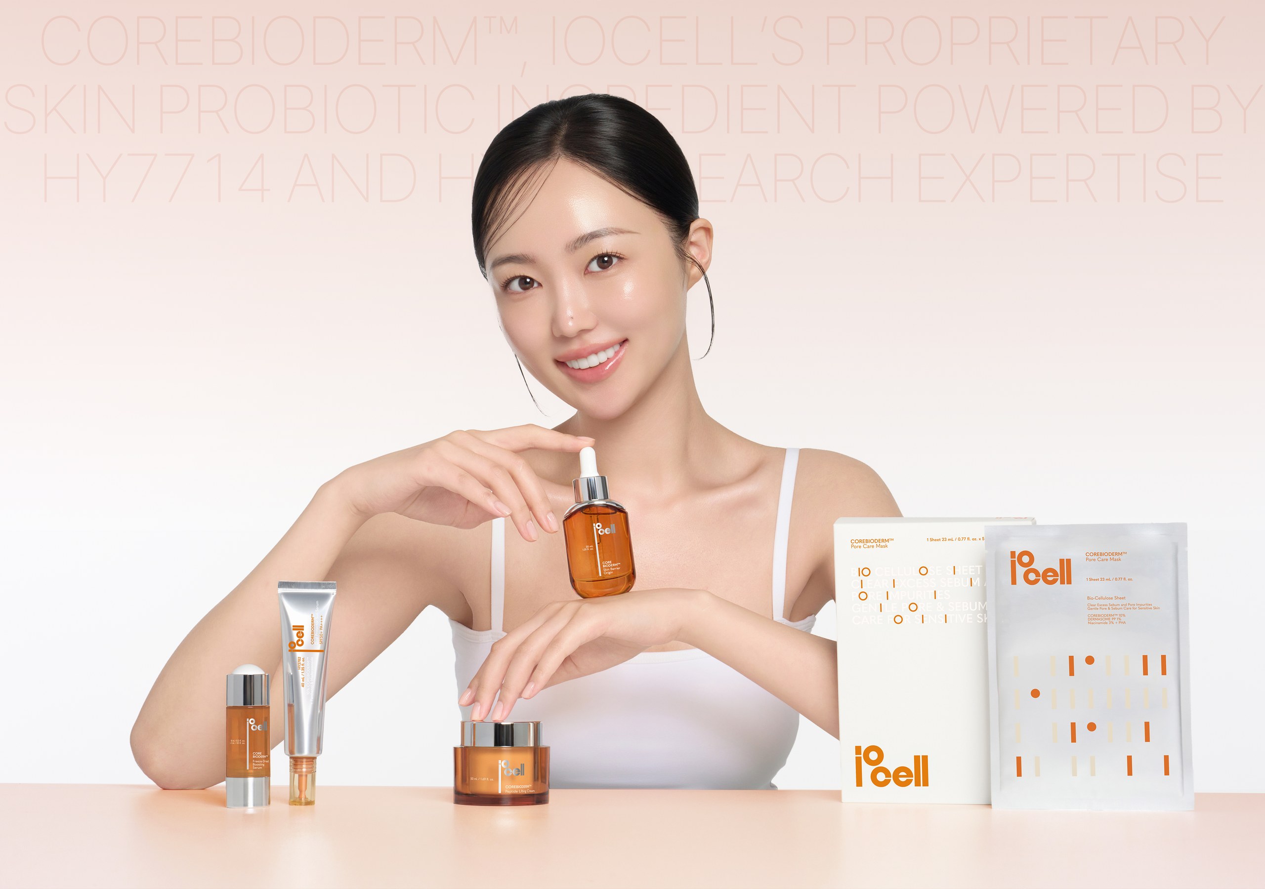
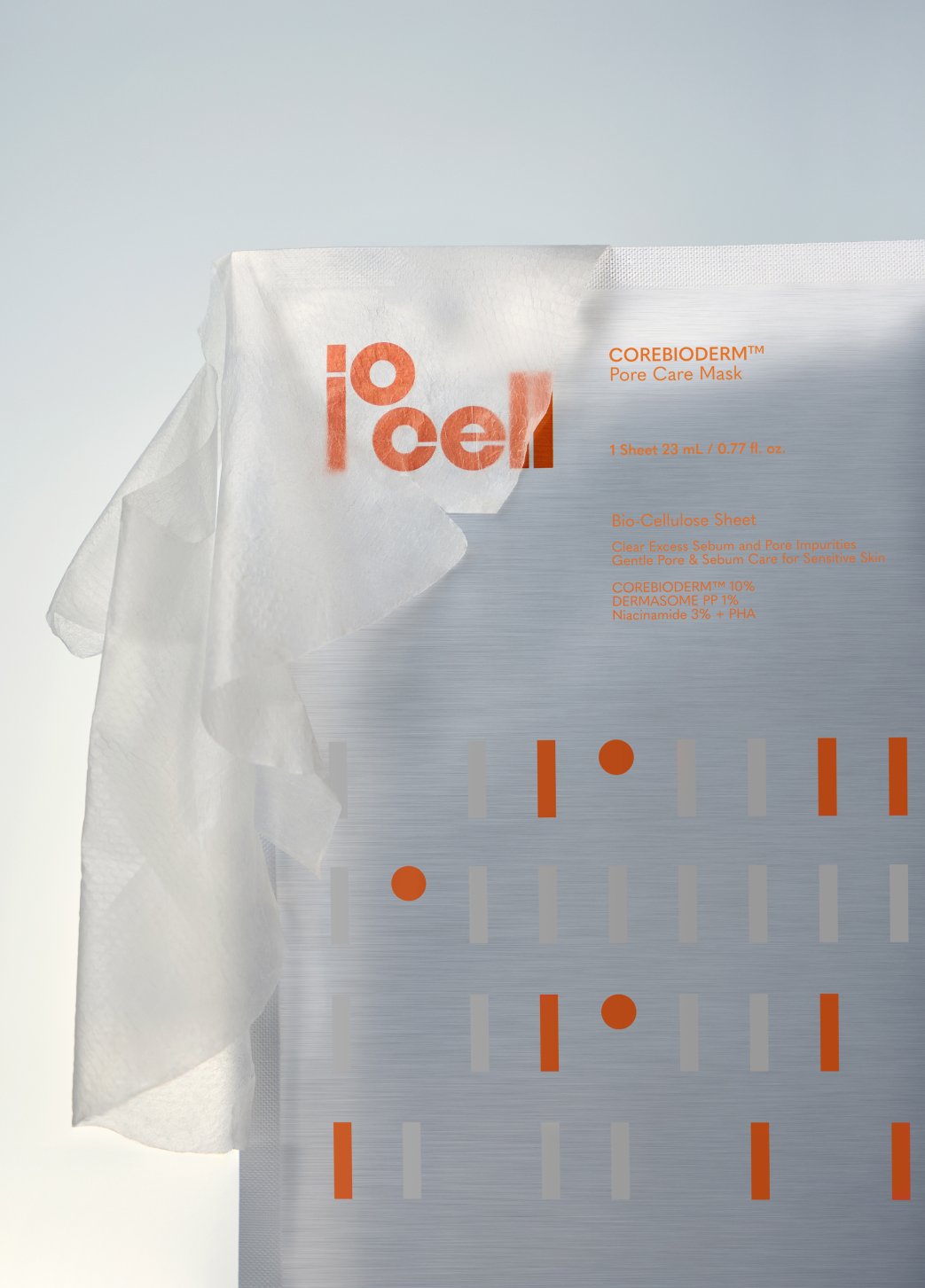
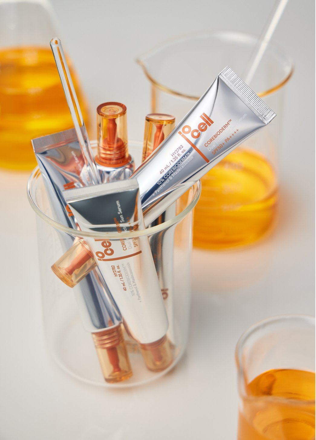
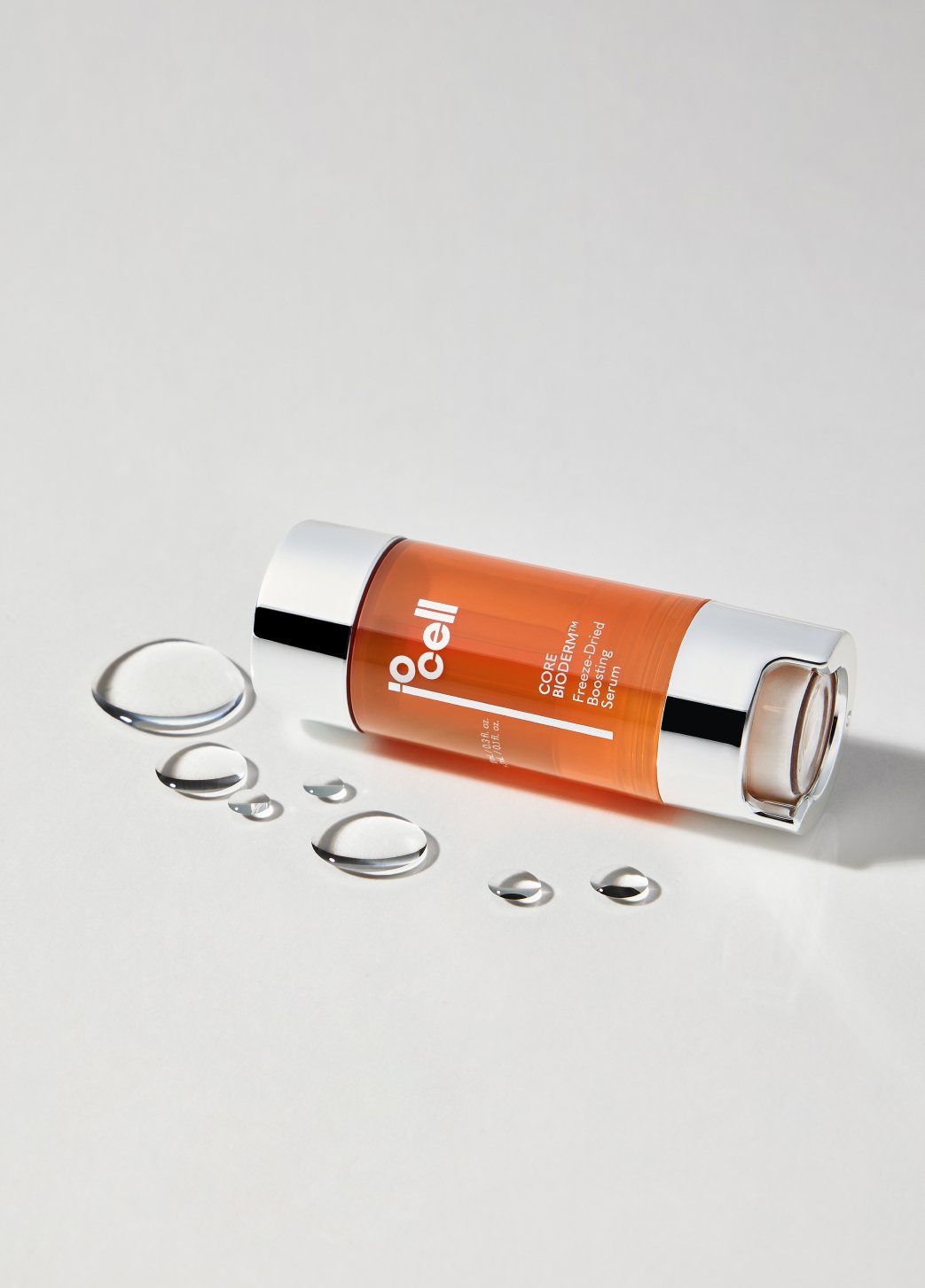
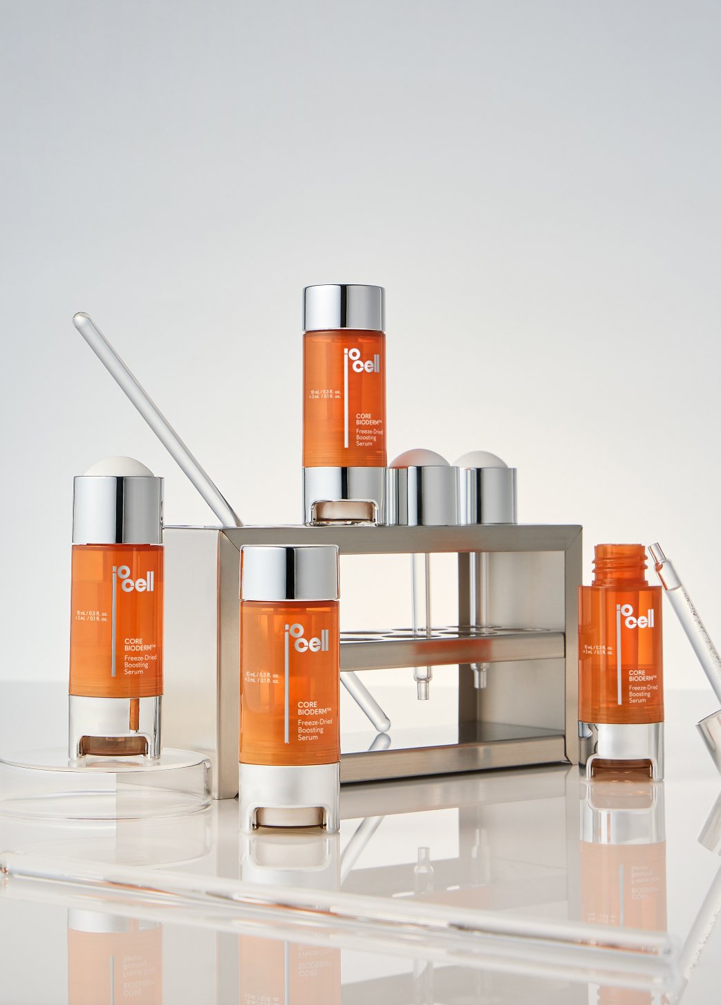
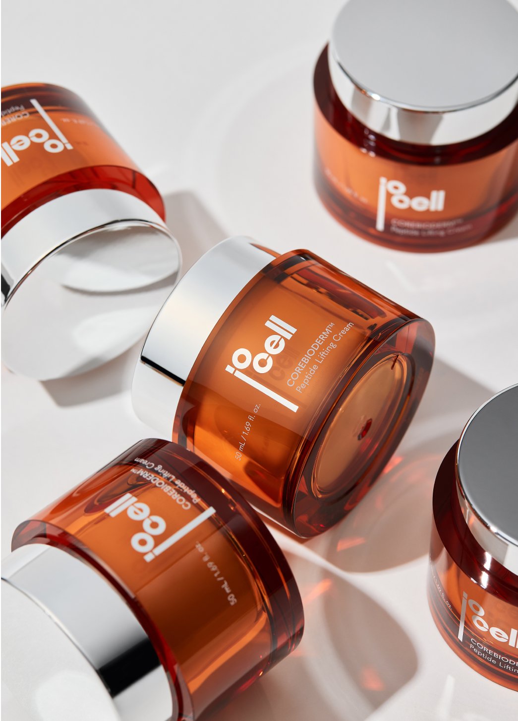
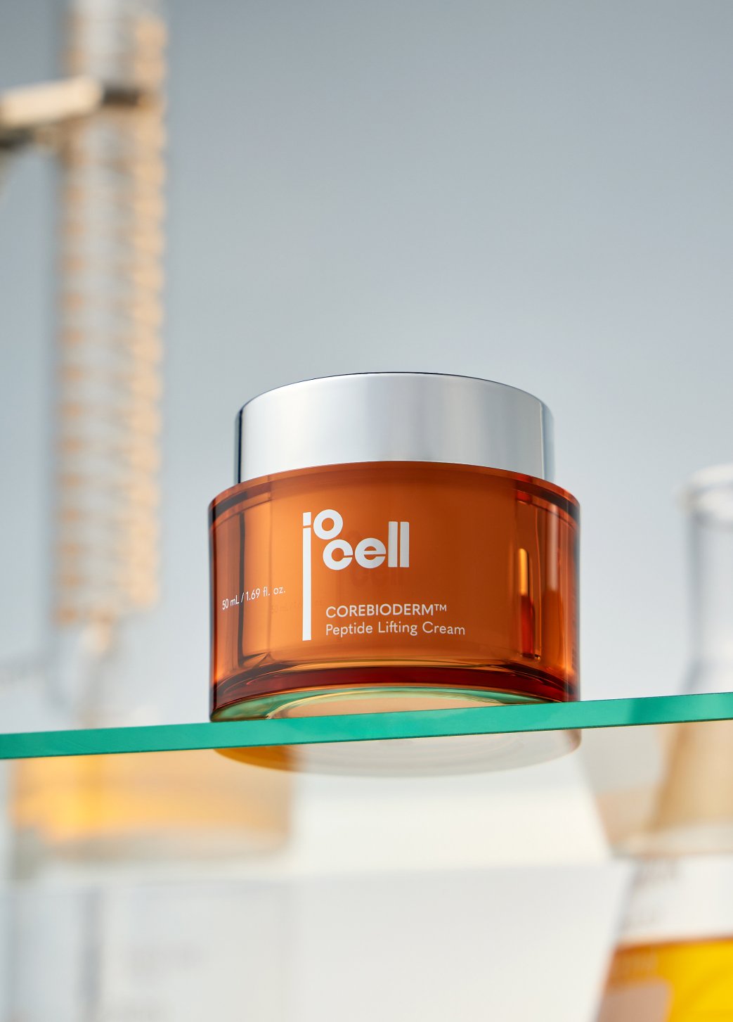
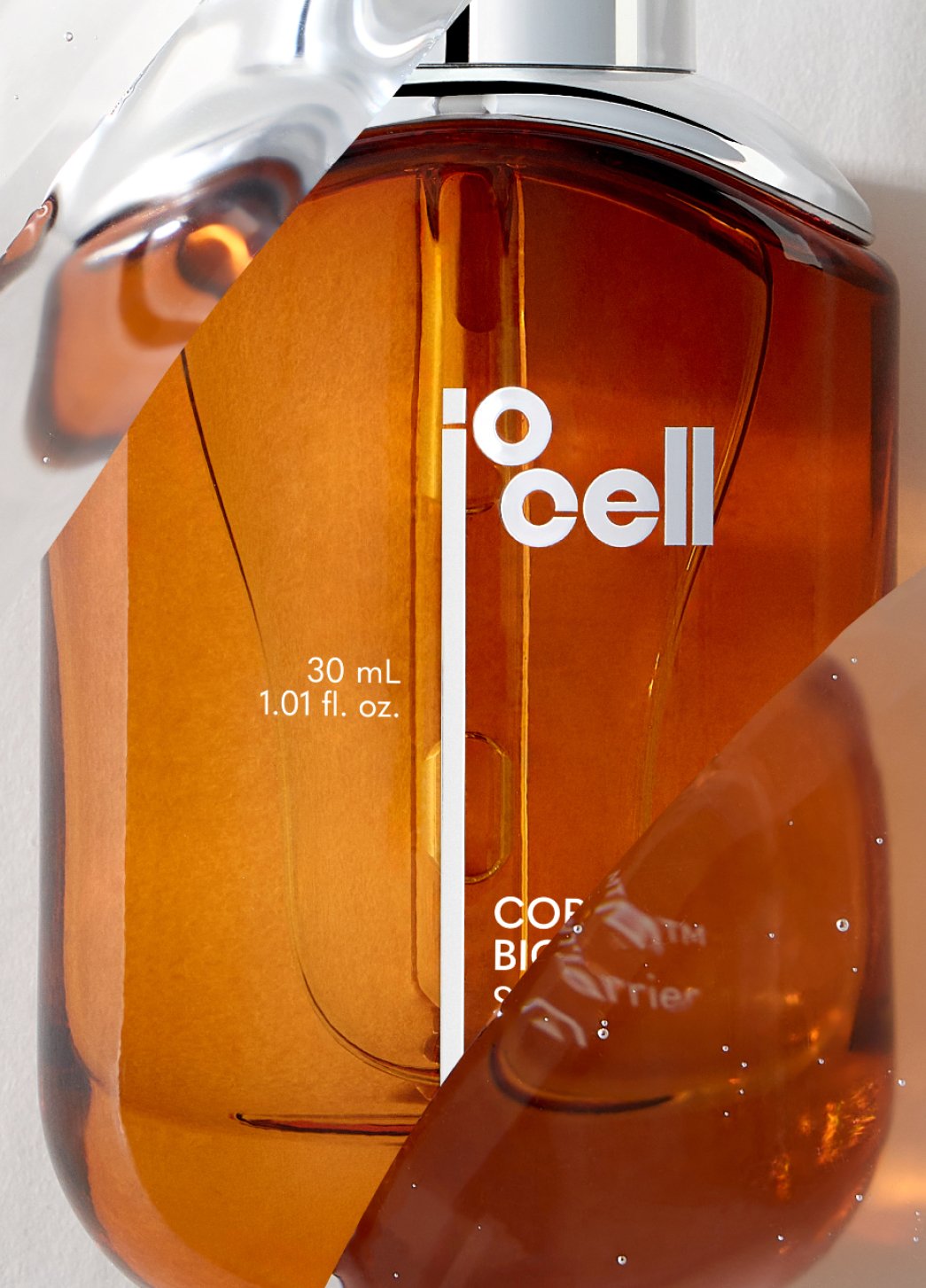
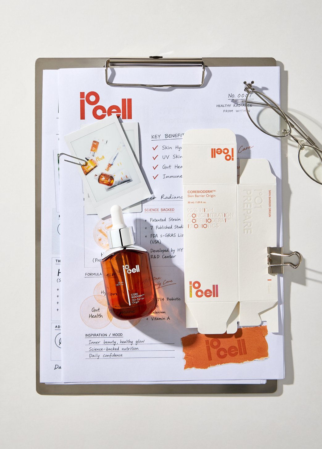
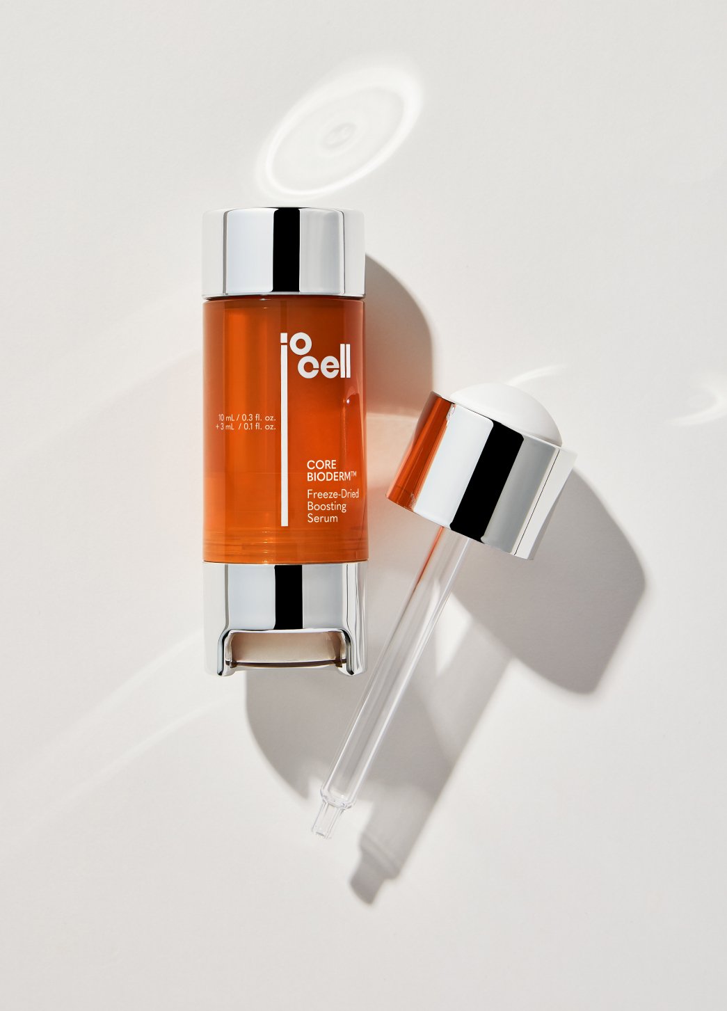
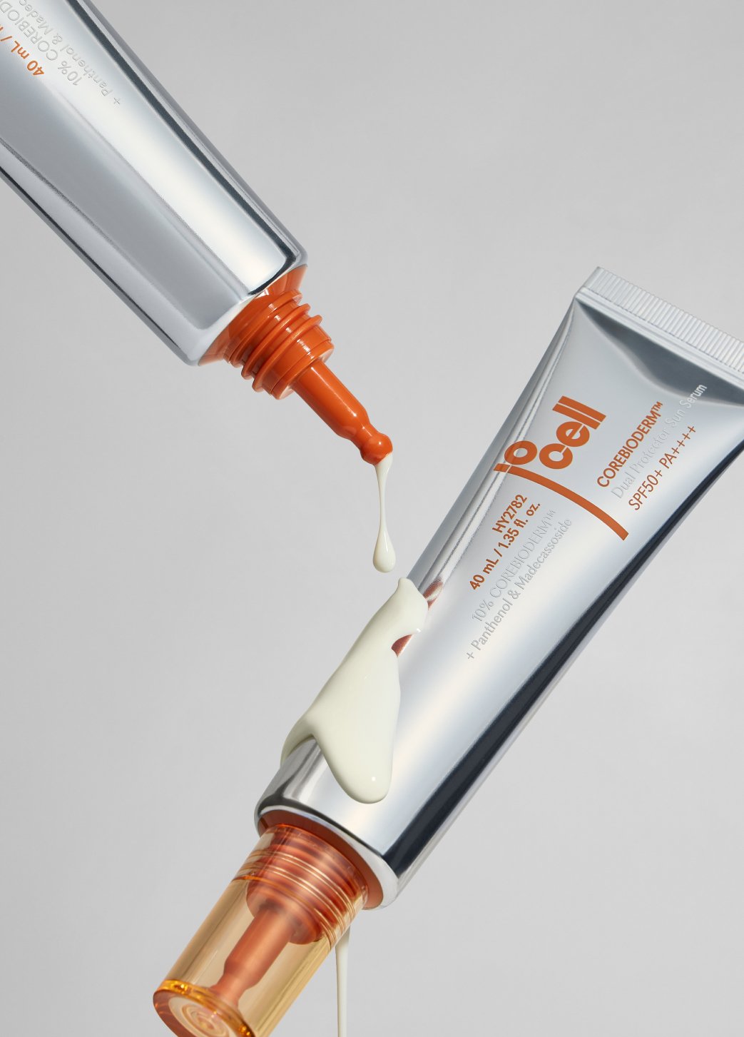
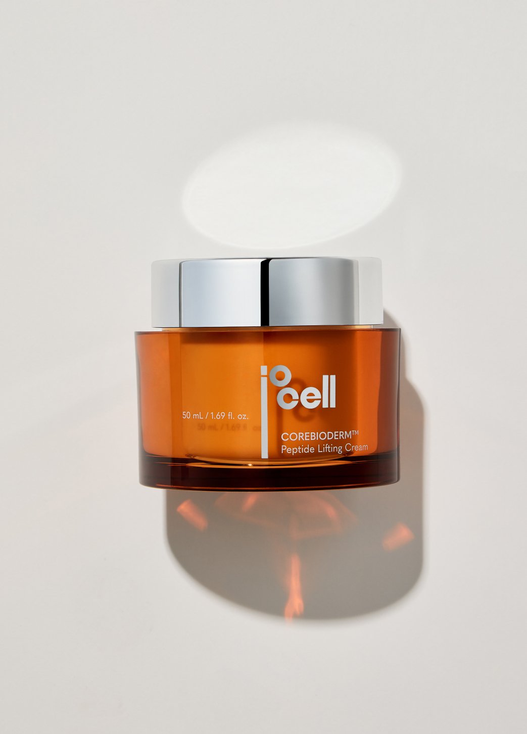
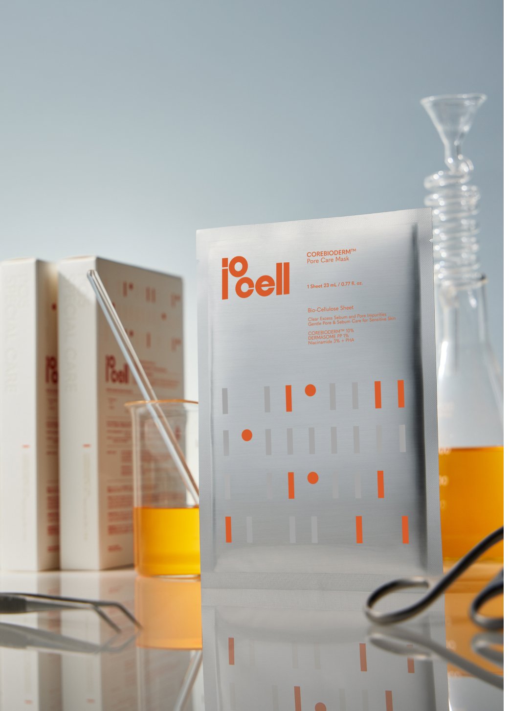
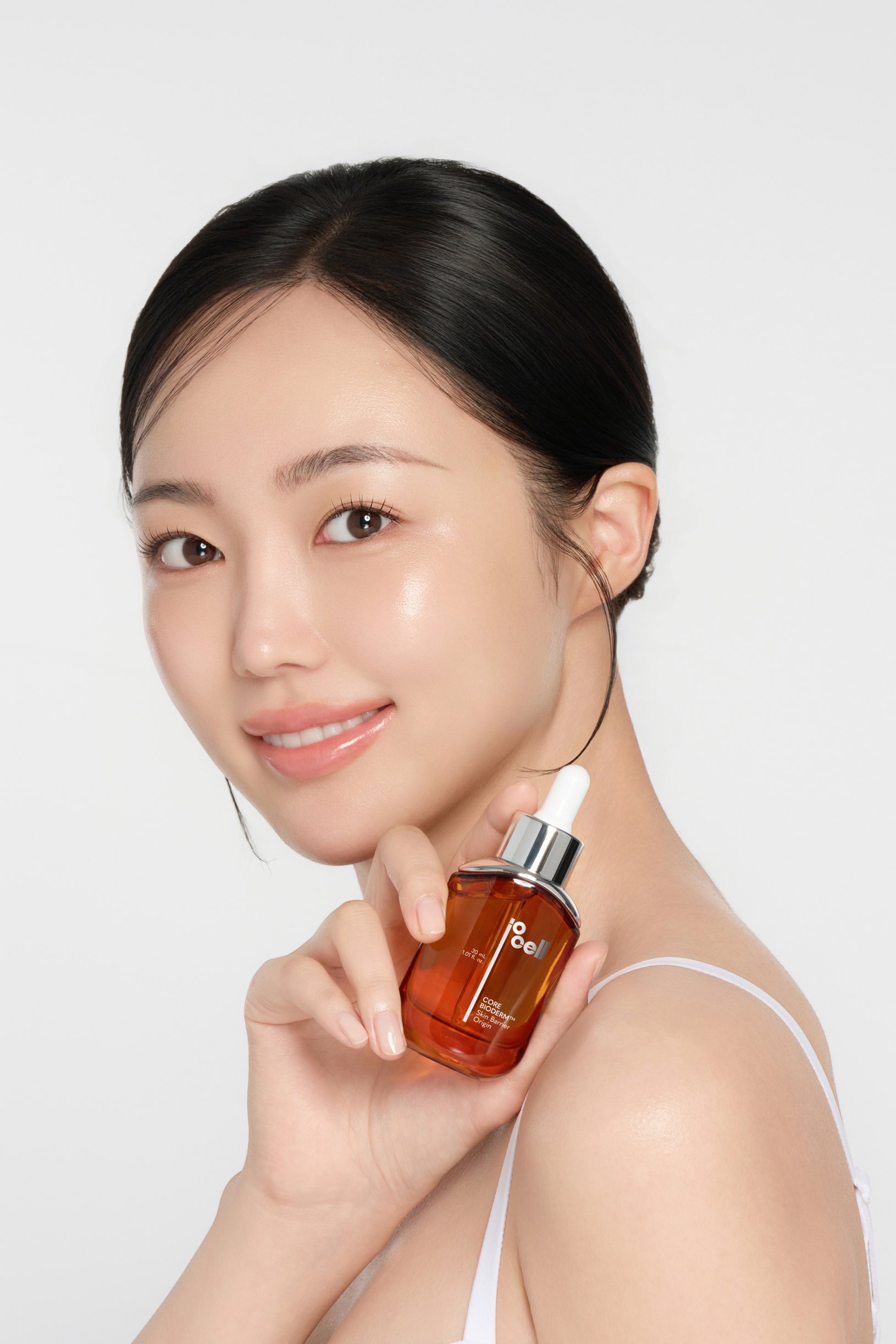
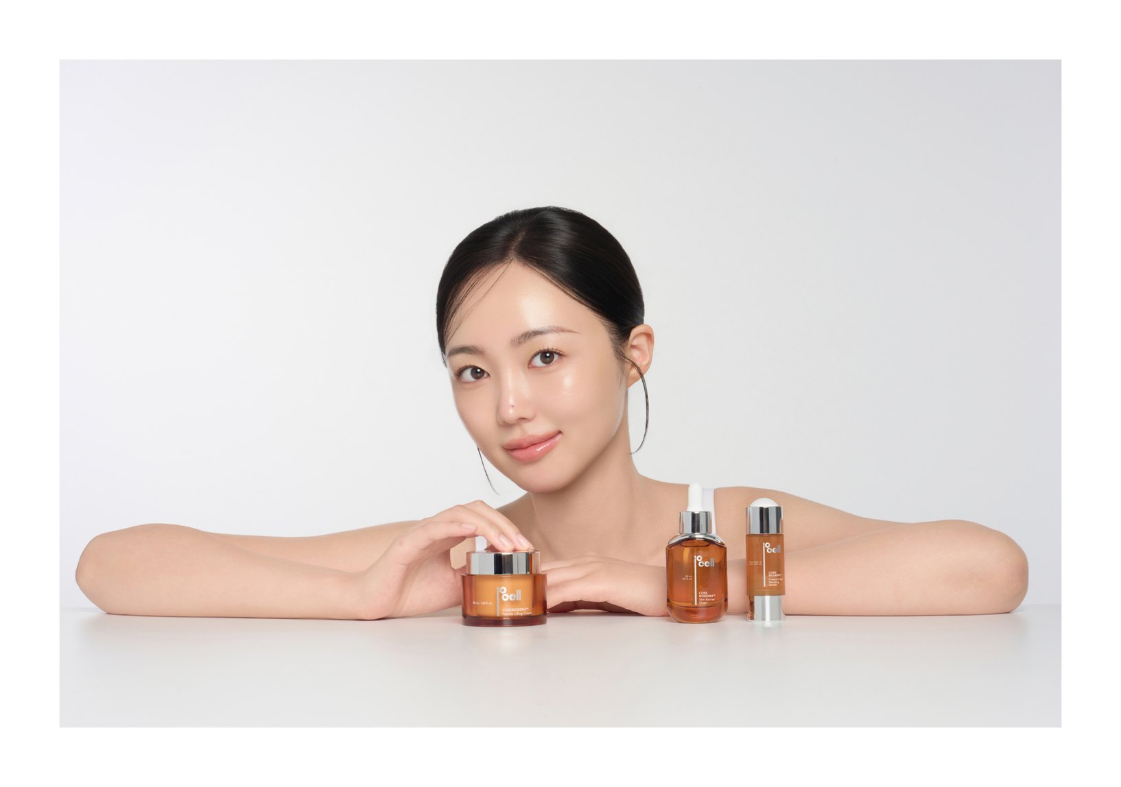
Working from iocell's brand concept and product character, we handled the whole process — model and product shoot direction, photography, and detail page planning and design. Lighting and composition were built so the product's signature amber orange and the texture of its clear containers stand out, while the model shoot captures clear, dewy skin for a skincare brand image. The detail page uses white space and fine line graphics for a composed mood, linking the shot imagery naturally with the ingredient story, clinical data and directions so the product's point of difference is easy to grasp — one consistent mood from shoot to design that conveys the brand's expertise and the product's appeal.
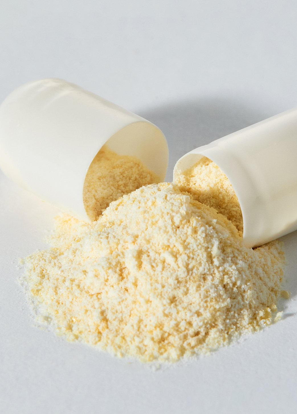
Model & Product shoot
Product shots set a refined laboratory mood with the contrast of amber orange and silver; model shots capture a natural skin glow under soft lighting.
Detail Page
Built around iocell's probiotic research, the detail page communicates the product's point of difference clearly. The product's amber orange leads the palette, with white space and fine line graphics expressing a composed brand image. Clinical data and infographics sit in harmony with product and model imagery, pairing sensory visuals with the credibility of information.
HY iowell
Directing, Photography,Detail Page Design
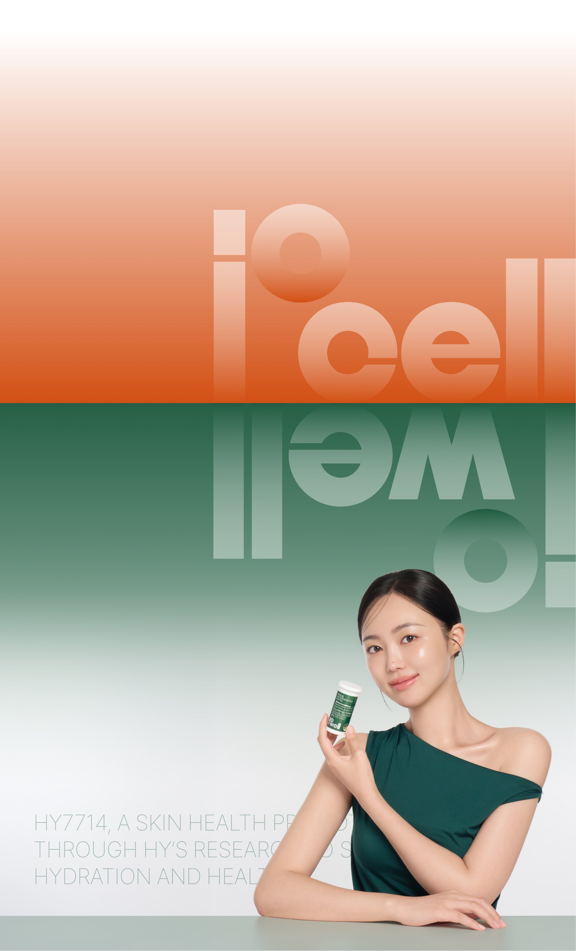
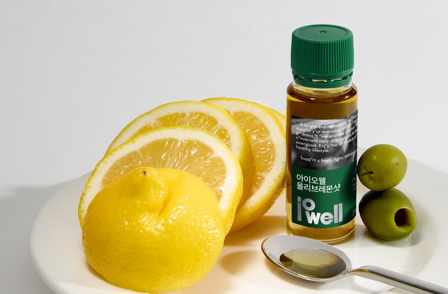
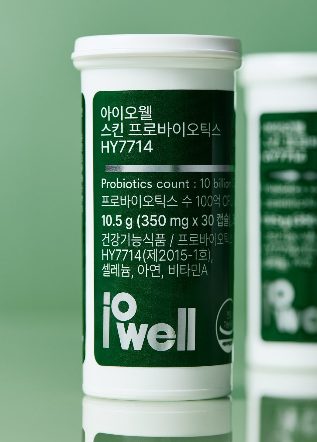
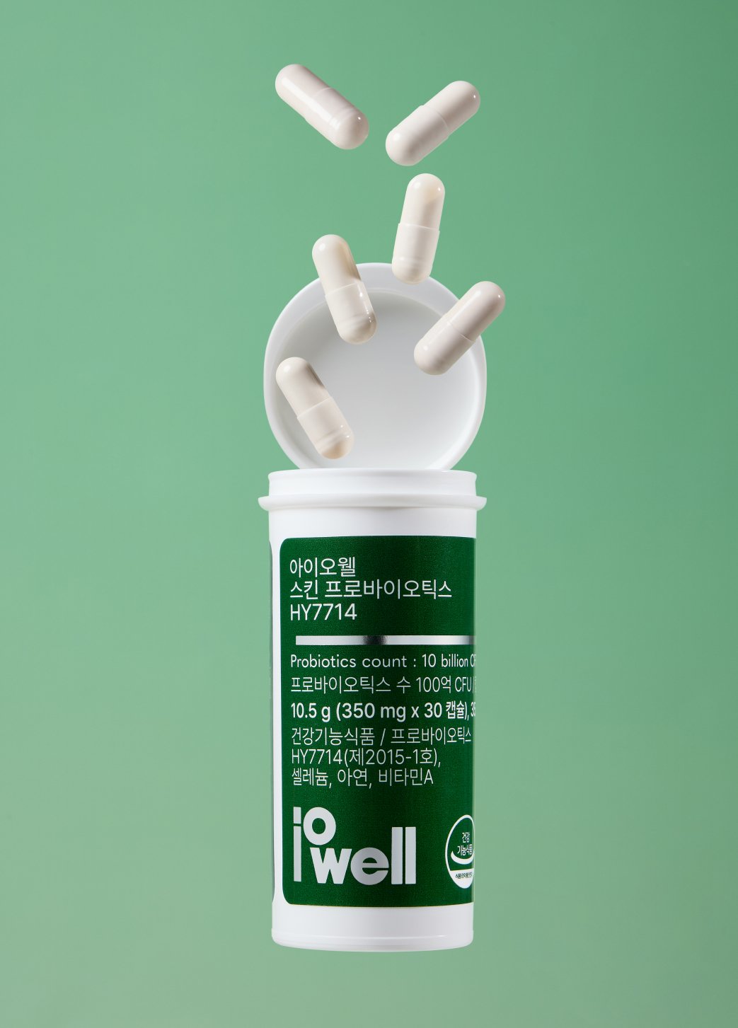
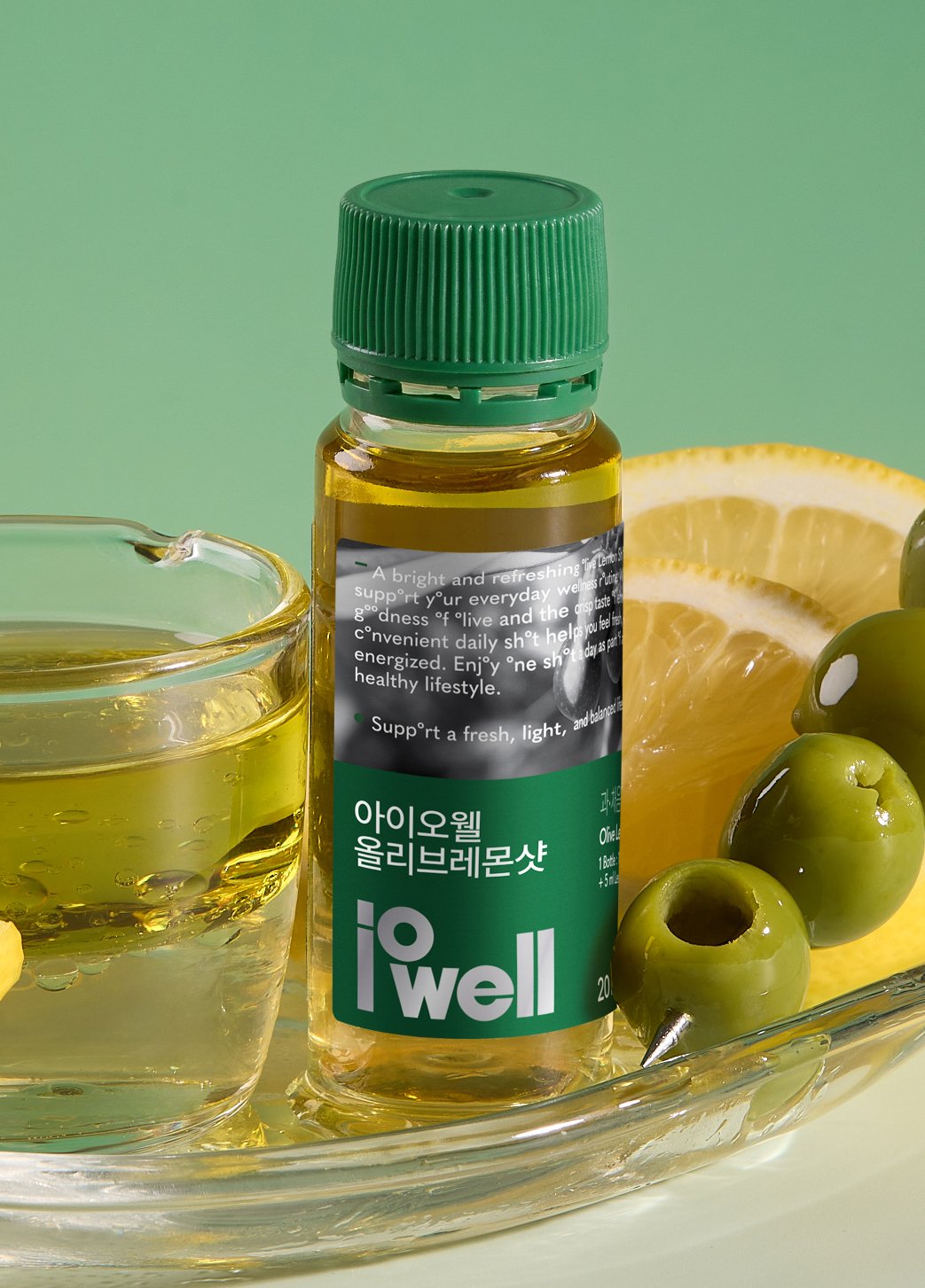
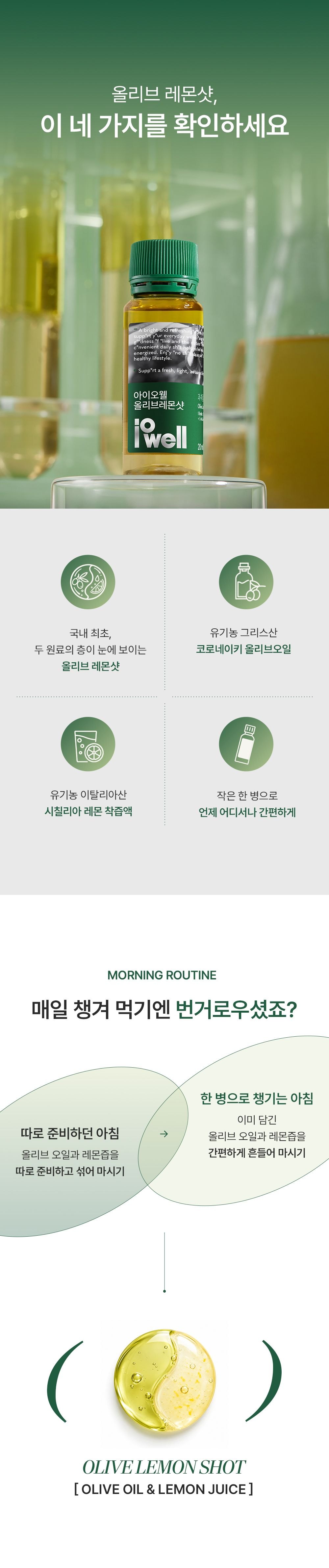
Based on the product's brand identity, we were responsible for the whole visual production — model and product shoot concept planning, shoot direction and detail page design. Green leads the palette, balanced with the deep yellow of olive oil, to express the product's healthy, natural image. Before the shoot we set the overall mood and references and directed every detail, from the model's styling and poses and how the product is shown to the background and props. Product photography ranged from styled shots that bring out the texture and colour of key ingredients such as olive oil and lemon to product shots emphasising the package and capsule form and detail. The images were used actively in the detail page design as well, keeping one visual flow from shoot to detail page so the brand's character and the product's differences come across effectively.
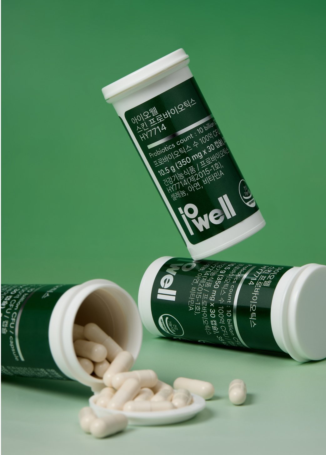
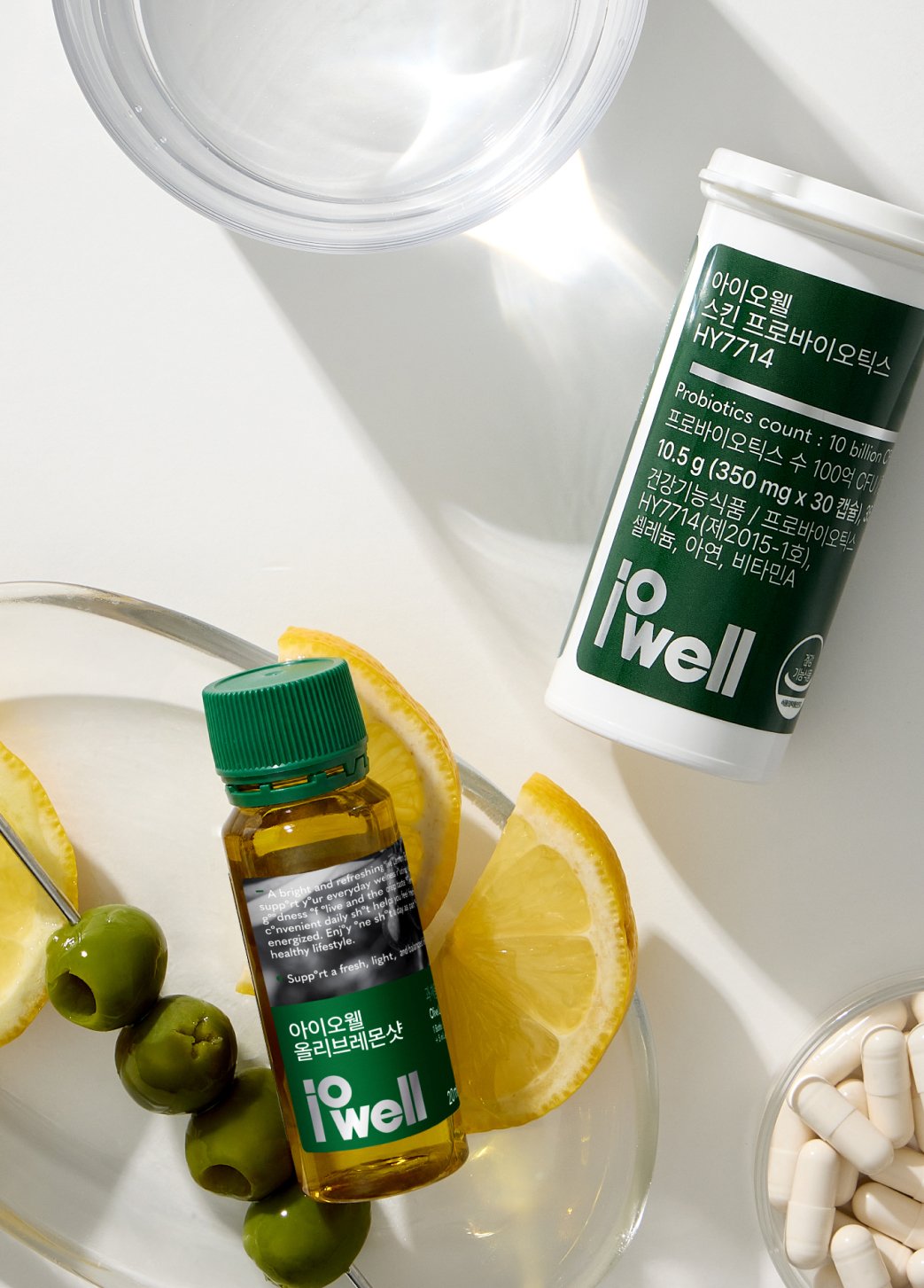
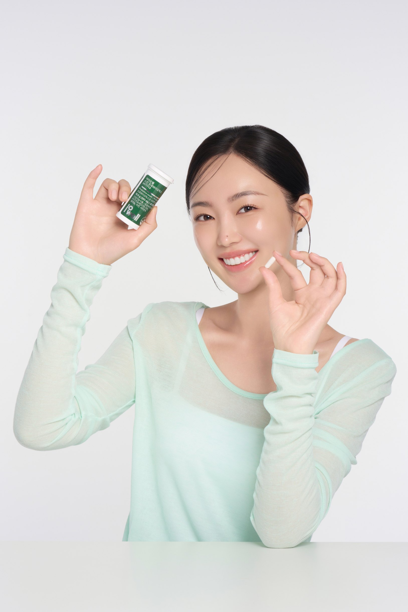
Model & Product shoot
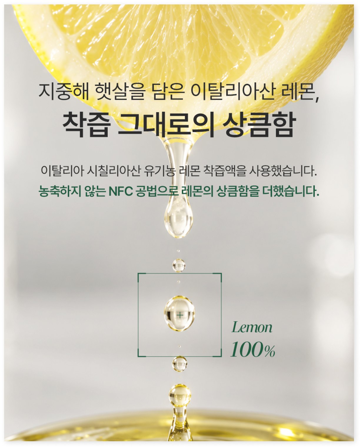
With green as the main colour, we styled the products alongside raw ingredients such as lemon and olive to express a fresh, healthy image. Styled shots that use the product and its texture in varied ways convey the key ingredients and character intuitively, and natural light with clean backgrounds completes a crisp yet professional mood.
Detail Page
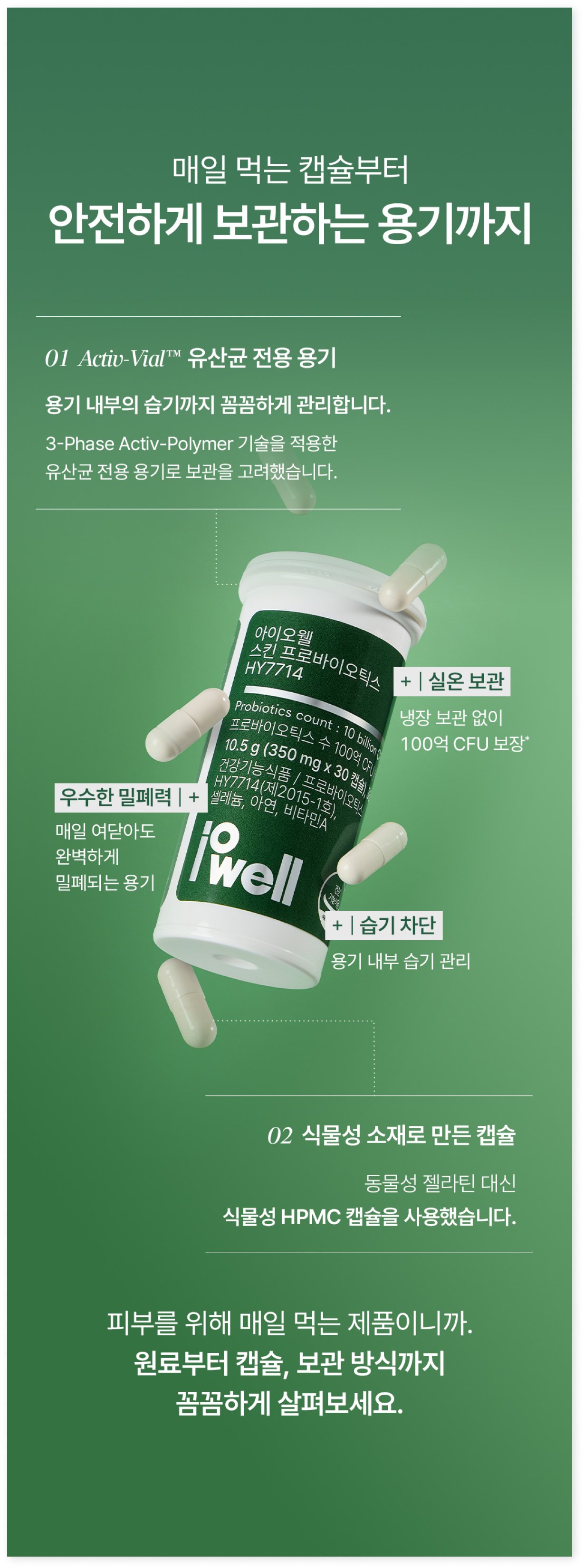
Centred on the pairing of olive oil and lemon juice, the design uses green and yellow so the product's ingredients and character show at a glance. From the 65% olive oil and 35% lemon juice blend ratio to ingredient features, how to take it, the storage container and research on the probiotic ingredient, the content is arranged in sequence to convey the product's difference and credibility. Throughout, the freshness of natural ingredients is emphasised while a clean layout and clear information hierarchy complete a professional, healthy brand image.