



GOONDORI
Branding, Photography, Detail Page Design, Packaging
Born from ‘Goondori,’ a lifestyle platform for soldiers, Goondori Labs offers a skincare experience designed around the environment and daily patterns of military life — easy enough to use every day without a second thought. To make care flow naturally even with limited time and space, we removed complicated choices and steps and set a core brand principle: communicate the functions that matter, simply and clearly. Since the Goondori app is the main touchpoint, information and visuals were streamlined so the product's features and usage can be grasped quickly on mobile, while the brand's expression was extended into the everyday language of skincare rather than recreating a military image. Through minimal design, a refined information structure and function-led visual communication, we built a brand experience in which practical care that began in the military can continue in everyday life.
Brand Challenge
Considering the environment and routines of military life, we explored a simpler, more intuitive skincare experience. Rather than showing military imagery or symbols directly, we aimed to extend the practical perspective found in military life into the everyday language of skincare. By streamlining how products are used and how information is delivered, Goondori Labs creates a brand experience that carries naturally into many kinds of daily life.
Pared back to the essentials
Calm, trustworthy white space
Function you can see at a glance
Brand Logo
The logo uses the English wordmark as the main identifier, focusing on a consistent brand impression across many environments. Bold, clear letterforms combined with rounded curves and a simple structure create an impression that is both friendly and stable. The silhouette stays instantly readable yet balanced, giving Goondori Labs its own visual presence. Instead of emphasizing a separate Korean logo, the system is built around a single English logo for clear, unified brand communication.
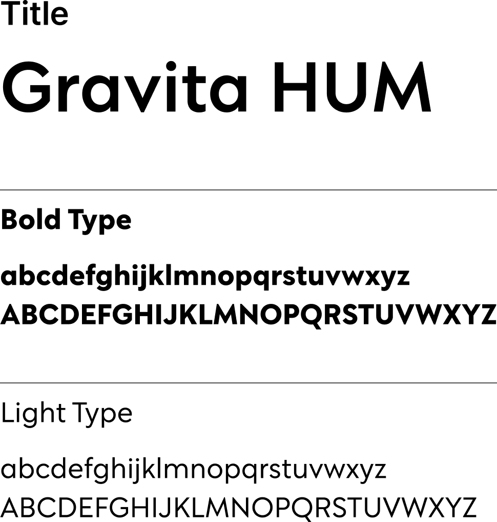
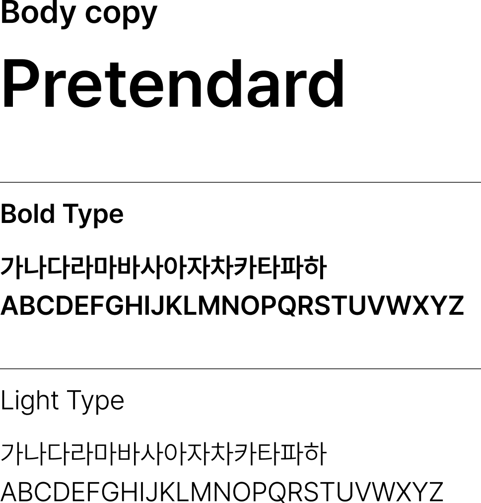
Typography
Goondori Labs' typography is designed around an unexaggerated impression, high legibility and a steadiness suited to long-term use. We chose a refined sans-serif pairing that clearly separates titles and body text while reading as one tone, without clashing.
Brand Character
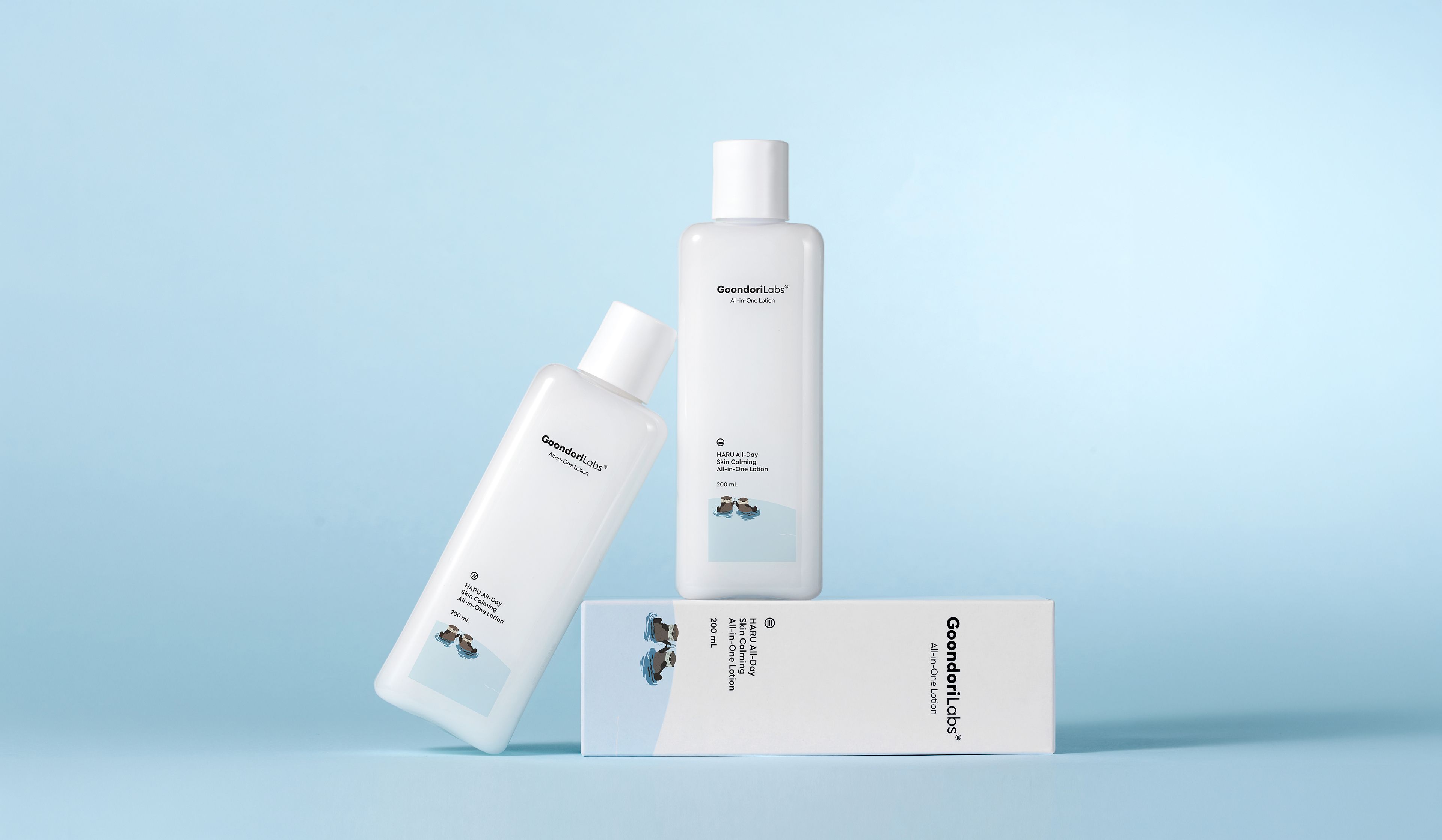
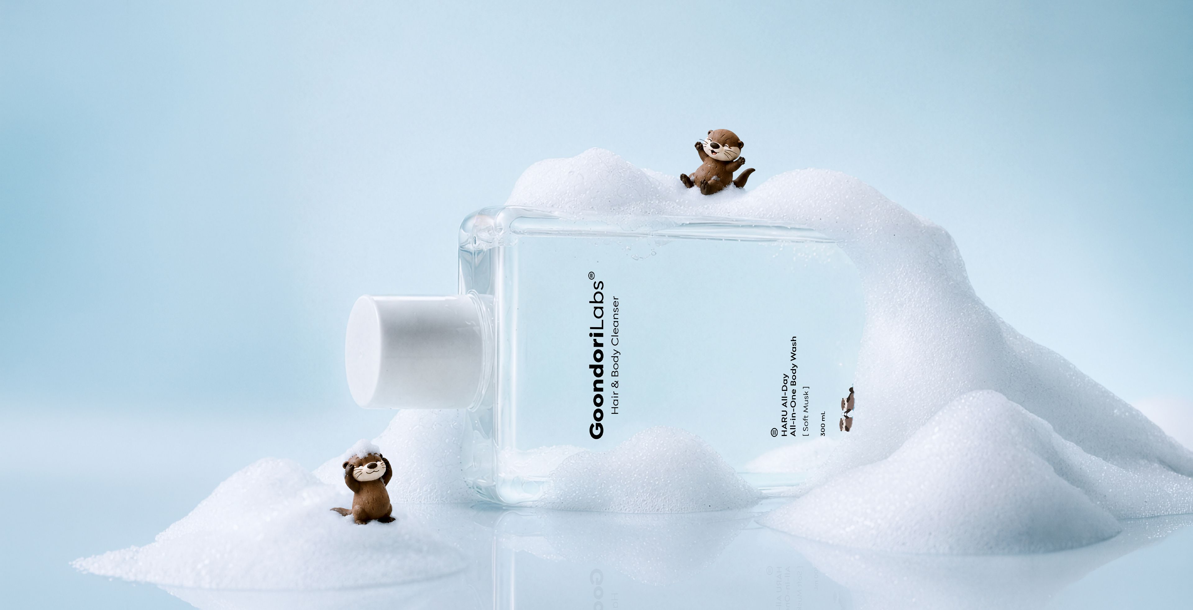
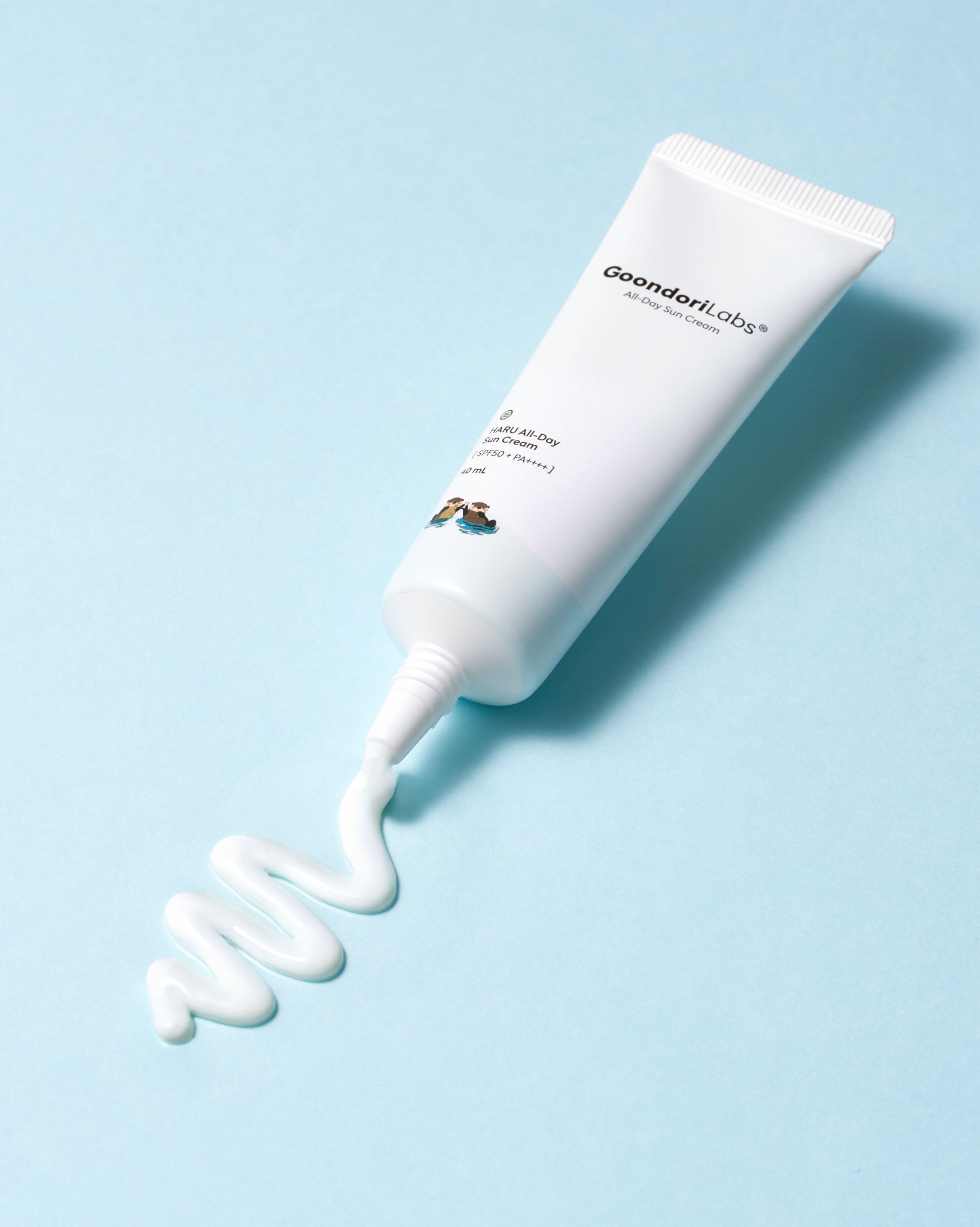
Goondori's otter character, inspired by the Korean wordplay ‘master of moisture,’ symbolizes daily hydration. Drawing on the otter's closeness to clean water, it carries impressions of moisture, cleanliness and trust, and was designed as a friendly, memorable visual element that represents the brand. As a result, the products are naturally remembered by affectionate nicknames like ‘the otter lotion’ and ‘the otter sunscreen,’ and the character becomes a lasting point of connection between product and brand.
Packaging
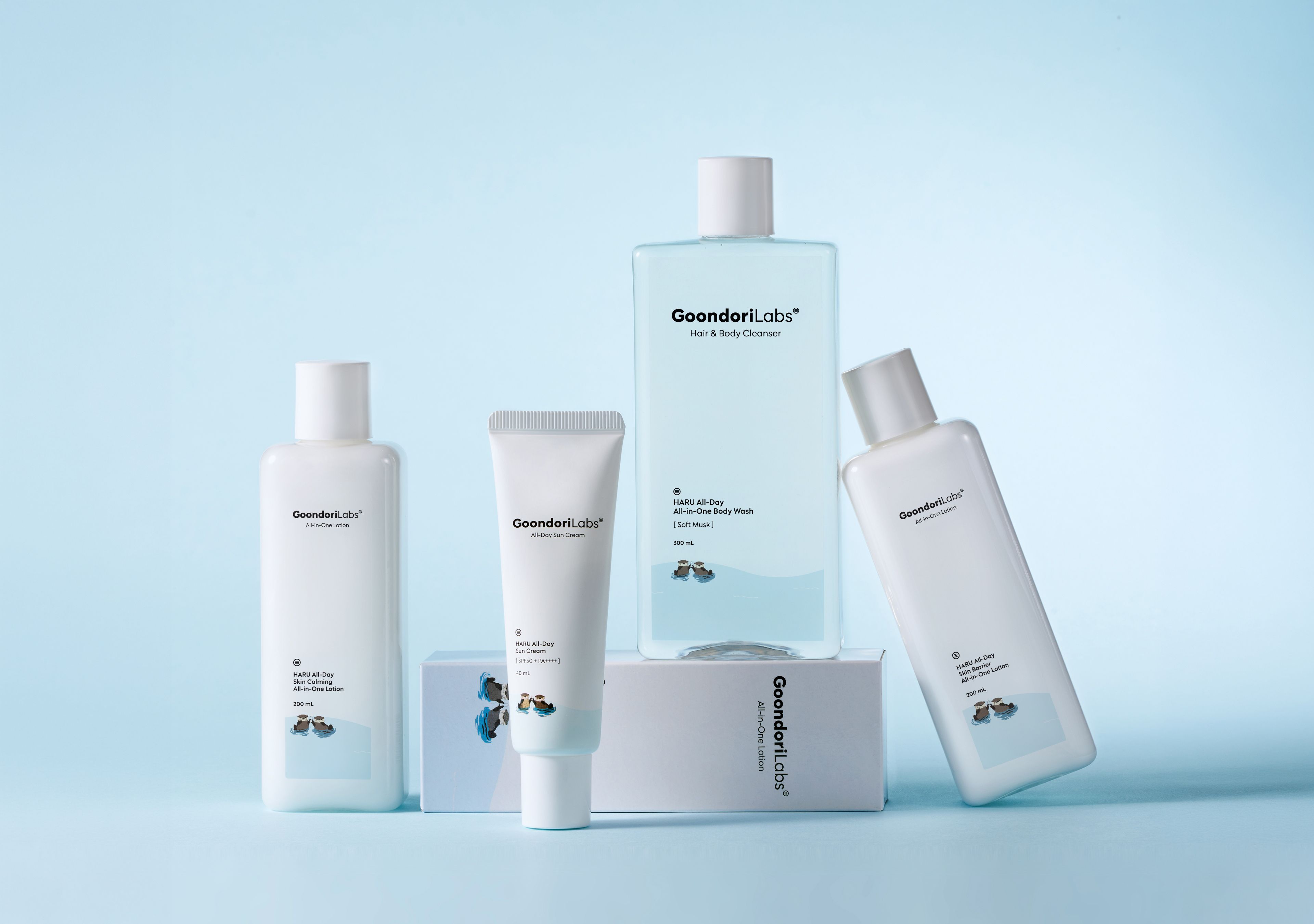
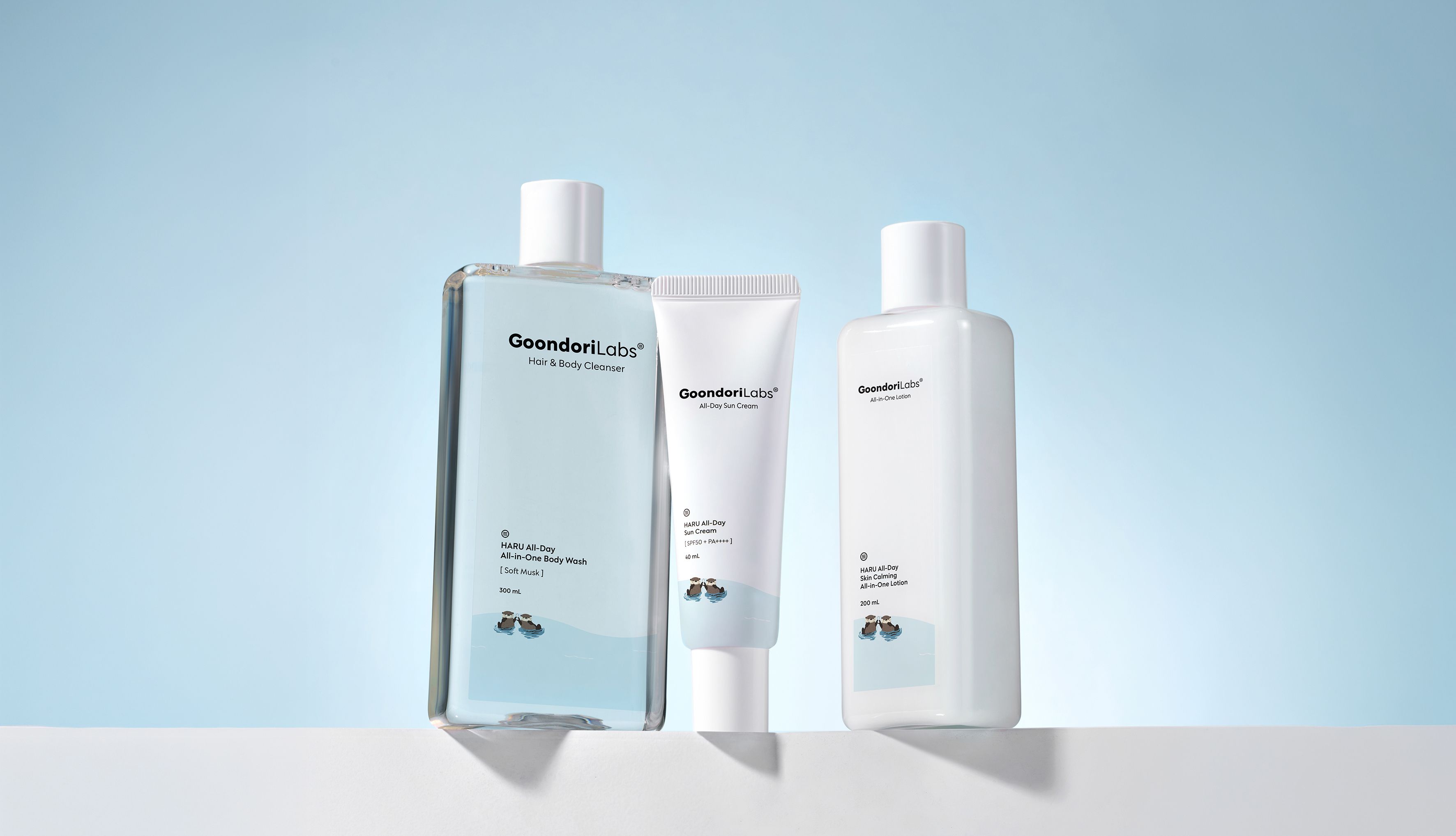
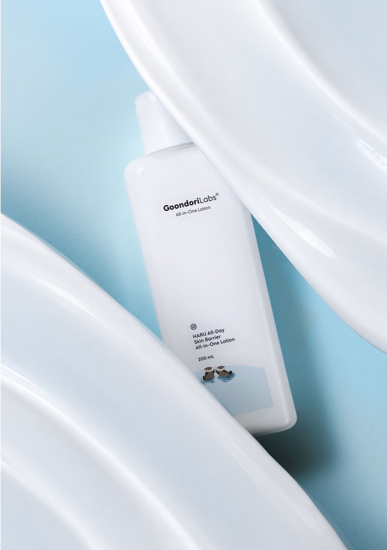
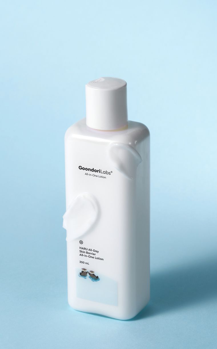
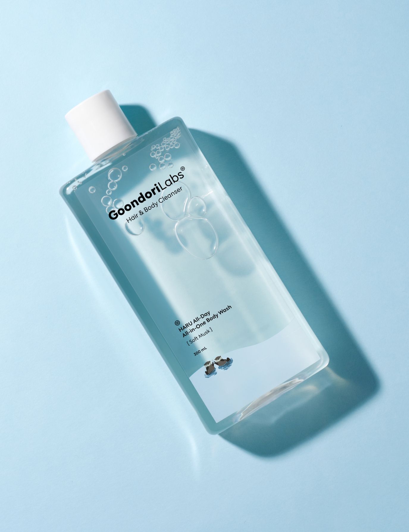
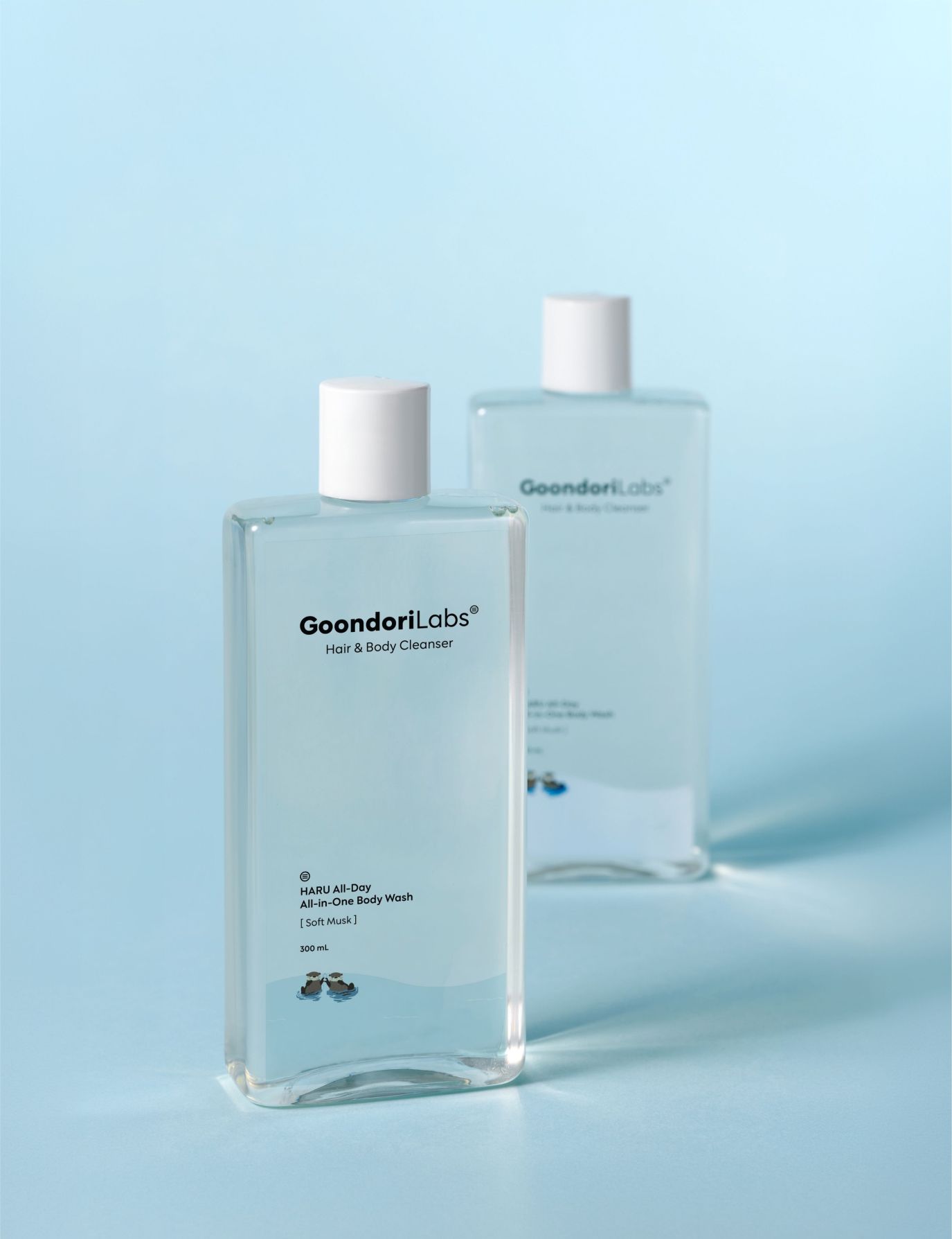
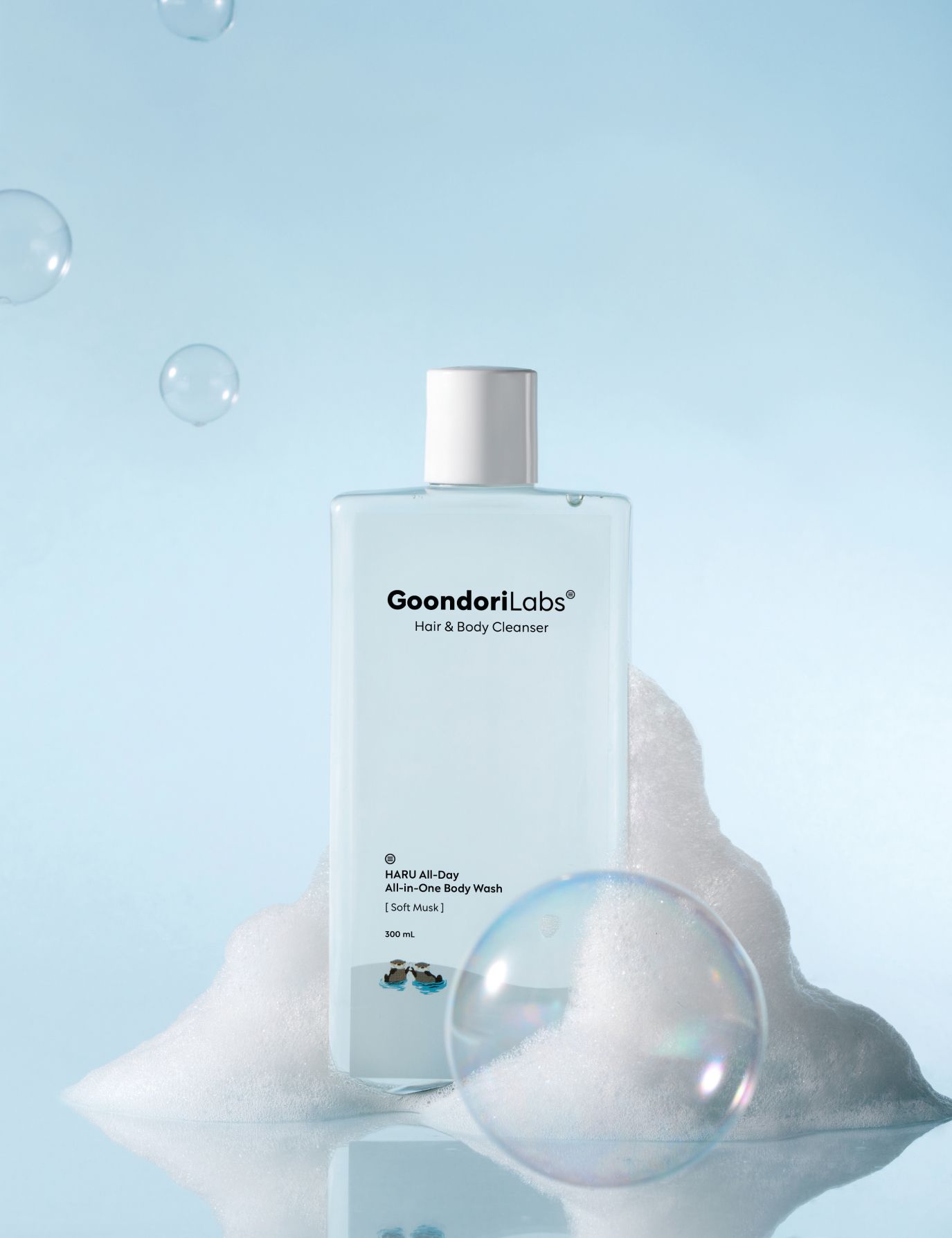
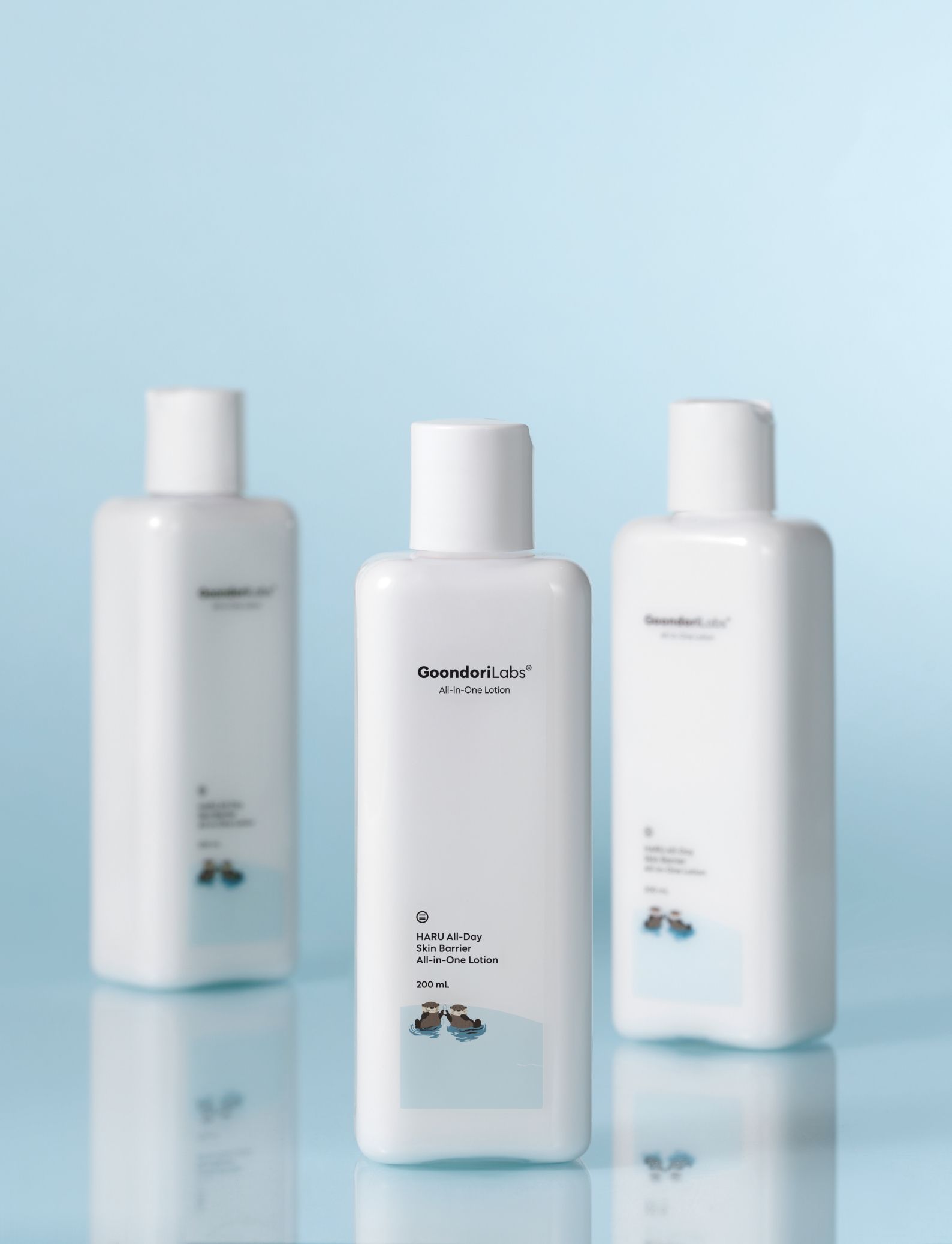
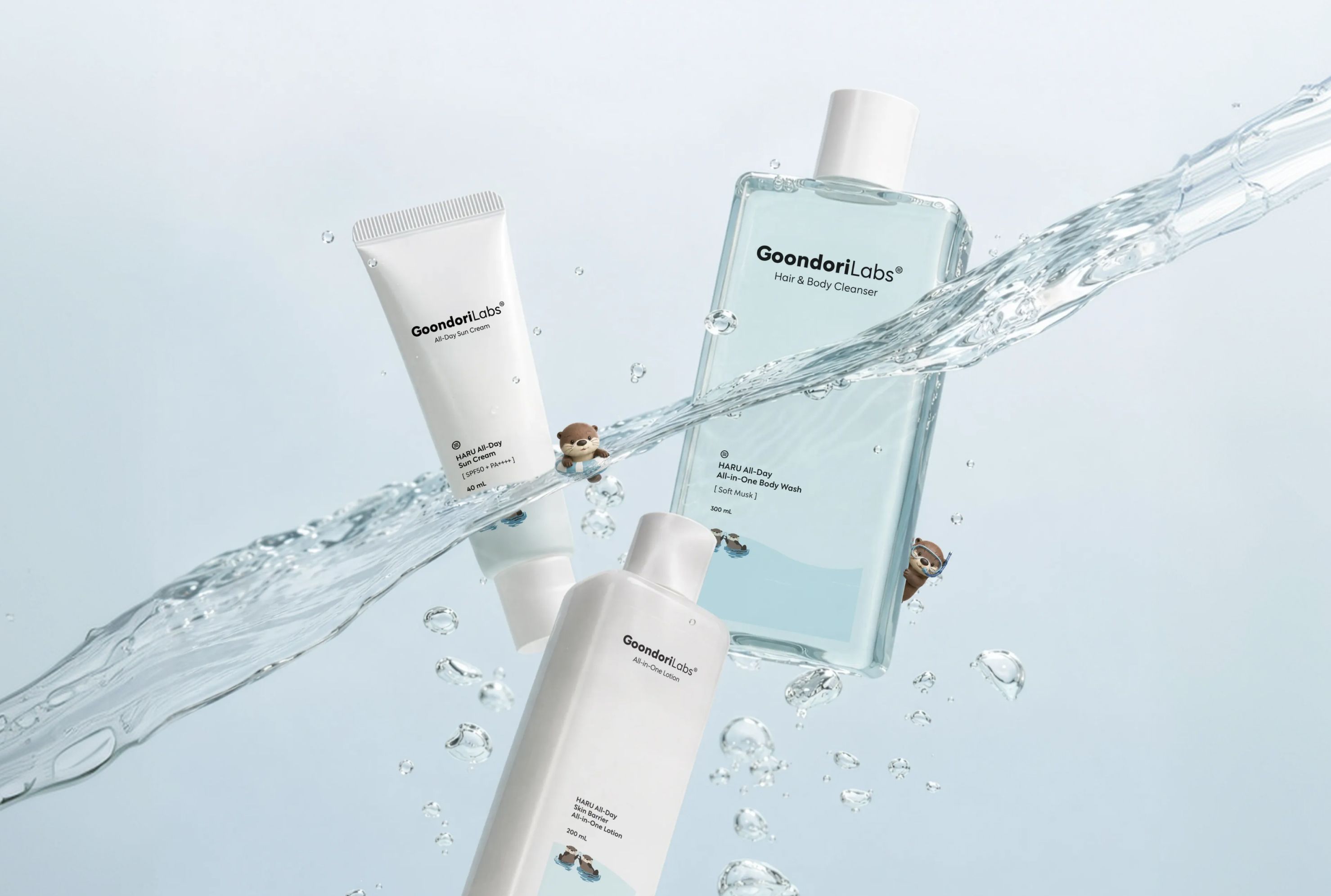
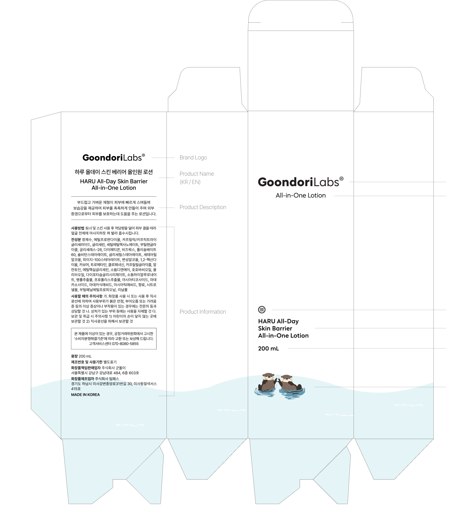
Goondori's packaging is built on a minimal layout with a clear information hierarchy, so the product's key function and information are recognized first. Rather than featuring the otter prominently on the front, we used it as a small accent that recalls the brand, keeping the overall impression tidy. Instead of confining visual elements to a fixed frame, the layout flexes to suit each product's shape and size. The wave graphic at the bottom wraps naturally around the package, visually linking it to the brand's hydration-focused image and keeping a consistent package identity across different products.
Brand Logo
Line Name
Symbol
Product Name
Net Volume
Character Illustration
Label System
Goondori's label system separates the information hierarchy of the front and back so product information can be recognized quickly and clearly. The front delivers key information concisely around the logo, line name and product name, with the otter illustration placed as a visual accent at the bottom. The back arranges the product name, description and required information in sequence, keeping readability steady even where the amount of information is large.
Detail Page
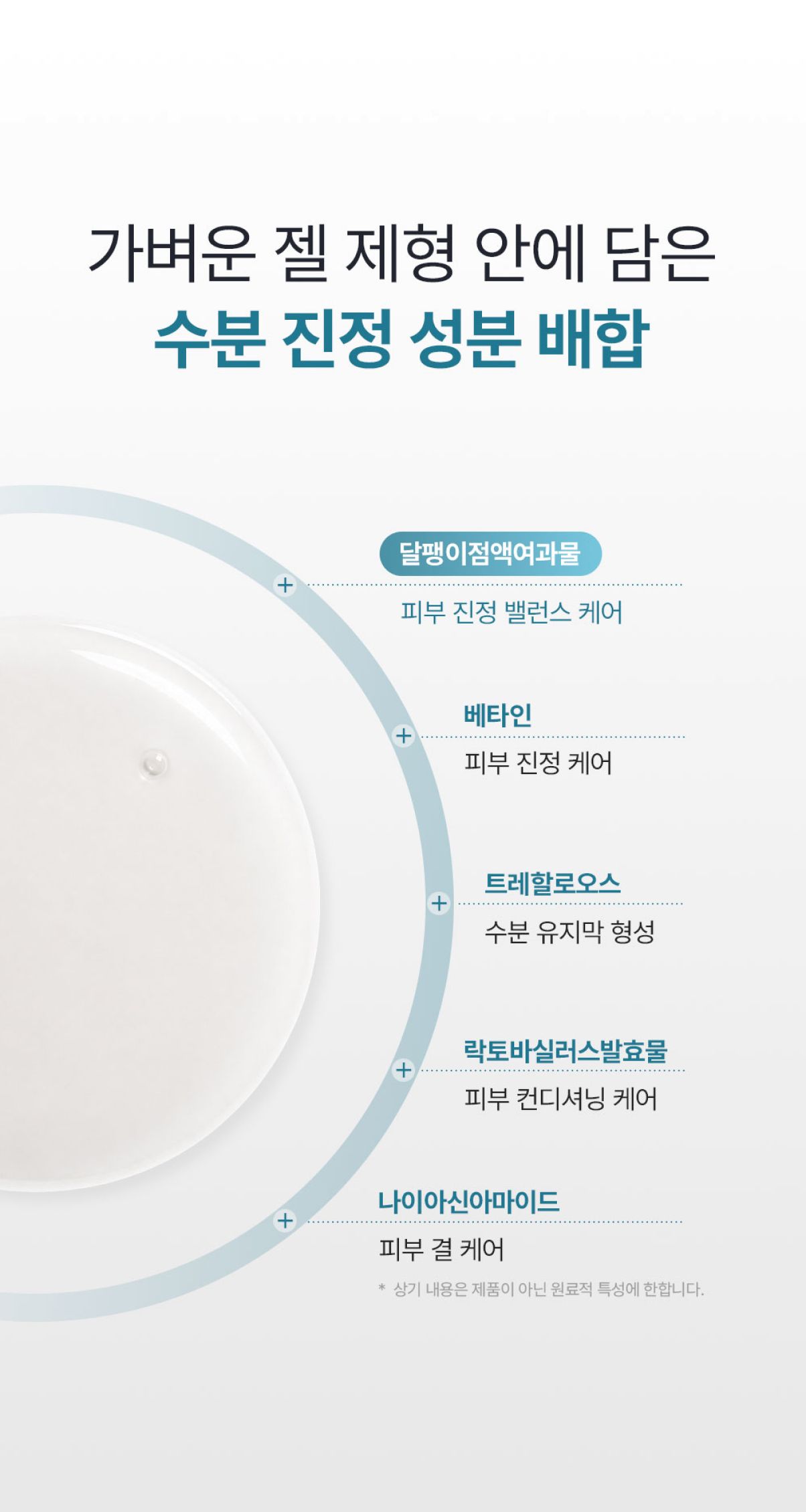
The Goondori Labs detail page focuses on communicating the product's key functions and information intuitively. Content is ordered clearly by importance, and product images are connected organically with concise messages so users naturally understand the product's features and how to use it. Going beyond simply delivering product information, it lets users quickly find and choose what they need from their own perspective — consistently reflecting the practical, simple approach to care that Goondori stands for.
Minimal
Refined Space
FunctionalVisual
Goondori Labs.Simple care for everyday life.