


Re 10+
Directing, Photography, PamphletDetail Page Design, Packaging
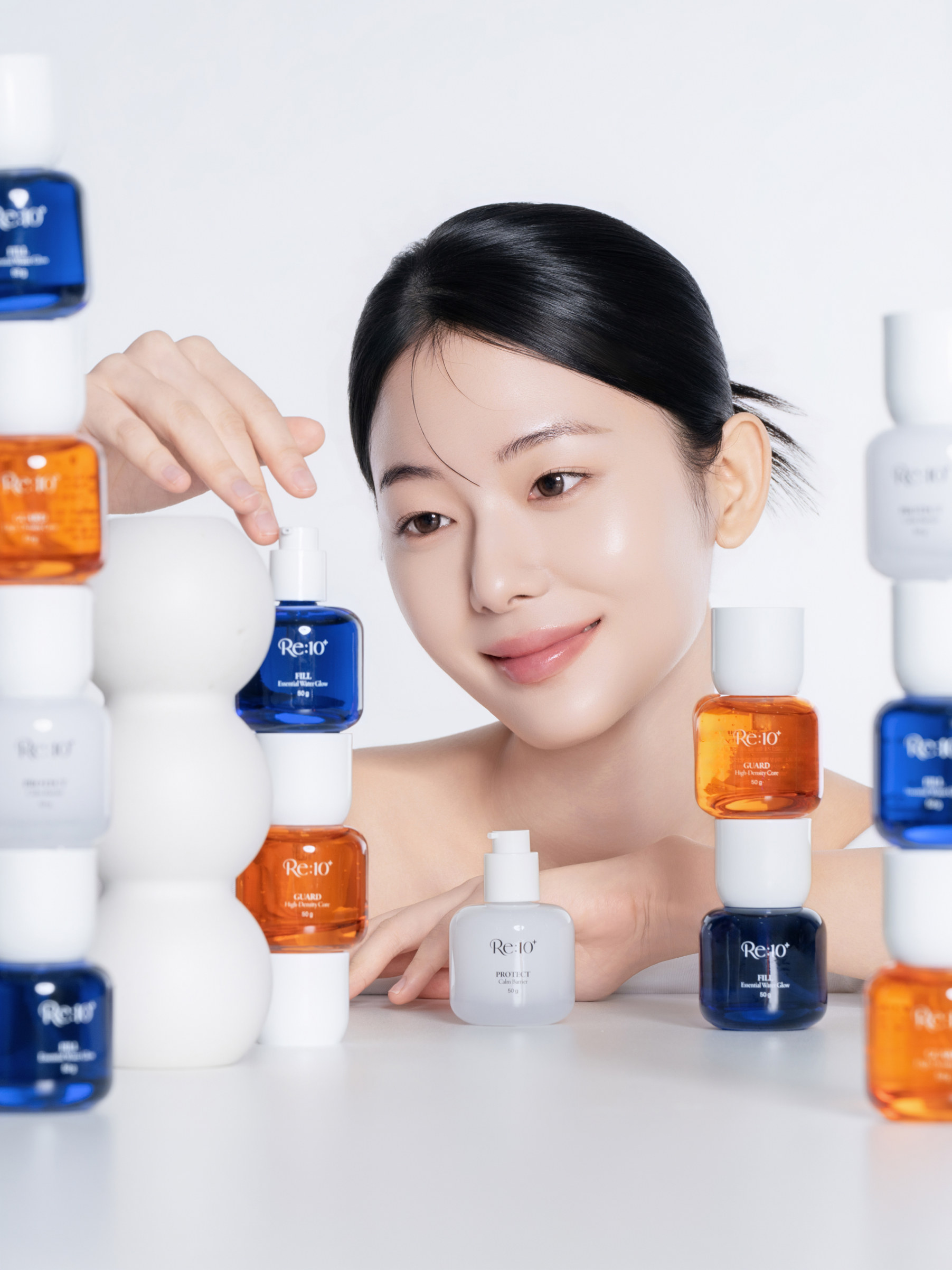
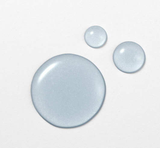
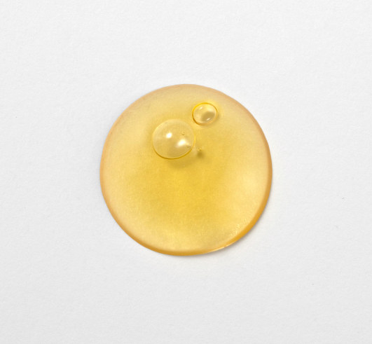
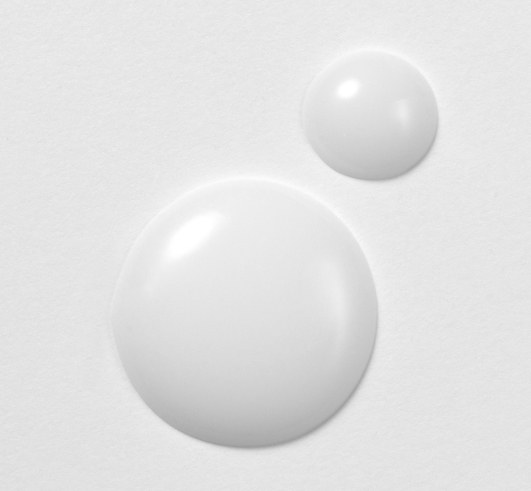
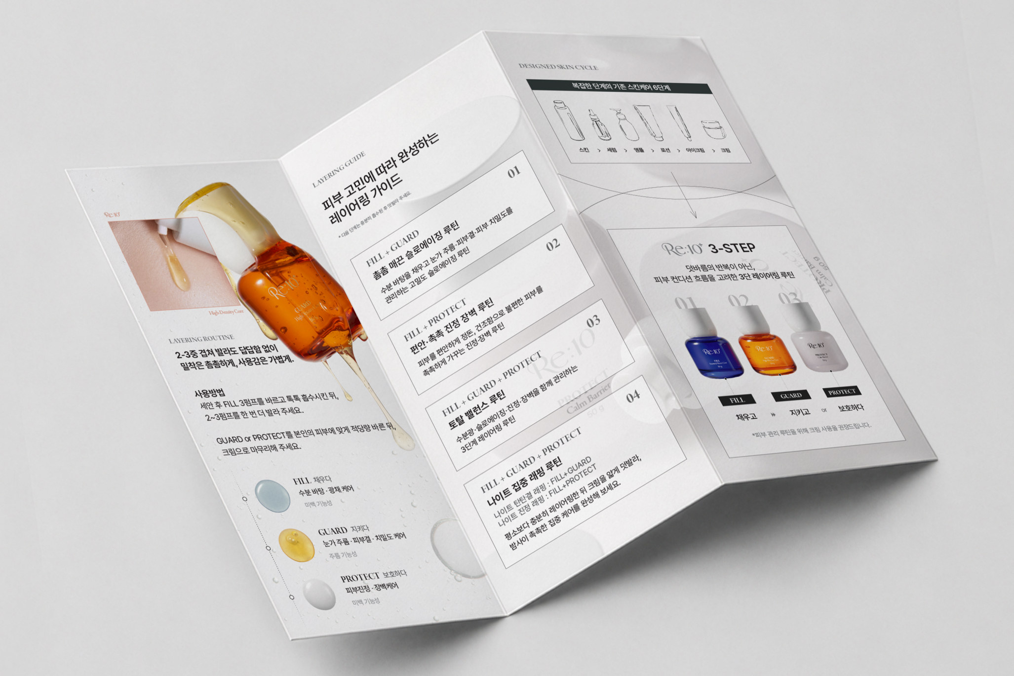
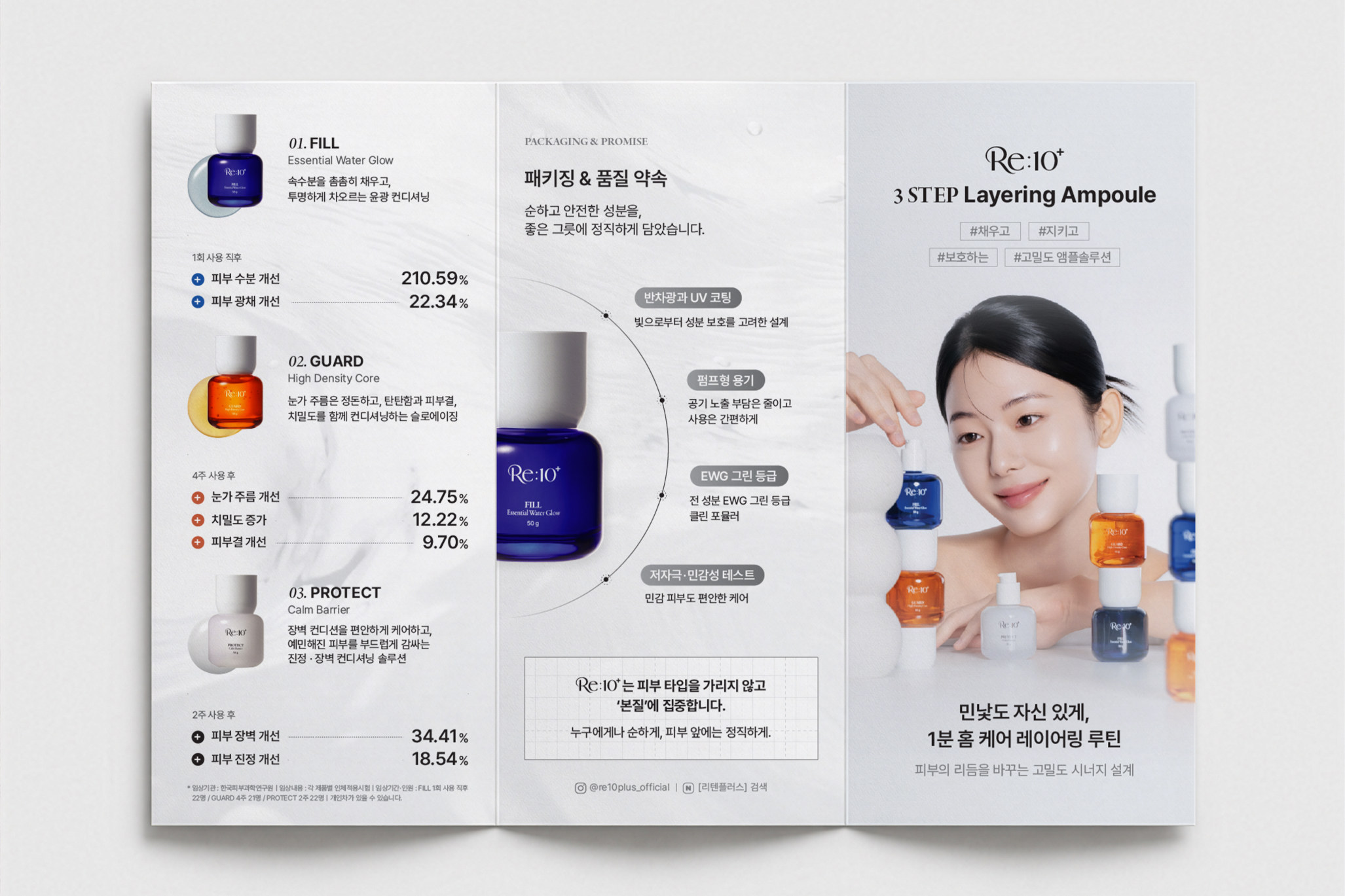
For RETENPLUS's three-piece skincare line we handled everything from package design to product and model photography, a tri-fold pamphlet and the detail pages. Centred on the idea of 'time that reaches the essence', three kinds of care — fill, guard and protect — are told as one layering routine. The packaging distinguishes each product with cobalt blue for FILL, amber orange for GUARD and milky white for PROTECT, while shared typography keeps the line unified. The shoot captures the colour of the bottles, the texture of the formulas and the model's natural skin glow against a grey-white backdrop with soft lighting. The pamphlet lays out each product's features, the order of use and combinations by skin concern so it is easy to unfold and read. The detail pages start from the three-step layering concept, introduce each product's role and the human application test results, and are designed so readers can look over the textures and directions and then choose the combination that suits their own skin concern.
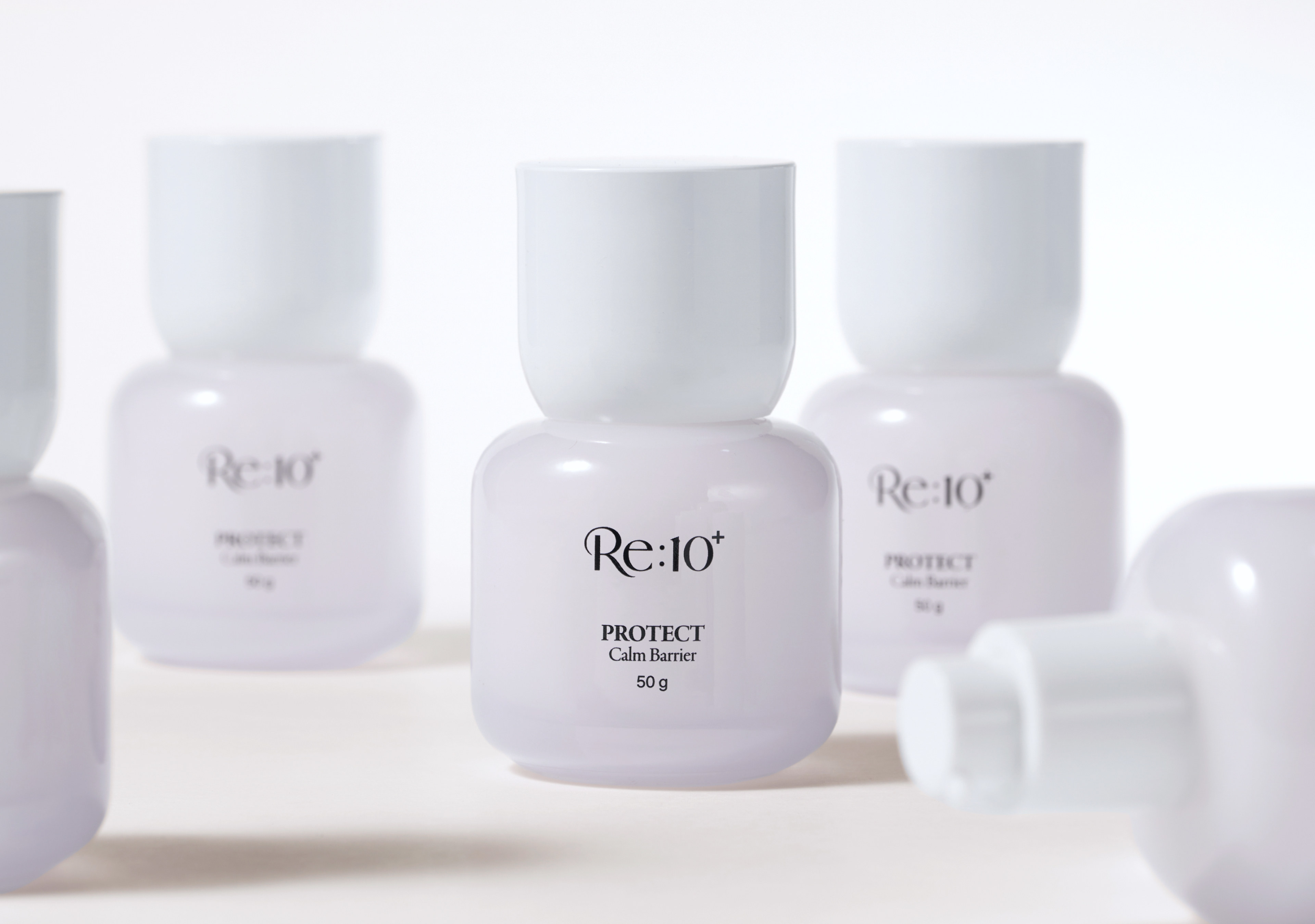
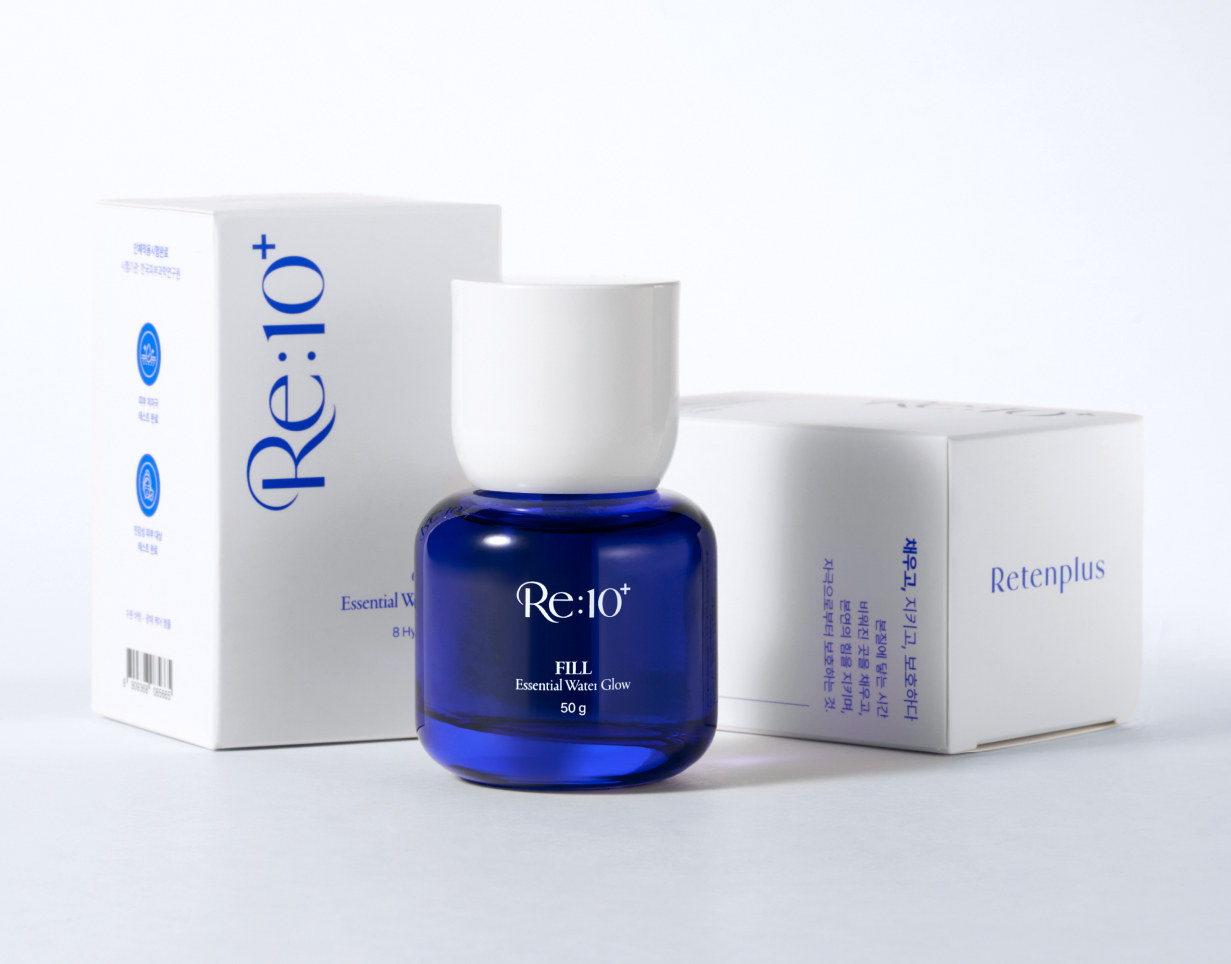
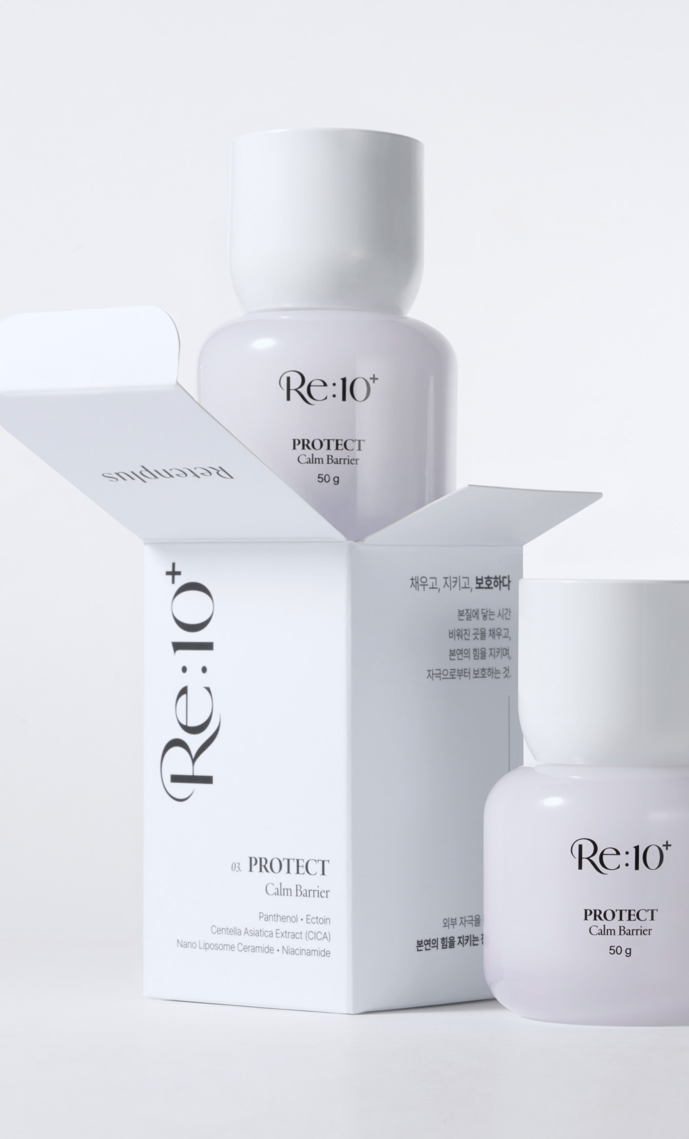
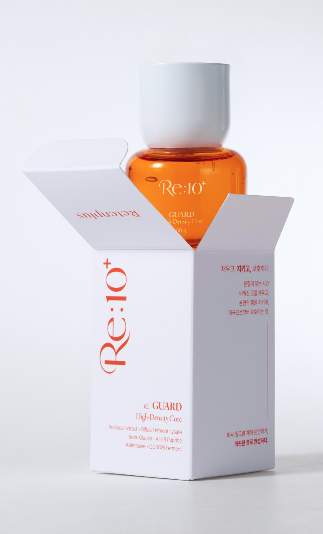
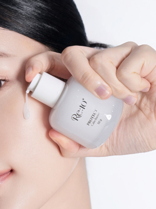
RETENPLUS's three skincare products bring three kinds of care — fill, guard and protect — into one line around the idea of 'time that reaches the essence'. FILL, which fills skin with moisture and glow, takes a vivid cobalt blue; GUARD, which cares for skin density and texture, a deep amber orange; and PROTECT, for soothing and barrier care, a calm milky white. A shared white cap and consistent typography keep the line unified while colour alone tells the products apart. The front of each bottle is kept simple around the logo and product name. The cartons leave generous white space with a vertical wordmark, and the product copy, key ingredients and mandatory labelling are divided by panel so they read in the order the package is turned.
Model & Product shoot
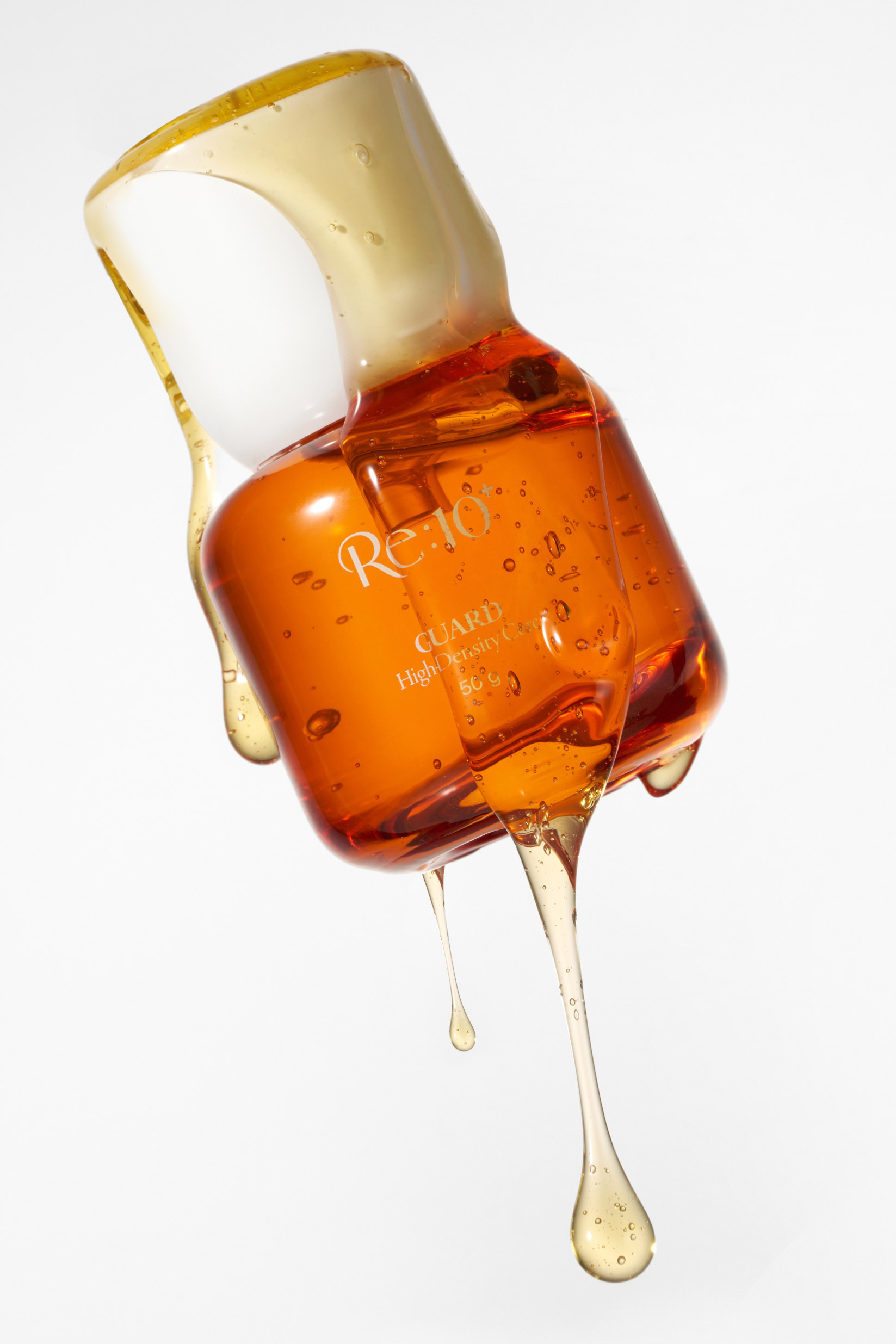
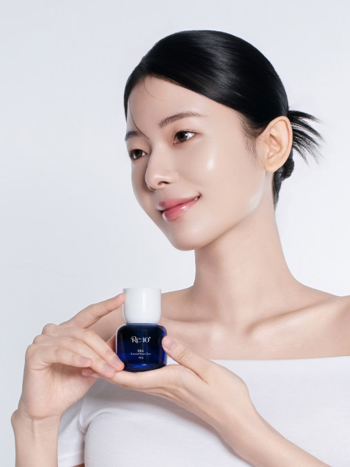
A cool grey-white backdrop and soft lighting capture the refined derma mood of Re:10⁺. Product shots are styled to bring out the transparency of cobalt blue and amber orange and the soft tone of milky white, while model shots focus on a subtle skin glow and natural expressions for a clean yet comfortable atmosphere.
Pamphlet
The Re:10⁺ concept of 'fill, guard, protect' is carried into a tri-fold pamphlet. The outside presents each product's features and human application test results; the inside sets out the order of use and layering combinations by skin concern.